Useful links: Funny stuff, press Enter, VoiceOver

Need a laugh? How to Successfully Educate Your Clients on Web Development at Smashing Magazine is really funny.

Who moved my Enter key? from Know IT describes the role muscle memory plays in keyboarding. Personally, I’m still waiting for Mac and Windows to agree on the location and function of the Ctrl/Cmd keys. Moving from Mac to Windows and back again is like getting into a car and discovering that the brake and gas pedal are reversed in this particular model. Once you get it working, you go back to the other car and have to learn it all over again.

iPhone VoiceOver Features for People with Disabilities is an informative video describing the iPhone VoiceOver accessibility features.

Useful links: online learning, browser basics, the personal blog

Usability Issues that Impact Online Learning from Faculty Focus doesn’t mention specific tools that meet some of the standards suggested for good usability in online learning, but it does tell you some things to strive for:

Good usability for online learning materials means the site, content, and media are easy to find, use, and navigate. And good usability for people means the interaction tools (such as email and discussion forums) are easy to use and facilitate getting input or help as needed.

It would be nice to see an exploration of the usability of the major online learning systems common to colleges. Has anybody done something like that already?

A Google video that will soon be added to the resources deemed worthy of being included in the InterAct Curriculum is Google Explains What a Browser Is. Excellent explanation of basics for the newbie.

I think it says a lot about the economy, the culture, the Internet, and the power of personal blogging when Dooce can raise money for charity online by selling photos of The Former Congressman Charles. What was it my English teacher used to say? The personal is universal . . .

Improve readability with line-height

The CSS line-height property determines the distance or spacing between the lines of text on the page. In the print world, this property is called leading.

Line-height can be applied to any text element, but it’s probably best to set it in the CSS rule for body in your stylesheet. All the textual elements on your page will inherit that line-height value, which can be adjusted if needed for specific parts of the page.

The perfect line-height will depend on your choice of font-family. In my examples, I’m using a sans-serif font. Some fonts are “taller” than others. Tahoma looks good at 1.5, but Times Roman might not. Generally, you don’t want the lines to be too close together or too far apart. You want enough space between the lines to create maximum readability, or the appearance of ease of reading. You want an open and inviting look rather than a  “dense” look, which discourages reading.

I applied different line-height values to some paragraphs so you could see the effect. The rule used in each example is a variation of

p {
font: 1em/1.2 Tahoma, Geneva, sans-serif;
}

To give you the same rule not in CSS shorthand, it would be

p { font-size: 1em;
line-height: 1.2;
font-family: Tahoma, Geneva, sans-serif;
}

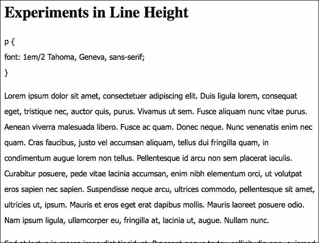
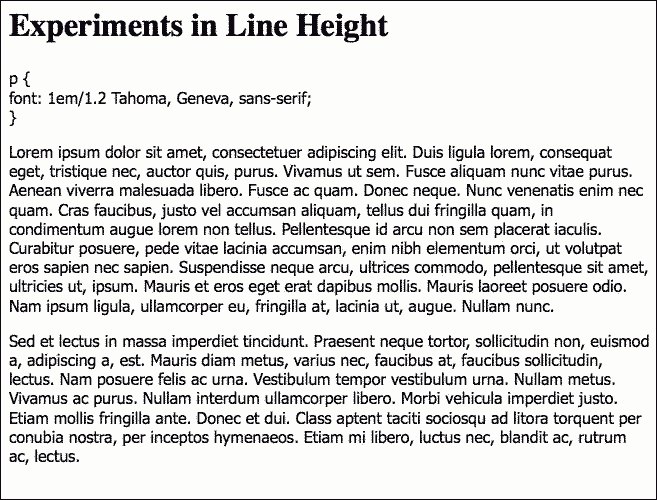
Notice that there is no unit attached the the line-height value. No px, %, or em units should be assigned to the line-height value.  In each example, I put the variation in the line-height rule at the beginning of the image so you could judge for yourself what the effect was.  Which examples look the most readable to you? Which encourage reading, which discourage reading?

Example 1

I’m not even going to show you how it looks if left at the default value, which would be 1. It’s a bit crowded at 1.2.

lineheight1.2

Example 2

I find 1.5 attractive for this font. It’s open and looks easy to read.

lineheight1.5

Example 3

Even at 1.8, the line-height is still working for me. It’s approaching the point of being too much, and I think 1.5 is better, but it still works. (I’d look at 1.6 or 1.7 before deciding for certain.)

lineheight1.8

Example 4

With a value of 2, I think the lines are so far apart that readability is impaired for this font. With so much distance between the lines, you lose the sense of proximity that tells you that these lines belong together in a semantic unit.
lineheight2

Useful Links: Open Letter, Blog Action Day, Free Culture, Usability, HTML5

An Open Letter to Mark Shuttleworth at Geek Feminism Blog points the spotlight at another incident in this year’s round of dismissive-to-women conference remarks.

The topic for Blog Action Day this year is Climate Change. Hope all you bloggers out there will participate.

.eduGuru reviews Lawrence Lessig’s Free Culture and says,

This is not a book about education or law, this is a book designed to educate.  Because of our proximity to such issues, I think it is critical that we all educate ourselves on the changes that are taking place, and the impact it is going to have on us as we move forward and try to support schools, professors, and students in their pursuit of an open learning environment.

10 Useful Usability Findings and Guidelines at Smashing Magazine has some excellent guidelines. This would make a good reading assignment for web design students.

The HTML5 DOM and RDFa talks about a known problem,  in a clear and interesting way.

Useful Links: Snow Leopard and AT, HTML5 and RDFa, Flash accessibility, and writing tips

Snow Leopard Assistive Technology Compatibility List is a very helpful compilation of what works and what doesn’t work on Snow Leopard. From ATMac.

There are so many posts about HTML 5 and RDFa flying around these days that it’s hard to keep up with them all. But here’s one that takes a different approach, Burningbird’s Maxwell’s Silver Hammer: RDFa and HTML5’s Microdata.

Wendy Chisholm chimes in with What I’m Watching about HTML 5.

Adobe Flash Accessiblity: Best Practices is must reading for anyone teaching or using Flash. From Erik Johnson at Six Revisions.

FatDUX has 20 tips for writing for the web that are a great lesson for beginners and a good reminder for the folks who’ve been at it a while.

Useful links: usability in tweets, net neutrality, copyrights

Twitter Postings: Iterative Design from Nielsen’s alertbox takes aim at usability in tweets.

Obama’s FCC to support Net Neutrality at The Hill. So far it’s just a promise, not a behavior.

Your copyright questions answered is a handy summary of copyright basics. Written by a copyright lawyer and published at Book by Its Cover.

Reblog this post [with Zemanta]

Reading with the Kindle Reader on an iPhone

I just finished the first book I’ve read on my iPhone. I used the free Kindle reader app. I read The Reader by Bernhard Schlink.

I just finished the first book I’ve read on my iPhone. I used the free Kindle reader app. I read The Reader by Bernhard Schlink.

I loved the experience. It was a relief to my often achy hands and thumbs to not have a heavy book to hold. The screen resolution is so crisp that I had no problem seeing it, even with my crap-for-eyes.

It went amazingly fast. The line length is so short than you can almost read down the page line by line without having to refocus your eyes again and again to scan across the lines. It’s speed reading without even trying.

I have a feeling that I’ll be buying all books that are available for Kindle in this way from now on.