
Here’s a nice HTML5 cheat sheet from Matt Banner. It can be downloaded as a free PDF. Save yourself the cost of a book with this handy tool. Continue reading “Free HTML 5 Cheat Sheet”
Tips, web design book reviews, resources and observations for teaching and learning web development.
Here’s a nice HTML5 cheat sheet from Matt Banner. It can be downloaded as a free PDF. Save yourself the cost of a book with this handy tool. Continue reading “Free HTML 5 Cheat Sheet”

A new open source tool, Responsive Image Breakpoints Generator, should be at the top of your to-do list of new things to learn to use. Developed by Cloudinary and offered to web designers for immediate use, the tool describes itself,
Responsive websites, even the most modern ones, often struggle with selecting image resolutions that best match the various user devices. They compromise on either the image dimensions or the number of images. It’s time to solve these issues and start calculating image breakpoints more mathematically, rather than haphazardly.
After you choose what you want the breakpoints generator to do for you, you can then download a zip file which contains the HTML5 code which uses the srcset attribute of the img element to set up the responsive breakpoints. The zip file also contains all the images that are referenced in the srcset attributes.
For a longer description of the tool, see this excellent article at Smashing Magazine, which explains a bit more about the tool.
Flash has had a few hard years. HTML5 whupped its ass. So it’s going away.
Sort of.
In its place, Adobe will give us Animate CC, which loses the loser of a name but retains much of the function. There will be added functions, as well. Here’s Adobe’s announcement of the change.
To summarize the changes, here’s how Adobe describes what the new software will do:
- Drawing, illustration and authoring
- Vector art brushes – Modify the path of a stroke after it’s been drawn, and scale them to any resolution without losing quality. You can also make custom brushes and import brushes created with Adobe Capture CC.
- 360° rotatable canvas – Rotate the canvas on any pivot point as you draw to get the perfect angle and strokes. You can even use this feature with a Wacom Cintiq!
- Improved pencils and brushes – Draw smooth, precise vector outlines along a curve and get faster live previews.
- Easier audio syncing – Control audio looping directly on the timeline, without having to code.
- Faster color changing – Naming tagged colors lets you change one color and have it automatically update your entire project.
- Colored onion skinning – Easily orchestrate complex animations now that adjacent frames can have different color and alpha values.
- CreativeSync integration
- Adobe Stock – Browse and license millions of high-quality photos, illustrations and vector graphics directly in Animate CC. You can even add life to static content by adding animations to them.
- Creative Cloud Libraries – Access colors, vector graphics and brushes directly as you work.
- Output capabilities
- Multiplatform support: HTML5 Canvas, WebGL, Flash (SWF), AIR, video, and custom platforms (such as SVG) via extensions.
- 4K+ video export – Export videos with custom resolutions for the latest Ultra HD and Hi-DPI displays.
- Custom resolution export – Revitalize older content by resizing and optimizing them for any resolution, such as Ultra HD and Hi-DPI displays.
- .OAM support – Export your project as an .OAM file for easy importing to Adobe Muse, InDesign, DPS and Dreamweaver.
The new Adobe Animate CC will be released in January 2016.
From Jamie Spencer, here’s a mega HTML 5 cheat sheet. If you want to print it, a PDF is available at makeawebsitehub.com/the-html-5-mega-cheat-sheet

Cheat Sheet via Make a Website Hub
Two excellent videos from Akamai Technologies are available explaining how to code for responsive images. The first is written by Mat Marquis, the second by Yoav Weiss.
Both films go quickly and bear watching more than once.
The standards set in WCAG 2.0 state:
Guideline 1.1 Text Alternatives: Provide text alternatives for any non-text content so that it can be changed into other forms people need, such as large print, braille, speech, symbols or simpler language.
Among those text alternatives is where alt text (or alternative text) for an image is used.
The HTML5 specification states that all images must have an alt attribute. Here’s the fine print. All images must have an alt attribute, but there are times when the alt attribute can be empty or null. That is, the attribute has to be there, but there might be nothing in it. Like this:
<img src="image.png" alt="">There are times when the text surrounding an image gives the alt text of the image. It’s part of the content. Therefore, to put the same information in an alt attribute becomes redundant and unnecessary.
Here’s an example from the blog Old Ain’t Dead in the section where the most popular posts are displayed. Alt text is shown using the tools in the Web Developer Toolbar.
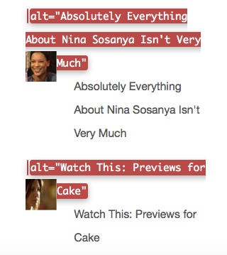
You can see that the alt text for the image is exactly the same as the link text that goes with it. On a screen reader, a user would have to listen to the same text read twice. It would be better if these images had null alt text because the function of the link is explained by the text accompanying it.
Look at how Twitter deals with null alt text.

If the alt text for Twitter avatars was not null, but in fact contained the name of the Twitter account, then the name would be spoken twice in a screen reader. In the example above, with null alt text, you would hear “Jeffrey Zeldman” spoken once only because of the null alt text.
Even if you couldn’t see the little profile image, you’d still know it was Jeffrey Zeldman’s twitter account.
If you consider the two examples already mentioned – the list of top posts and the Twitter avatars – in neither situation would null alt text on the image result in the user becoming confused. The information is there in text form and it’s all that is needed.
In that case, put a description in the alt attribute that explains the function of the image or provides the content of the image.

I’ve been attempting to sort out in my own mind exactly what I needed to be teaching students about responsive images. For a while, things have been a bit wobbly in this area and there were no definite best practice ideas. Thanks to the Responsive Images Community Group, I think a consensus on best practice has gelled for now.
I’m sure you’ve heard about the new picture element. Before you think about using it, you need to know when you can use the familiar img element.
The majority of the time, the srcset and sizes attributes of the img element will be what front end developers use.
This example shows srcset with img and options for display density.
<img src="image500px.jpg"
  srcset="image750px.jpg 1.5x, image1000px.jpg 2x"
  width="500px" alt="great image">
The src attribute is the fallback image. The “1.5x” means 1.5 device pixels per CSS pixel, and is a larger image. The 2x means 2 device pixels per CSS pixel, and again, refers to a larger image. It means you have prepared 3 versions of the same image and uploaded them.
Here’s an example of code using an img element with srcset and sizes attributes.
<img srcset="large.jpg 1024w,
 medium.jpg 640w,
 small.jpg 320w"
sizes="(min-width: 36em) 33.3vw,
 100vw"
src="small.jpg"
alt="A great image">
The srcset attribute lets you give a comma separated list of image file paths. The second example used w to specify width to the browser and vw to specify viewport width. Instead of display density, the second example uses media queries to designate images from the list. Again, you have prepared 3 images in different sizes and have them on the server.
Whether you’ve prepared your code to work with pixel density or using widths, the result is the browser makes a choice as to which image will work best. The browser decides which image of the listed images fits the situation by evaluating resolution, viewport size, even bandwidth, and chooses the best image for the situation.
You can also add add the sizes attribute. The sizes attribute tells the browser how many pixels it needs by describing the final rendered width of the image. To make the image occupy a third of the viewport, the code would be:
sizes="33.3vw"With sizes, you provide a CSS length that describes the image’s rendered width. CSS lengths can be either absolute (150px or 20em) or relative to the viewport as in 33.3vw. As with fonts or other relative measures, the relative to the viewport value is what offers the responsive rendering. The 100vw measure is the default length and would be used if no other conditions matched.
Value can be in px, ems, or vw.
In the second example above the sizes attribute uses media query width descriptors with values in ems or vw (viewport width). The first value is a media condition (a media query without the media type) and the second value is a length. Note, the default length is not matched to a media query.
You can use only the srcset or both srcset and sizes attributes with the img element.
So, when do you use the picture element?
Sometimes an image won’t work if it is simply sized differently for different devices. It might need to be cropped or have some other type of what is called art direction work done on it. In this situation, you want to give a list of different images to the browser to use in different situations. Perhaps they’ve been cropped. If the image contain words, perhaps the text has been reworked for different size displays. They are not merely resized versions of a single image, but completely reworked images meant to fit different situations.
Use the picture element with multiple source elements for this situation.
<picture>
 <source media="(min-width: 40em)"
  srcset="big.jpg 1x, big-hd.jpg 2x">
 <source
  srcset="small.jpg 1x, small-hd.jpg 2x">
<img src="fallback.jpg" alt="">
</picture>
Embedded in the picture element are source elements with images paths, media queries, display density designations – all the things we saw with the img element, but here the source elements link to images that have been altered in some way. The last thing nested in the picture element is a fallback img element.
That’s a lot of new information for someone who grew up on the old style image tags. New length measures, new elements, new attributes. I’m not sure I really have it clearly understood. Writing this was one way to help me work it all out in my mind. If any of you see where I’m foggy or misunderstand something, please offer suggestions.