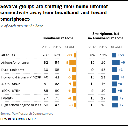
The Pew Research Center released a new survey on home broadband use in 2015 that has implications for web designers. The overall finding is that fewer people have home broadband, while more people rely on their smart phones for Internet access.
The changes are slight, but possibly significant. Home broadband adoption has plateaued. It now stands at 67% of Americans, down slightly from 70% in 2013.
Pew Internet Survey results for movement from broadband toward smartphones. African Americans, those with relatively low household incomes and those living in rural areas show the most change.
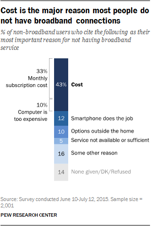
The cost of broadband is a major problem cited by many of those surveyed.
The monthly cost of broadband is prohibitive to 43% of those who do not have it
24% of Americans do not have cable or satellite. 15% are former subscribers who ‘cut the cord.’ Young adults, in particular, expect to be able to use their smartphones to access almost anything they want, apply for jobs, follow the news, access government services and more.
The implications for web designers
websites should work well on mobile devices
websites should download quickly with a minimal hit on a users data plan
Two excellent videos from Akamai Technologies are available explaining how to code for responsive images. The first is written by Mat Marquis, the second by Yoav Weiss.
Both films go quickly and bear watching more than once.
I’ve been attempting to sort out in my own mind exactly what I needed to be teaching students about responsive images. For a while, things have been a bit wobbly in this area and there were no definite best practice ideas. Thanks to the Responsive Images Community Group, I think a consensus on best practice has gelled for now.
Srcset and sizes
I’m sure you’ve heard about the new picture element. Before you think about using it, you need to know when you can use the familiar img element.
The majority of the time, the srcset and sizes attributes of the img element will be what front end developers use.
This example shows srcset with img and options for display density.
The src attribute is the fallback image. The “1.5x” means 1.5 device pixels per CSS pixel, and is a larger image. The 2x means 2 device pixels per CSS pixel, and again, refers to a larger image. It means you have prepared 3 versions of the same image and uploaded them.
Here’s an example of code using an img element with srcset and sizes attributes.
The srcset attribute lets you give a comma separated list of image file paths. The second example used w to specify width to the browser and vw to specify viewport width. Instead of display density, the second example uses media queries to designate images from the list. Again, you have prepared 3 images in different sizes and have them on the server.
Whether you’ve prepared your code to work with pixel density or using widths, the result is the browser makes a choice as to which image will work best. The browser decides which image of the listed images fits the situation by evaluating resolution, viewport size, even bandwidth, and chooses the best image for the situation.
You can also add add the sizes attribute. The sizes attribute tells the browser how many pixels it needs by describing the final rendered width of the image. To make the image occupy a third of the viewport, the code would be:
sizes="33.3vw"
With sizes, you provide a CSS length that describes the image’s rendered width. CSS lengths can be either absolute (150px or 20em) or relative to the viewport as in 33.3vw. As with fonts or other relative measures, the relative to the viewport value is what offers the responsive rendering. The 100vw measure is the default length and would be used if no other conditions matched.
Value can be in px, ems, or vw.
In the second example above the sizes attribute uses media query width descriptors with values in ems or vw (viewport width). The first value is a media condition (a media query without the media type) and the second value is a length. Note, the default length is not matched to a media query.
You can use only the srcset or both srcset and sizes attributes with the img element.
When you need to do more than resize an image
So, when do you use the picture element?
Sometimes an image won’t work if it is simply sized differently for different devices. It might need to be cropped or have some other type of what is called art direction work done on it. In this situation, you want to give a list of different images to the browser to use in different situations. Perhaps they’ve been cropped. If the image contain words, perhaps the text has been reworked for different size displays. They are not merely resized versions of a single image, but completely reworked images meant to fit different situations.
Use the picture element with multiple source elements for this situation.
Embedded in the picture element are source elements with images paths, media queries, display density designations – all the things we saw with the img element, but here the source elements link to images that have been altered in some way. The last thing nested in the picture element is a fallback img element.
OMG
That’s a lot of new information for someone who grew up on the old style image tags. New length measures, new elements, new attributes. I’m not sure I really have it clearly understood. Writing this was one way to help me work it all out in my mind. If any of you see where I’m foggy or misunderstand something, please offer suggestions.
Bryan Cranston now pushing iPads to Apple addicts. This funny headline gives me the opportunity to make a comment on the new iPad Air. I have a regular iPad and an iPad mini and I much prefer the smaller one simply because of weight. I applaud the arrival of a lighter full-sized iPad.
Why Responsive Web Design Can Transform Higher Ed Recruiting. One of many interesting tidbits in this article: “According to research from Higher Education Consultants Noel-Levitz, 68 percent of college applicants have viewed college websites on mobile devices. And if a college’s website isn’t optimized for mobile, these potential students drop off: 24 percent of students would leave a website after a poor internet experience.”
Here’s a view of the changes that Yahoo! went through in building its new logo. It’s simple, and the exclamation mark is animated. What do you think of it?
I’m feeling just a bit cross-eyed after seeing the meta-fizzy effects created in MetaFizzy Effect with SASS at CSS Tricks. Let’s not all go out and do this, okay?