Gather Content Offers a Free UX Guide

A Guide for UX Designers

Gather Content, an online software tool that allows people to streamline their web content production, is making their UX Guide available as a free download.

The book, UX Design And Content Strategy: The Project Guide, is described as a hands-on resource for all UXers and a project guide to UX design and content strategy that explores the relationship through a website project. The book is a 64 page PDF document.

I haven’t read the book myself, but if you are interested in a project based approach to user experience, it certainly is worth a look.

O’Reilly EBook: Design for Voice Interfaces

Design for Voice Interfaces

O’Reilly Media is offering an ebook called Design for Voice Interfaces: Building Products that Talk by Laura Klein. It’s only 30 pages long and worth reading. It gives a brief background, talks about current issues in designing VUI and concludes with a few helpful resources to get you started learning more about it.

You definitely can’t beat the price for this informative book. It’s free.

The UI Improvement that Wasn’t

An iPhone 6. Image from Apple.com
An iPhone 6. The lock button is directly opposite the volume buttons. Image from Apple.com

I recently got an iPhone 6. As I’m sure you know, it’s bigger than the previous version of the iPhone. I assume that is the reason why Apple moved the power/lock button from the top to the right side. Makes it easier to reach with your thumb.

Since I frequently want to darken and lock my iPhone before putting it in my pocket or purse, this button is a big deal for me. But with it directly opposite the volume buttons as it is now, I have a hard time using it. I can’t comfortable hold the phone in one hand and click the lock button without clicking one of the volume buttons at the same time.

When I click both the lock button and a volume button at the same time, the volume changes. The phone does not lock.

I have to grab the phone with two hands so I can get my thumb on the lock button without also holding a volume button.

I’m sure Apple thought they were doing us a big favor moving that button, but for me, it created an annoying problem.

Review: Badass: Making Users Awesome


Badass: Making Users Awesome by Kathy Sierra is from O’Reilly (2015). This book is about motivation and skills and progress and brain science. It shows you how to use motivation and skill levels and learning progress by being badass, by modeling badass, and by giving you the badass version of learning how to be badass.

If you know who Kathy Sierra is and what she’s already done as a writer and programmer, you’ll recognize what she’s talking about in this book. It’s been her topic before and she’s come back to it with a powerful teaching device – this book. Kathy’s premise is you don’t just want a great product, you want great users. You want users who find it easy to learn to be experts with your product. Even when your product is complicated and hard to learn to use at an expert level, if you approach helping users the right way, they will reach the badass level as users.

The book if full of lively graphics, funny illustrations, and simple but powerful charts.

A chart showing how an upgrade to software can move users from competent back to feeling like they suck

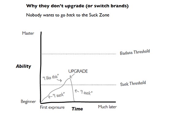
This chart shows exactly how I feel about every new upgrade of Dreamweaver CC. Each time I open it, I go back into the suck zone on something. Getting the labels on form fields – oh, no, I suck. Creating a new selector in the style sheet – oh, no, I suck. Using the fucking fluid layout grid – oh, no, I suck. Kathy explains how to help users avoid that oh, no, I suck sensation with upgrades and with new skills mastery in general. The people at Adobe are definitely not using all of Kathy’s suggestions to help users move to badass with updates to their products.

A chart showing the good practice is in the zone between what your good at and what you are bad at

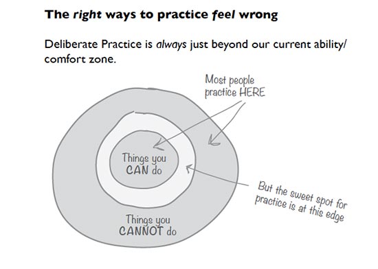
Even something as basic as practicing a skill to get better at it has brain science examples to help you design experiences for users that let them practice the right way. There are also chapters on how to help users filter out brain spam so they can concentrate on things that matter. Here’s the table of contents:

The table of contents for Badass: Making Users Awesome

Just looking at the table of contents tells you a lot about how this book works, and how Kathy Sierra uses her deep understanding of brain science and user experience to craft an experience for you that will leave you feeling badass.

If you want to learn how to create and market a product that your users will love using and will recommend to others, read this book. After you’ve read it, go back and look at how it was written. What were you asked to do as you read? How were you helped to understand the points made? How were you helped and supported as a reader to become an expert in making users awesome? What patterns and perceptions sneaked into your brain without you knowing how it happened?

Kathy Sierra has always been about creating awesome users, and this book can help you be about that, too.

Welcome back to the conversation, Kathy. You were missed.

A review by Virginia DeBolt of Badass: Making Users Awesome (rating: 5 stars)

Summary: Kathy Sierra shows you how to make your users keep coming back by helping them be badass at using your product.

Disclosure: I received a free copy of this book from the publisher for this review. Opinions are my own. Links to Amazon are affiliate links. Here is my review policy. .

The Unicorn Institute

Leslie Jensen-Inman and Jared Spool

Have you noticed what Leslie Jensen-Inman and Jared Spool are doing at The Unicorn Institute? Anyone with an interest in web education should take a look at what they are doing and join them in their effort.

Here’s the goal.

We can create the next generation of UX professionals, also known as Unicorns, by connecting industry, education, and community.

Here’s a bit more about what they are doing.

We know UX design career pathways and education need a transformation. So we’ve set out on a research adventure to determine what skills UX designers need and what type of learning environment is best suited to practice and to apply those skills. Our goal: Find out everything we can to create the next generation of UX design unicorns.

You can sign up with them to stay informed and participate at the web site. They are looking for students, teachers, hiring managers, and “fellow adventurers” to join them.

Go look at what they are doing and consider helping out.

Useful Links: Resolution Resource, iPad Air, Usability

Device Screen Resolutions Ordered by OS is a very useful resource from David Storey.

Bryan Cranston now pushing iPads to Apple addicts. This funny headline gives me the opportunity to make a comment on the new iPad Air. I have a regular iPad and an iPad mini and I much prefer the smaller one simply because of weight. I applaud the arrival of a lighter full-sized iPad.

Designing for Usability: Three Key Principles comes from Measuring Usability, a blog by Jeff Sauro with many helpful articles.

Useful links: Fast Forms, Slanted Tabs, Zombie Scroll

5 Killer Ways to Use Fast Forms has some interesting suggestions in form design.

Slanted Tabs with CSS 3D Transforms is a very nice tutorial from Lea Verou.

Creating game-style parallax scrolling: Zombie Edition at Dev.Opera has the world’s best blog post title and enough HTML, CSS, and JavaScript to fill your geeky heart.