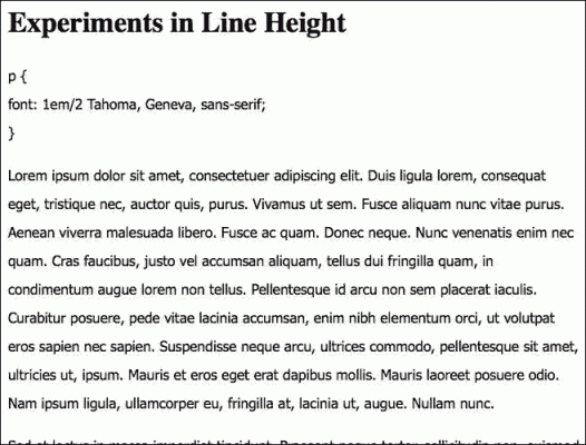
The CSS line-height property determines the distance or spacing between the lines of text on the page. In the print world, this property is called leading.
Line-height can be applied to any text element, but it’s probably best to set it in the CSS rule for body in your stylesheet. All the textual elements on your page will inherit that line-height value, which can be adjusted if needed for specific parts of the page.
The perfect line-height will depend on your choice of font-family. In my examples, I’m using a sans-serif font. Some fonts are “taller” than others. Tahoma looks good at 1.5, but Times Roman might not. Generally, you don’t want the lines to be too close together or too far apart. You want enough space between the lines to create maximum readability, or the appearance of ease of reading. You want an open and inviting look rather than a “dense” look, which discourages reading.
I applied different line-height values to some paragraphs so you could see the effect. The rule used in each example is a variation of
p {

font: 1em/1.2 Tahoma, Geneva, sans-serif;

}
To give you the same rule not in CSS shorthand, it would be
p { font-size: 1em;
line-height: 1.2;
font-family: Tahoma, Geneva, sans-serif;

}
Notice that there is no unit attached the the line-height value. No px, %, or em units should be assigned to the line-height value. In each example, I put the variation in the line-height rule at the beginning of the image so you could judge for yourself what the effect was. Which examples look the most readable to you? Which encourage reading, which discourage reading?
Example 1
I’m not even going to show you how it looks if left at the default value, which would be 1. It’s a bit crowded at 1.2.

Example 2
I find 1.5 attractive for this font. It’s open and looks easy to read.

Example 3
Even at 1.8, the line-height is still working for me. It’s approaching the point of being too much, and I think 1.5 is better, but it still works. (I’d look at 1.6 or 1.7 before deciding for certain.)

Example 4
With a value of 2, I think the lines are so far apart that readability is impaired for this font. With so much distance between the lines, you lose the sense of proximity that tells you that these lines belong together in a semantic unit.

I find line-height to be a huge factor in whether I stay around at a site and actually read anything.
Sites where the lines are too close together just lose me immediately.
Thanks for this tip.
.-= Miraz Jordan´s last blog ..Adult literacy is poor in New Zealand =-.
Virginia, thanks for this. I finally decided I was going to start customizing my own templates a little at a time rather than pay someone to do redesigns, so it will be a good first step to evaluate each of my blogs for their line height and see if they could benefit from changes.
.-= Skye´s last blog ..In The Days After The Slaughter =-.
I did some research on readability a few years ago, and one of the interesting things I learned is that, to preserve readability, longer lines require taller line-height. If the box of text is not very wide, your line-height probably won’t need to be as tall.
Good point, Dave. Lately I’ve been using an app called Readable that restricts line length and lets you set things like font size. It doesn’t allow a setting for line-height, but it makes reading on the web very easy.