Form New Habits for Working with CSS in Dreamweaver CC

The way the CSS Designer in Dreamweaver CC creates selectors is different from the way you may be in the habit of working with previous version of Dreamweaver.

Good, Bad Habits

You now need to know more about creating an appropriate selector. Instead of relying on Dreamweaver to generate a good selector for you based on your selection in the Document window, you need to be ready to decide for yourself what the best selector should be. This is especially true if you are using the CSS that comes from using the Dreamweaver grid layouts. The suggested selectors with a grid layout are quite cumbersome.

If you know what selector you want, Dreamweaver will help you choose it, but you have to know the trick.

A Specific Example

This example comes from a grid system layout. Other layouts might not have such ungainly selectors as default suggestions. If you click the familiar plus sign (+) to create a new selector while something is selected in the Document window, the selector suggested by Dreamweaver gives the full page structure.

The Dreamweaver suggested selector based on something selected in the Document window.

There is no longer a “Less Specific” option to remove the unneeded parts of this very long suggested selector. The easiest way to deal with it is to remove the entire thing. Do that by typing the beginning letters of what you know you want the new selector to be.

For example, if the element to style is an <a> element nested in an <aside> element, begin by typing as in the editable selector field. Code hint appear giving choices that contain “as.”

Begin typing a selector and Dreamweaver will show you options as code hints

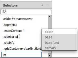
Using the arrow keys, or the mouse, select aside. To add a descendent selector after aside appears in the editable selector field, type a space and another selector after aside. For this example, type a: and Dreamweaver shows code hints.

The field remains editable so that descendant selectors can be built

From the code hints for :. pick one of them using the mouse or arrow keys. Press Return/Enter when you’ve finally go the selector you want. The selector will turn blue and the Properties Pane for that selector will be populated with all the Property options.

Knowing how to use the code hints provided in the editable selector field will help you get quickly to the selector you need for a particular style.

Sections and Articles are Not Generic Containers

html5 logo

The proper use of section and article elements in HTML5 is one of the sticking points to good implementation. If you’re teaching HTML5, or just learning about HTML5, here’s a tip for you.

A section element (or an article element) should not be used as a container for styling purposes. However, any time you have some content that needs a heading or h1, h2, etc. at the beginning, sections and articles are semantic candidates for proper markup.

If what you are doing is wrapping something up in a container with an id or class that will be used for anything but content with a heading at the top, you should use a div. A div is, by definition, a generic container. It carries no semantic meaning. It needs no heading element. It is meant to hold blocks of the page for styling purposes.

The W3C offers this guidance:

Each section should be identified, typically by including a heading (h1-h6 element)as a child of the section element.


Each article should be identified, typically by including a heading (h1-h6 element) as a child of the article element.

An Accessibility Primer

How do we achieve accessibility? Follow these simple guidelines.

wheelchairicon

Create web sites that

  • Use web standards
  • Use semantic HTML: POSH
  • Integrate accessibility from the start of a project
  • Are POUR

What is POSH?

  •  Plain old semantic HTML
  •  The Hypertext Markup Language is meant to format text into semantic elements. Most HTML tags are self-describing, that is, the tag itself describes the semantic meaning of the text it is meant to format.
  •  Make sure the HTML elements that content is placed in are really describing the content. Use heading tags (<h1>, <h2>, etc.) for headings. Use list tags for lists. Use table elements properly.
  •  There are only a couple of exceptions to the semantic nature of HTML: the generic container elements <div> and <span> do not have semantic underpinnings.

What is POUR (or the WCAG 2.0 guidelines)

Perceivable

  • Provide text alternatives for any non-text content so that it can be changed into other forms people need, such as large print, Braille, speech, symbols, or simpler language.
  • Provide alternatives for time-based media
  • Create content that can be presented in different ways (for example, simpler layout) without losing information or structure.
  • Make it easier for users to see and hear content, including separating foreground and background.

Operable

  • Make all functionality available from a keyboard.
  • Provide users enough time to read and use content.
  • Do not design content in a way that is known to cause seizures.
  • Provide ways to help users navigate, find content, and determine where they are.

Understandable

  • Make text content readable and understandable
  • Make web pages appear and operate in predictable ways
  • Help users avoid and correct mistakes

Robust

  • Maximize compatibility with current and future user agents, including assistive technologies.

4 Little Known Google Search Tips

Search Technology Redux

No more leafing through a card catalog card by card. Search travels at the speed of electrons now. There are some characters and tricks that you can use to refine a search on Google that will get you the information you want more efficiently. Here are a four.

Exclude with a Dash

Putting a dash in front of a word excludes it from your search. A Star is Born -Striesand.

Include Synonyms with a Tilde

Putting a tilde before a word means that synonyms will be included for the word. Halloween ~masks.

Use Two Periods to Search a Range

Putting two periods between terms will give you a range of things like dates, measurements or prices. Gas prices 2001 .. 2005.

Use Related to find Related Items

Use related: to search for things that are related to a specific site. related: oldaintdead.com.

Tips on Using the Dreamweaver CC Layout Grid

I’ve learned a few things about how the Dreamweaver CC layout grid system works after making about 30 different layouts with it and struggling to figure out its bugs.

One helpful thing is to take a look at the stylesheet that Dreamweaver generates after you’ve told it how many columns you want in the various sizes. This is before you’ve entered any content of your own or added any CSS rules of your own.

Read through it and notice the order of the rules and media queries.


@charset "UTF-8";
/* Simple fluid media
   Note: Fluid media requires that you remove the media's height
  and width attributes from the HTML
   http://www.alistapart.com/articles/fluid-images/ 
*/
img, object, embed, video {
	max-width: 100%;
}

/* IE 6 does not support max-width so default to width 100% */
.ie6 img {
	width:100%;
}

/*
	Dreamweaver Fluid Grid Properties
	----------------------------------
	dw-num-cols-mobile:		4;
	dw-num-cols-tablet:		8;
	dw-num-cols-desktop:	12;
	dw-gutter-percentage:	15;

	Inspiration from "Responsive Web Design" by Ethan Marcotte 
	http://www.alistapart.com/articles/responsive-web-design
	and Golden Grid System by Joni Korpi
	
Home
*/ .fluid { clear: both; margin-left: 0; width: 100%; float: left; display: block; } .fluidList { list-style:none; list-style-image:none; margin:0; padding:0; } /* Mobile Layout: 480px and below. */ .gridContainer { margin-left: auto; margin-right: auto; width: 96.7391%; padding-left: 1.6304%; padding-right: 1.6304%; clear: none; float: none; } #div1 { } .zeroMargin_mobile { margin-left: 0; } .hide_mobile { display: none; } /* Tablet Layout: 481px to 768px. Inherits styles from: Mobile Layout. */ @media only screen and (min-width: 481px) { .gridContainer { width: 91.4836%; padding-left: 0.7581%; padding-right: 0.7581%; clear: none; float: none; margin-left: auto; } #div1 { } .zeroMargin_tablet { margin-left: 0; } .hide_tablet { display: none; } } /* Desktop Layout: 769px to a max of 1232px. Inherits styles from: Mobile Layout and Tablet Layout. */ @media only screen and (min-width: 769px) { .gridContainer { width: 89.0217%; max-width: 1232px; padding-left: 0.4891%; padding-right: 0.4891%; margin: auto; clear: none; float: none; margin-left: auto; } #div1 { } .zeroMargin_desktop { margin-left: 0; } .hide_desktop { display: none; } }

The styles all flow from the 480 px and below layout rules. Dreamweaver expects you to begin adapting the style rules and adding your content in the mobile layout. Nothing explains that to you, but when the grid you set up in the File > New dialog opens in the Design View, it opens on the mobile view. Notice the size selector at the bottom of the document window, and the 4 column grid in the background.

This subtle clue means start with the mobile layout. Too subtle?
These subtle clues means start with the mobile layout. Too subtle?

Is opening up in the mobile view too subtle a clue? Shouldn’t there be some text somewhere, about starting with the mobile layout?

Once you have the mobile layout done, you are expected to move to the tablet size layout and adjust the fluid grid accordingly.

Finally, you can make any adjustments to the fluid grid for a desktop layout.

Additionally, when the initial grid layout opens in Design View, it contains a div (with the id div1) which you are expect to delete. There’s nothing to alert you to the fact that you should delete this placeholder div and replace it with a header element or whatever you want to add first to your page.

Since Adobe has so few tutorials that illustrate the proper use of the grid layout system, much of what you need to know to figure out the new layout system comes by way of trial and error. I hope my trial and error stumbling and learning experiences can help you get off to a smoother start.

Changing Your Facebook Gender Settings

Your body. Your definition. Now on Facebook.

Facebook added the ability to set your gender outside the binary male/female choices just in time for Valentine’s Day. Now you can define yourself with a choice more reflective of who you really are if the binary choices don’t cover it.

Here’s how to update your gender settings.

1. Choose Edit Profile. If you’re on the page with your News Feed, it’s under your name at the upper left.

choose edit profile
Choose edit profile

2. Scroll down to the Basic Information Section and click Edit.

Edit Basic Information

3. You’ll see a gender option. Use the pull down menu to select “Custom.”

Select Custom
Select Custom

4. Start typing in the input field. After you type the first letter, Facebook populates the list with options based on your first letter. I typed a “c” thinking that I would like to identify as “crone.”

The "C" options
The “C” options

As you can see, crone isn’t an option. I tried typing it in and saving, but got an error message. It will only let you choose one of the options offered. (There are about 65 choices in all.)

I typed a “f” in the box. Here are the options offered. As you can see, choices included options with “f” in many places, not just as the first letter.

the "f" options
The “f” options

5. Pick a pronoun. If you choose a custom gender definition, you have a chance to choose your pronoun.

Choose a pronoun
Choose a pronoun

The pronoun choices are limited and don’t offer some common choices that people who don’t fit the binary prefer. Maybe Facebook will add to the pronoun options later. They need to do that.

6. Save

Related post from 2010 (or this has been a long time coming) Have You Thought About the Gender Choices on Web Forms?

Note: This post was syndicated on BlogHer.com.

Think about ARIA roles when choosing a WordPress theme – Updated

ARIA landmark roles are used to improve accessibility and provide useful navigation points that a screen reader recognizes and can find quickly.

The role information is written into the HTML as an attribute of any element that fills a particular role. In the code, they look like this:

<header role="banner">
<nav role="navigation">

The current list of landmark roles includes:

  • application
  • banner
  • complementary
  • contentinfo
  • form
  • main
  • navigation
  • search

Some WordPress themes come with ARIA landmark roles built in from the start. It’s easy to find out if your theme uses them. One way is to look at your page source and search for “role” to see if or where it appears in the source code.

If you have the Web Developer Toolbar installed in your browser, use the Information menu to look at ARIA roles.

Display ARIA roles
Display ARIA roles in Information menu

This blog uses a slightly modified version of the basic WordPress Twenty Eleven theme. It’s an excellent theme in terms of ARIA information. Using the Display ARIA roles command from the Web Developer Toolbar, this blog looks like this:

Web Teacher ARIA roles
Web Teacher ARIA roles visible above the fold

One of the things you want to do when using ARIA roles is make sure that every section of your page that a screen reader user would want to find quickly has an appropriate landmark role. Twenty eleven has this covered.

I’m using a theme called Oxygen on my new blog Old Ain’t Dead.

Old Ain't Dead ARIA roles
Old Ain’t Dead ARIA roles

The only roles that comes out of the box with this theme identifies the navigation elements. A bit further down the page the social media sharing buttons do have role=”button” but the plugin maker deserves the credit for this, not the theme designer.

It’s easy to go into the theme files and add roles where you want them. For example. in the header.php file, I added role=”banner” like this:

adding a role
Adding a role to the header.php file

This is immediately reflected on the blog when I upload the header.php file.

the new banner role
The blog displays the banner role

I don’t regard this as a perfect solution, however. I am using a child theme. I made the adjustment in the header.php file of the parent theme.

Turns out you can copy theme files such as header.php, footer.php, sidebar.php and others into your child theme folder, add the ARIA role where you want it, and that version of the file is what gets served. Updates to the parent theme don’t cause the ARIA roles to disappear.

aria roles
ARIA Roles displayed on Old Ain’t Dead

Look at the beautiful ARIA roles on my blog now. And I have role=”contentinfo” in the footer, too!

A theme on wordpress.com

The two themes I’ve mentioned are self-hosted blogs, and I have control over the theme files. I also have a blog on wordpress.com – a free blog that I have no control over. I’m using a pretty old theme that I haven’t changed in years. It’s inadequate and I cannot do anything to fix it.

First 50 Words ARIA roles

The two navigation landmarks you see come from the WordPress header bar, not from the theme.

I can change the theme to a more modern one, but if I stay with this one, there’s nothing. This is the incentive I need to take some time to look for a more current theme with ARIA roles included.

When you choose a WordPress theme, keep accessibility in mind and look for ARIA roles built into the theme by the designer.

For more information, see ARIA Roles 101.