Creating Transitions in Dreamweaver CC

The CSS interface for Dreamweaver CC is very different from the classic look seasoned users interacted with for years. In Dreamweaver 6, CSS 3 transitions were added to Dreamweaver’s design tools. The interface works approximately the same in Creative Cloud (Dreamweaver CC).

I added a transition to a couple of images on my home page. Here’s how I did it, step-by-step.

1. Find or create a selector

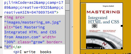
I decided to apply the transition to a couple of book images. I added class="grow" to the images, so I could target them easily for the transition.

Also note, while you’re looking at the code for the image, that it is set at a width of 30%. My goal is to change that width with my transition rule.

class selectro

2. Add a new Transition and Target a Rule

In the CSS Transitions panel, I clicked the familiar plus sign to add a new transition. A dialog window opened. I’ll go through it in steps.

target rule

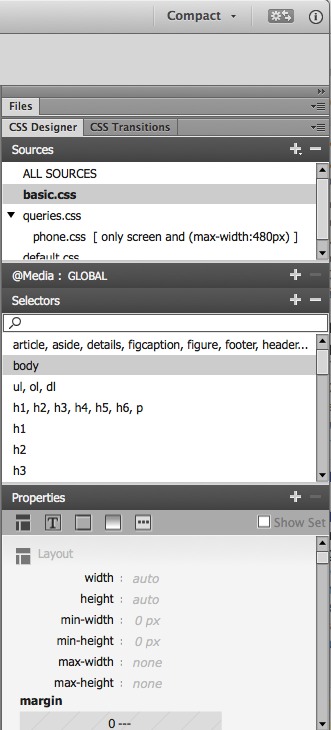
First, pick the target rule. Every rule you have in your style sheet is shown in alphabetical order. Like any other field in Dreamweaver, you can type directly in the field if you want instead of looking through your list of styles. I selected the .grow rule to target.
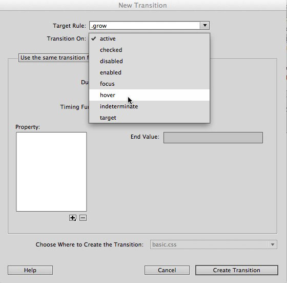
3. Transition On

The next choice is to decide when you want the transition to happen. You can see the options in the image. I picked on hover.
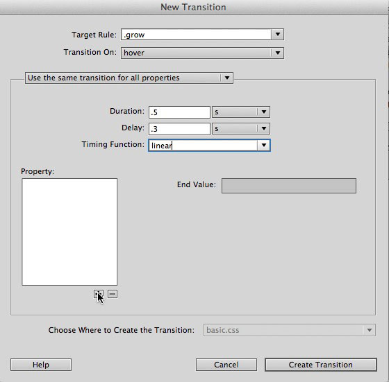
hover

4. Pick the timing

You can use the same transition for all properties, as I have here. You can also set different transitions for different properties if you want to have more than one transition happening in the same event.

You set the duration and delay in either seconds or milliseconds. The timing function offers ease-in, ease-out and others as well as the one I picked, linear.

duration and timing

5. Pick a property to transition

Click the plus in the Property area. As I mentioned, my goal is to change the width of the image during the transition, so I picked the property width. I set the end value to 40%.

Finally, I picked the stylesheet where I wanted it saved, and clicked Save Transition.

width

And You’re Done

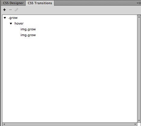
That’s the transition. It’s now shown in my CSS Transitions pane. I can edit it at any time by double clicking the transition.

transitions list

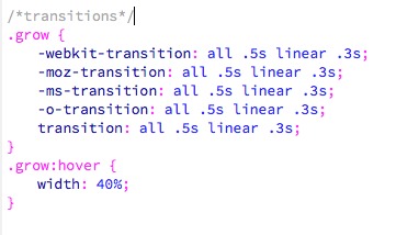
This was added to my stylesheet. The necessary vendor prefixes are included.

css rule

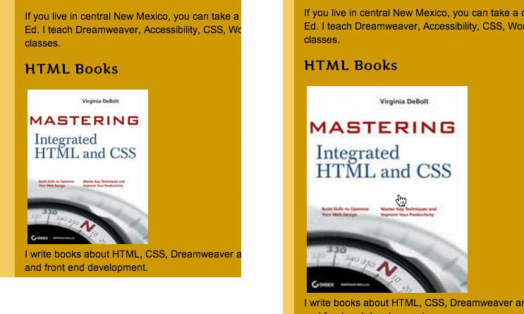
In a browser, you see the normal display to the left, and what happens on hover to the right in this composite image.

results

You’re now ready to make transitions happen in Dreamweaver Creative Cloud.

See Also: Dreamweaver and CSS in Creative Cloud

Dreamweaver and CSS in Creative Cloud

The Dreamweaver wizard that Macromedia came up with way back in the dark ages to create CSS rules stayed with us and served us well for a long time. Because of all the CSS 3 properties that have come along since then that weren’t anywhere in the wizard, things were due for a change.

In Dreamweaver CC, we see the change. It looks really different, but you’ll get the hang of it quickly.

Choose Your View: Compact or Expanded

The panels are where the action is now, not in a pop-up dialog box (the well-known wizard). You can view the CSS tools with the panels in either compact or expanded view. Here’s compact.

DW CSS panels

Start from the very top menu bar, you see the pull down menu to choose compact or expanded.

In the panels area, you see I’ve collapsed the Files panel. Immediately under that you see two CSS main panels, CSS Designer and CSS Transitions. With the CSS Designer panel active, under it you see the list of style sheets in my particular example. There’s a panel for adding @media queries (collapsed in this image) to your stylesheets, just in case you didn’t start your project by creating layouts for various media sizes from the outset. There’s a Selectors panel which looks quite familiar, and a Properties panel which is very changed. We’ll look at the fine details about the Properties panel in just a bit.

First lets see the expanded view.

DW expanded view

In the expanded view, you have space to see a smidgen of the Files panel and a whole lot more of the crucial Properties panel. You can see that this particular example has a style sheet called basic.css selected, and within that a rule for body is highlighted.

It only takes a second to switch from Compact to Expanded view, but you’ll find it almost impossible to do anything useful to your CSS in Compact view, so that’s a good thing.

The Properties panel

At the top of the Properties panel, you see icons for the categories of CSS you will want to work with. The first category is layout. I’ve pasted two sections of this together into one long image, so you get an idea of what you would see if you scrolled down a bit in the layout category.

layout

You have a box model thumbnail for setting margins, padding, and positioning. Below that you set float, clear and more. You can set individual properties for margins and padding by typing any amount and unit you want, or you click the linky looking symbol in the center to set them all at once.

If you continue to scroll down, you come to the Text category, or you can click the Text icon at the top.

text

Below what you see here for text, you also have a text-transform, letter spacing, alignment  and other text choices.

border

Border is the next category. Scroll below what you see here and there’s a border-radius area with a nice thumbnail representation of your choices for each corner.

background

Background is the next category. The box-shadow options will show in the next image.

other

The last category is Others, which includes list options.

On the right of the Properties panel title bar, you see a box called “Show Set.” If you select that, you see only the properties that have been assigned a value.

Nothing looks the same, but it only takes a second to grasp what the new symbols represent.

float and clear

Look at the icons for float and clear, for example. You click the icons to set up float:left, float:right or float:none. With clear, you click the icons for clear:left, clear:right, clear:both, or clear:none. It’s different looking, but what you’re doing is pretty obvious once you figure out how the interface is organized now.

After you’ve worked on your CSS, change the view back to Compact while you’re working in the Document window so you have more space on your screen.

See Also: Creating Transitions in Dreamweaver CC.

The Whys and Hows of Two-Step Verification

Untitled

I spent the weekend in Chicago at BlogHer13. One of my jobs there was to do a couple of sessions in the Geek Bar on two-step verification. While I have the information at my fingertips, here are the whys and hows of two-step verification

Why

Why is every big company bringing in the opportunity for users to sign up for two-step verification? Horror stories of hacked accounts, mostly. All these companies have made it possible for you to use two-step verification.

  • Google
  • LinkedIn
  • Facebook
  • Twitter
  • WordPress
  • Evernote
  • Apple
  • Dropbox

Two-step verification adds a layer of security to your account and makes it harder for your account to be hacked.

Once your account has been breached, it can be used to broadcast spam or malicious links. Your password can be changed. Your information can be changed or removed (and there’s no way to get it back). If it is a Twitter or Facebook password that someone has figured out then all the sites that you sign into using Twitter and Facebook have been compromised as well.

How

You still need a strong password, even if you opt in to two-step verification. Remember that.

If you use two-step verification, here’s how you do it.

  • Sign in to your account on Facebook or Gmail or whatever service you are using. Find the settings in your profile.
  • Sign up for two-step verification and provide your mobile phone number
  • Now, when you go to the site and enter your password to sign in, you may be required to enter a second access code, which is sent to your mobile phone

On Facebook, for example, enable ‘Login Approvals’ from the ‘Account Security’ section of the account settings page

facebook opt in

On Twitter, visit your account settings page. Make sure you have provided a phone number. Check the “Require a verification code when I sign in” box

twitter opt in

Unless a hacker has your phone in his hand, he may have guessed your password, but he won’t have the code that gets sent to your mobile phone.

It depends on which company you are using whether you are asked to enter the second code every time you sign in. If you are signing in from a recognized device, you may not be asked for the second code.

2 Ways to Get a PDF onto an iPad

I wanted to save a PowerPoint presentation I had prepared as a PDF and transfer that PDF to my iPad. If I could make that happen, I could travel for a presentation without having to drag my computer along.

I emailed it to myself and opened it with my Xfinity email app. There was no way to do anything with it there except print. The problem was with Xfinity. Downloading from Gmail seems to present similar problems.

I found two ways that worked.

  1. I put it on Dropbox and could open the PDF file with my iPad from there. This was super easy, but if you don’t have a Dropbox account all is not lost.
  2. I mailed it to my Mac Mail account. There were several options for saving it from the Mac Mail app.

Mac Mail Tips

In Mac Mail I could tap and hold the icon for the PDF file and a menu opened up with several options. The options you see here are reflections of what I have installed on my iPad. You would have at least iBooks in your options. Note that the document was attached in the body of the email.

Mac Mail Options

I chose to open the file in iBooks. To find it in iBooks, I had to click the collections button so I could choose between books and PDF files.

the collections menu

Now I can give a presentation with my iPad in hand and leave the computer at home. That’s a relief.

Style Sheets for Blogs: What’s the Purpose?

February 2, 2011

If you’re a seasoned blogger, you know about your style sheet and what it’s doing for your blog. But if you’re new at the game, you may not be sure what that style sheet does for you. This post deals with blog style sheets and WYSIWYG tools and how to keep them separate.

When you choose a style (or theme or template) for your blog, you get a set of style rules that determine appearance. Those rules are stored away from your blog posts and live in a document all their own. That’s where you want the style rules to be. Away from your blog post.

The style sheet sets up layout, colors, fonts and a lot more. With all that taken care of, all a blogger has to do is open up a new post window and start to type. You type your post,  publish it and you’re done. The style sheet makes it look nice in your published blog. All is right with the world.

Most blogs also have WYSIWYG (what you see is what you get) toolbars. Some you need to use to do formatting of text as headings or paragraphs or lists. Others let you change appearance. By changing appearance I mean you change the way something displays, but not the actual content. Maybe you want to change something from black to red. Just once. You can do that with the WYSIWYG toolbar provided above the post entry box. But it’s not a good idea to use those WYSIWYG appearance changing tools.

What happens when you do change a color or alignment as you are writing a post? Your blog software writes new appearance rules right in the blog post. These new rules override the appearance rules in your style sheet. Before you had appearance rules off in the style sheet where they belong. Now you have appearance rules in the blog post – not where they belong.

Why don’t you want style rules in the blog post?

Anything in your content – your blog post – can get picked up to use elsewhere. You want that to be your text and images: the headings, the paragraphs, the lists, the images. Your content.

You don’t want the blog post to contain style rules that could be carried over into unexpected places where they might not work such as mobile devices or other blogs that might quote your content. Appearance rules in those places could have unwanted effects.

Best Practice

The best practice is to choose a look you like as a template or theme and then leave it alone. Don’t use the provided toolbar to change fonts or colors or layout as you type your content into your blog. Use the tools to create headings and lists and blockquotes – that formats content into meaningful page elements – that’s okay. But font size or alignment or color choices are not meaningful. Instead, they deal with appearance. That’s not okay.

5 Great Web Teacher Tips

flames

If you read Web Teacher posts via an RSS feed, you may forget that there is a page on the blog where I track a list of most of the posts I categorize as Web Teacher Tips. Here are 5 of the best ones brought back to your attention.

The Flap Over Flat Design

Lately I’ve been seeing many articles talking about flat design. It was not totally clear from the articles what flat design was. It wasn’t clear why we needed to talk about it as the latest hot thing. So I did a little research. Here’s what I learned.

Most articles talk about flat design as opposed to skeuomorphic design. Skeuomorphism is an attempt to give web page elements qualities they might have in real life. For example, a button might have a drop shadow so it looks like a real-life button. Think Apple design elements with drop shadows, gradients, rounded corners. You can see an example in this calculator keyboard from Apple.

Apple calculator

On the other hand, flat design gets rid of those beveled edges, gradients, shadows, and reflections. The look of Windows 8 is a good example of flat design.

Windows 8

I don’t want to paint this design discussion as a Mac vs. Windows thing. Web sites are using what they are identifying as flat design. Google+ uses it. There’s even one of those showcase design sites where you can look at the latest in flat designs. It’s called – what else – Flat Design.

On the Usabilla blog, they wrote Flat Design: Trend or Revolution? They argue there that flat designs are honest, quick, usable, and scalable. I don’t see any evidence that flat design is more honest, quick, usable and scalable than any other kind of design, but that’s their checklist. In the end, however, Usabilla does not come out and boldly say that flat design is better or more usable.

Reading and researching this topic has been interesting in terms of trying to parse out the facts from the slant and bias. For example, Gizmodo describes skeuomorphism as overwrought trickery while describing flat design as modern and simple.

The article that got me started reading on the topic of flat design is The Interview about flat design that wasn’t cool enough for the media by Michael Flarup. It’s an interview he did for Wired that never made it into the magazine so he published it himself. He, very sensibly in my opinion, says that the debate about flat vs. skeu is a false one.

I think I speak for a sizable amount of the design community when I say that we’re all a bit tired of this debate. One isn’t better than the other, no more than a hammer is better than a screwdriver. A flat minimalistic design, and a rich ‘themed’ design are both tools in a designers toolbox. They are different approaches and they each come with their own pros and cons. Both can work fantastically in the right context.

To me, describing the two styles as 3-D and 2-D makes more sense than using terms like skeuomorphism and flat. But such basic terminology might not generate as much discussion.

What did I learn from this little research project? I learned about the 2 dimensional flat design trend (I’ll label it a trend, even though Usabilla wouldn’t). I understand what the term means now.

Did I learn anything about what makes good design, or the best type of design? No. Flat design is just another type of design. Use it if it makes sense for you. But don’t think you have to because there are 631,000,000 mentions about it on Google.