Should Your Blog Use Responsive Web Design?

Two trends converged during 2011. One from the world of Internet connected devices and the other from web site design world. Statistics show that more people are connected to the Internet through some sort of mobile device than through a desktop or laptop computer. Web designers are scrambling to make sure that web pages are going to work on all those devices – phones, tablets, and computers.
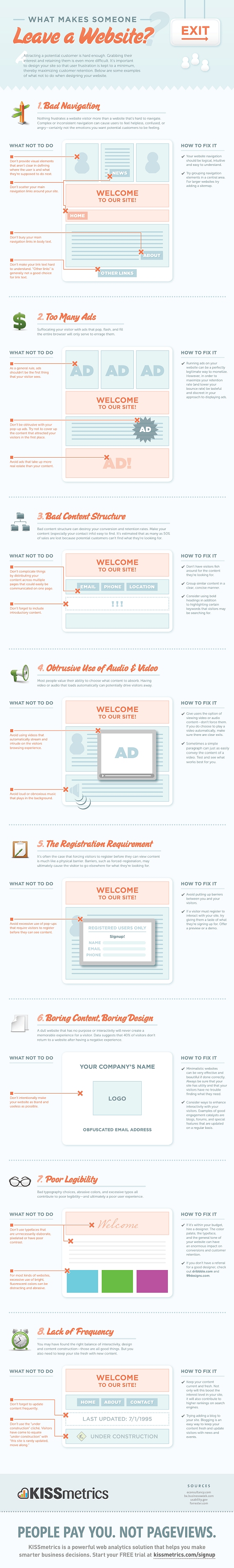
spark box responsive design
Image: Spark Box

The direction web designers are heading in this quest for universal access is called responsive web design.

Responsive web design is a way of organizing information and page layout so that a web page responds in an appropriate way to the device on which it’s viewed. On a large screen, the page might have two or three columns. On a tablet sized device it might have two columns. On a phone, it might have one column with simplified navigation. The images and the font sizes might be adjusted to fit the size of the device, too.

Want to see some examples of working sites that use it? Mediaqueri.es has a lot of examples. You can click through to look directly at each of the examples, such as the one at Spark Box. On Mediaqueri.es, the examples are shown in four sizes so you can see how each design looks at different widths like this example, The Boston Globe.

boston globe responsive design


It’s the same content in every case, it simply responds to the device with a different presentation of that content. Even if you only know a little about web design, you probably know that content and presentation are code words for HTML (the content) and CSS (the presentation).

Stay with me here on the content and the presentation. The HTML stays the same for every device. (Of course, the HTML you start with must be thought through so that your content can be laid out effectively for different devices. See Fluid Grids for more detail.) Add to that a few CSS rules aimed specifically at different types of devices. These CSS rules are called media queries.

Media Queries

Here are the rough basics of media queries.

In a media query, you specify a media type – screen, for example. Then you set up a feature for that particular form of media – width or color, for example. Check my fact sheet for a list of all the features (like screen) and resolution sizes for which you can write CSS rules.

You can put media rules in a separate style sheet for each device. If you do it that way, the link to the separate stylesheet looks like this:

<link rel="stylesheet" media="screen and (max-device-width: 480px" href="example.css">

In that linked stylesheet, you write rules that determine the display for any screen device with a maximum width of 480px, the width of an iPhone in landscape mode.

You can incorporate media queries into your existing stylesheet with @media rules. If you do it that way, you add this to your stylesheet.

@media screen and (max-device-width: 480px) {rules here}

At this point, all you have is the media query. You don’t have the style rule changes to make the design respond for various media features. Let’s say that your blog, at its computer screen width, has two columns. One floated left called “main” at 66% of the width and one floated right called “sidebar” that is 33% of the width. Here’s how you would turn off that layout for devices with a maximum width of 480 px.

@media screen and (max-device-width: 480px) {
#main {
float: none;
width: 100%;
}
#sidebar {
float: none;
width: 100%;
}
}

Now the two columns will line up one under the other, and look like what you see in the left-most image from the Boston Globe example above.

There’s a lot more to it, but that’s really all it involves: tweaking the CSS for various devices. For more in depth information you can check out the following.

Are there Blog Themes for Responsive Designs?

Yes, there certainly are. wplift has a list of both free and paid WordPress themes you can look through. Here are the Premium Themes. If you use the Genesis theme popularized by CopyBlogger at Studio Press, responsive designs are available for you. Search for responsive designs for your particular blog platform and you’ll probably find several choices.

Should You Rush Out and Get Responsive?

Well, that depends. You should investigate your audience and the sizes of devices that are using your site. Is your site one that people are reading at their leisure on a big screen, or one they are doing something with while on the run?

A while back, I wrote about some Useful WordPress Plugins for Your Blog. One in particular, WPTouch, made your WordPress blog more mobile friendly. I have that one working on my own blog now and don’t feel in a big hurry to choose a responsive theme yet because of it. You may feel pretty well covered in the mobile department in the same way I do.

On the other hand, I know the trend toward mobile is only going to grow. The need for web sites to look good and work easily on mobile devices is going to grow along with that trend. While there’s no rush, but there is the need to think about responsive design, learn about it, and choose a time to adapt to the idea of mobile design as an important consideration for your blog.

Have you Already Gone Responsive Design?

Do you have a blog that has already taken this design route? Please share.

Note: Originally written for BlogHer and cross-posted there.

Want To Land That Design Job? Top Three Things That Get You Hired After The Interview

Pick Me

You want to stand out right? You want them to notice you and hire you over the last three people that just walked in the door. As a designer working for a small firm myself, I’ve interviewed lots of people. Here are a few ways people have stood out to me over the years.

They Bring Samples of Their Work

Seems like a no brainer right? Think of how much you would stand out from the crowd if you brought in a visual sample or even a printed portfolio with you to the interview. Chances are you competition is just going to show up and direct the interviewer to some links of their work. In most cases, this is a fine approach, but when the competition is fierce, bringing a portfolio or a few samples along with you to the interview not only shows proof of experience, it also demonstrates passion and a level of engagement that most prospective employees lack.

They Show An Interest In The Company

Think about how much time you put into an application? If the answer is “not much”, you can kiss your chances goodbye. The reason for this is because there is someone out there, about to get an interview, that has done their research on the company, shows an interest in what the company does, and crafts an application tailored directly to the company and job description.  I have seen applications, where a web designer will create a web page just for the application. Displaying a beautiful, well-crafted visual and well written friendly approach as well as linked to a page where there was clean, well-written code displayed will give you a head-up on the competition right from the get go. Amazing! The old adage “show, don’t tell”, is definitely relevant when applying for a design job. You may think that sounds like a lot of work, well, it is. How much are you willing to give in order to get what you want? Well if you really want this specific job you’re applying for then don’t be afraid to go the extra mile and show them that you have what it takes and you really want this job!

They Follow-Up

There is nothing worse than a person that doesn’t show appreciation for other people’s time. I always follow up any meeting with a quick “thank you” note especially after a client meeting. I would want my prospective employees to do the same. I like to send a hand written thank you note as that will always stand out from the numerous “thank you” emails I receive, but if you can’t find the time for that just a friendly follow-up email will do the trick. Something that emphasizes your enthusiasm for the company, the position and thanks the employer for meeting with them is a good start.

Hopefully these tips will give you a good advantage over the competition and land you the job. It never hurts to look the part while you’re at it.

Guest Author Kimberly Clark is a Content Strategist who enjoys helping clients navigate through web design in Louisville and beyond.  From planning to ongoing content strategies, she has a deep understanding of the tools of the trade like social media and SEO. Kimberly is also a data fiend and uses it to develop unique, original and interesting web content that keeps visitors engaged and interacting. She blogs at: VIAStudio Elements.

Useful links: Adaptive Design, nested figures, Susan Kare

Nice article on Opera Dev by Chris Mills about Adaptive Design with media queries.

Nested Figure Elements on Paciello Blog.

The Sketchbook of Susan Kare: The Artist Who Gave Computing a Human Face. Did you know about Susan Kare? I’d never heard of her before. I certainly think a mention of her contribution to the GUI needs to be included in Introductory courses on history of the Internet and history of computing.

Review: Designing for Emotion


Designing for Emotion, written by Aarron Walter, is another of the brief but valuable books from A Book Apart. If you’ve read other books from A Book Apart you know they are high quality work from knowledgeable writers. This one is no exception.

With only 7 chapters and less than 100 pages to tell his tale, writer Aarron Walter gets right to it in a hurry. He explains what emotional design is and how it uses personality, humor, and positive experiences to meet human needs on web sites. Walter infuses the book with personality, humor and positive experiences, too, making it a delight to read. For example,

There’s a very practical reason that emotion and memory are so closely coupled—it keeps us alive. We would be doomed to repeat negative experiences and wouldn’t be able to consciously repeat positive experiences if we had no memory of them. Imagine eating a delicious four-pound log of bacon and not having the sense to eat another the following day. That’s a life not worth living, my friend.

That wasn’t the only remark in the book that made me smile. Walter does practice what he preaches.

He gives examples for each point he makes, giving the reader some real world examples to examine. In the chapter explaining what emotion design is, he points to Wufoo and Betabrand.

In the chapter on designing for humans, he talks about psychological principles that guide the emotional language and imagery web designers might employ. For example, “baby-face-bias”. Baby-face-bias triggers positive emotions with characters with large eyes, small nose and a pronounced forehead. It’s behind the successful imagery used by Brizzly, Twitter, StickyBits, and Walter’s own work at MailChimp. This chapter also talks about the use of contrast and aesthetics.

There’s a chapter on personality. Creating a website with personality gives users a sense of human-to-human interaction. He talks about personas and provides a detailed downloadable worksheet to help you create a design persona for your website. Online examples include Carbonmade and Housing Works.

In the chapter on emotional engagement, Walter talks about surprise, delight, anticipation, and priming. Examples in this chapter include Photojojo and the New Twitter. He discusses the idea of variable rewards from sites like Groupon, but I think the uncertainty of what will come next from the new app Siri on the iPhone 4S—which came out after this book was written—is a terrific example of baked in emotional engagement, surprise, delight and anticipation.

The next chapter is overcoming obstacles. This chapter deals with convincing users to click, sign up, complete the process and keep coming back. He discusses game theory, bribery and a sense of achievement. Mint and Dropbox are the examples described.

In the chapter called Forgiveness, Walter talks about what to do when you screw up, and how to help people overlook your shortcomings. Flickr is the example he uses in this chapter.

The final chapter is about risks and rewards. It talks about the risks of getting started with emotional design, and the rewards. CoffeeCup Software is cited as an example of how to start small with a limited time idea to see if it works. He describes the risk of starting a new site with emotional design in mind from the beginning. Designers can alienate users instead of making them feel good about a site with emotional design. Walter discusses some of those risks. He borrows the phrase progressive enhancement for those who want to work some personality into existing websites. The online example cites Blue Sky Resumes.

Finally, there is a list of resources for those who want to dig into the concepts from this book in more detail. The resources are genrally books about design principles, science, psychology, behavior, the human brain and user experience, but there are some online resources, too.

Summary: Brief but packed with useful concepts and concrete examples.

A review by Virginia DeBolt of Designing for Emotion (rating: 5 stars)

Useful Links: Handy, Google+, Captioning, usability tests, CSS3 Please

One Page Apps I Actually Use from CSS Tricks has several very helpful links for designers. You may want to keep them handy.

I haven’t received an invite to Google+ yet, but I’m looking at other people’s reports on it. It’s so similar to Facebook, even though people are comparing it with Google WAVE. If you move your life to Google+, are you quitting Facebook? More importantly, are people like me – who’s job partly entails promoting stuff by social media – now going to have to add Google+ to the mix? Like Facebook, is Google+ going to be one of those things you can’t avoid just because everyone else is using it?

How to Start Adding Captions/Subtitles to Online Video. Just one article from a captioning site by Bill Creswell that is full of captioning help.

Very interesting run through some usability tests on TED.com by IntuitionHQ. TED.com makes a pretty decent score at the end of it all.

CSS3 Please is a really nice tool to generate cross-browser CSS3 rules to copy into your own stylesheets.

Useful Links: Games for Change, Jet Blue, HTML5 Template, Urban Outfitters

Find out about the Games for Change event this June.

Getting the jetBlues. Derek Featherstone explains why Jet Blue is being sued for having an inaccessible web site.

A basic HTML5 Template shows you the skeleton of an HTML5  page.

Re the Urban Outfitters copying designs and the power of social media: