On March 27 I’ll be leading an online seminar for ADA Online Learning. The topic is Introduction to ARIA.
If you’d like to join the seminar, information about the schedule, registration and more is located at the ADA Online site. It’s free and registration is easy.
The seminar will focus mainly on ARIA landmark roles and will help the people attending see how to use landmark roles in their work. It will include an explanation of how to add landmark roles to WordPress themes that don’t have them built in.
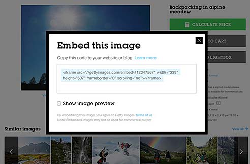
Getty Images announced a new embed feature that gives free, legal access to many images to bloggers for noncommercial use.
If you find an image on the Getty site, look for an embed icon(</>) from the search results or image detail page. Click that and you’ll get the HTML code to embed that image on your site.
Getty has images from news, entertainment, sports, archival and creative imagery content. This new embed tool takes the rights of its content contributors and partners into account, because images will include photographer attribution and, when clicked, will link back to gettyimages.com where the image can be licensed for commercial use.
For a look at the dark side of what this means in terms of advertising and to photographers, see Getty did what?
After building about 20 layouts, redoing a couple of sites, and starting and rejecting an uncounted number of Dreamweaver CC grid system attempts, I’m here to describe some of my issues with this tool.
Control Issues
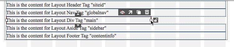
Elements inserted into the fluid grid have controls that appear when the element is selected. In the image below, the div “main” is selected. (Dreamweaver CC does not have a “main” element in the Insert panel yet.) A few controls are shown that can affect the element selected.
Control icons for the element selected will move it up or down, hide it, move it up a row, duplicate it, or trash it.
Other controls for elements include the set zero margin.
The set zero margin control must be used so that all the list items in the nav will fit in the assigned space.
The controls are lovely – when they appear. Sometimes they just disappear. I had to toss out layouts or parts of layouts and go back to step 1 a number of times because the controls just were not there!
The controls are touchy. Just putting the cursor near the duplicate control – without even clicking on the icon – can duplicate something.
Tutorial Issues
One of the biggest problems I had with using the grid layout system was that the tutorials and videos on the Adobe site are often not applicable to the latest versions of CC. For example, the online tutorials from Adobe suggest that a nav element inserted in the smart phone sized grid will automatically adjust itself to a touch screen type drop down menu instead of a horizontal list display. This does not happen.
Nesting Issues
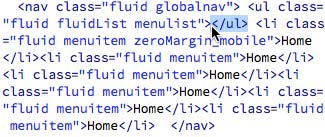
Several times I had a mysteriously misplaced closing </ul> tag on the nav list.
The mysteriously misplaced closing ul tag
Maybe this was my own fault for inserting the list items incorrectly, but I was very careful about getting my cursor positioned in the right place before inserting anything. You have to be very careful because placing the cursor in the right spot is extremely difficult. It’s hard to move out of an inserted item and stay within the container grid. In spite of all my careful checking to be sure I was inserting things where I wanted them, I still ended up with closing </ul> tags in places where they didn’t belong.
I also had problems with the closing </nav> tag being in the wrong place.
Seeing Double
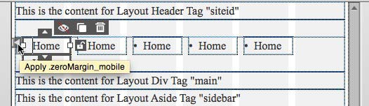
Now, the way I think the controls are supposed to work is that you apply them and they change to indicate what you’ve done. If you move something up a row, the control changes to move it down a row. If you apply a zero margin, the option to apply it should go away. (A control to remove the zero margin choice does not appear, by the way.)
In the image below, you can see that Dreamweaver suggests that I can apply the zero margin rule to a list item that clearly already has the class applied.
The control to zero the margin is there, even though it’s already been applied
Styling Issues
One of the tutorials I watched suggested keeping the styles and media queries created for the layout in a separate stylesheet from the CSS you write to give your layout a particular appearance, color scheme, fonts, etc. I followed that advice, but found a few strange issues.
I found that doing something like inserting a 1 pixel border on an element can throw off the whole grid and destroy the layout.
Just Annoying
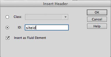
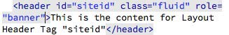
You must assign either an ID or a class to every item you put in the grid layout.
You must use an ID or class for everything you insert
Even if you know that you only want one header or footer or nav on your page, you still cannot insert one into the grid layout system without giving it either an ID or a class assignment.
What I Want
I wish Adobe would do something to make the grid layout system easier to use. Expanding the outline of the container grid to make locating the cursor less exacting would be a help. The disappearing control icons seems to be a bug – I hope Adobe is working on it.
The control operation should require more of a click – a definite click – instead of being triggered by a roll over or some other accidental touch that generates an action.
It would be nice if videos and tutorials were more in your face about which version of Dreamweaver’s grid system the tutorial describes. It’s hard to know what to do when a video tells you something is going to happen and it just plain doesn’t happen.
If there is an Adobe person reading this who can tell me where to find answers to these issues, which tutorial is up to date, or anything else useful about using Dreamweaver CC’s layout grids – help a teacher out, please. Otherwise, when I teach this, my students are going to get an earful about how buggy it is instead of how wonderful it is.
Something Good
Here’s one good thing. It’s really easy to type in ARIA roles as you add layout elements to a page. It has nothing to do with the grid layouts, but I wanted to end on a positive note.
Happy Thought: It’s easy to insert ARIA roles in code view.
Behance is an enormous online professional network, connecting some of the best creative minds in the design community. As a result, it is a platform upon which you can promote yourself as a web designer. Upon creating a profile you can post your work and interact with other designers in order to boost your online presence and communicate with prospective clients. If you possess a competent portfolio with skilled work, you can attract a great deal of publicity and status for your personal business enterprise using Behance.
Although Behance is a members only website, anyone can request an invitation to join. All you have to do is complete an online form with an email address and description of your web design work in order to acquire free membership.
Creating a professional and polished Behance profile is fundamental to successfully promoting yourself and your work.Your profile presents your background information such as profile photo, name, website, designer bio and location, as well as a detailed portfolio of your web design work to date.
In order to promote yourself more effectively, you can visually personalize your profile to make it appealing to visitors. Moreover, you can expand your profile to incorporate the various creative fields within which you work such as web design and development, the type of work for which you are available, your professional level and any relevant qualifications which you may have. Additionally, you can designate search tags to your work or provide links to any sites which feature your work, as well as incorporating references and recommendations from previous clients.
Utilising Behance, you have a wealth of options at your disposal through which to publicise your current work. These options include the ability to select project details such as the type of work and media in with you are proficient. This wealth and depth of information efficiently promotes your capabilities as a web designer to any visitors who view your profile. Visitors are able to scrutinise your profile, familiarising themselves with you and your work before contacting you. You can also authorize visitors to comment on your work, which will help you to learn the specific designs which are favoured by clients and what you can improve upon in order to gain further employment.
As well as customising your site with regards to visual and informational depth, Behance enables you to specify the copyright information, project ownership and relevant tools you used in your web design projects. You can also save projects to be published at a later date, thus granting you complete creative authority over the promotion of your profile, permitting you to specialise your profile to appeal to your target market.
Upon publishing a project to your Behance profile, you can promote it further by linking it to your various social networking accounts. Behance is an immensely trafficked site, exponentially elevating your online exposure to prospective clients and employers. Digital marketing agencies including Realia and Cuckoo Design recommend networking your social profiles extensively.
Furthermore, Behance allows you exclusive access to creating public or private groups with other Behance members. Within these groups you can promote your web design services to individuals with similar mindsets and interests. This provides a lucrative opportunity for project feedback, discussions regarding new technologies and designs, as well as transferring crucial career advice and references. Moreover, if your work is currently for sale, you can link your Behance profile to an existing online store or establish an eCommerce feature within the Behance Network.
Ultimately, Behance provides you exclusive access to a vast online network of prospective clients, employers, and potential colleagues. If you exercise precision and accuracy to the development and promotion of your profile, Behance can provide a springboard upon which you can launch a lucrative and sustainable web design business.
Guest author Bradley Taylor is a freelance writer from Derby, England. He is a motoring enthusiast who loves writing about cars and everything automotive but is versatile and also writes across a variety of other topics. You can connect with Bradley on Google+ and get his updates on Twitter.
Prior to reading this book, I would have told you I wasn’t a designer. My designs were super simple, even plain. There were no cute little graphics all over the place, no lush backgrounds or images, no clever metaphors. If you’re reading this on my blog, you’re looking at what I think is a good design right now. Plain, white background with black text, clear in purpose and easy to read and navigate.
Turns out that Eric Karjalouto considers my choices to be design choices. He says design isn’t about how decorated or beautiful something is, but instead is about how something does what it is meant to do. In terms of a web design, that means communicate.
It takes Karjaluoto about 10 seconds to debunk the myth that design is about visual beauty and a number of other commonly held beliefs about design. He says it’s about making things. He calls it a problem solving process that helps facilitate desired outcomes.
The book describes his problem solving process and is a practical outline of the step by step work needed to discover what outcome a design is meant to produce and then discover a way to make that happen. In that sense, his design method gives you a map that will help you create a design process that works and help you run a successful design business. There are checklists, systems thinking and steps, and details about everything from using his design method for discovery, planning, creating, and applying ideas. He also helps with ideas on how to present designs to clients.
The book would be particularly helpful to designers who are struggling to build a business that makes money. It gives steps, processes, client interview techniques, testing techniques, and all kinds of ideas that a firm can use to build designs that work, and therefore a company that works.
A review by Virginia DeBolt of The Design Method (rating: 5 stars)
Summary: Practical not precious. Advice for getting things done.
Disclosure: I received a free copy of this book from the publisher for this review. Opinions are my own. Links to Amazon are affiliate links. Here is my review policy.
Facebook added the ability to set your gender outside the binary male/female choices just in time for Valentine’s Day. Now you can define yourself with a choice more reflective of who you really are if the binary choices don’t cover it.
Here’s how to update your gender settings.
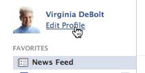
1. Choose Edit Profile. If you’re on the page with your News Feed, it’s under your name at the upper left.
Choose edit profile
2. Scroll down to the Basic Information Section and click Edit.
Edit Basic Information
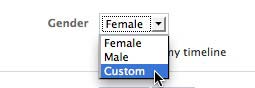
3. You’ll see a gender option. Use the pull down menu to select “Custom.”
Select Custom
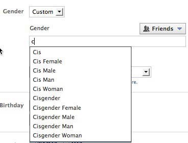
4. Start typing in the input field. After you type the first letter, Facebook populates the list with options based on your first letter. I typed a “c” thinking that I would like to identify as “crone.”
The “C” options
As you can see, crone isn’t an option. I tried typing it in and saving, but got an error message. It will only let you choose one of the options offered. (There are about 65 choices in all.)
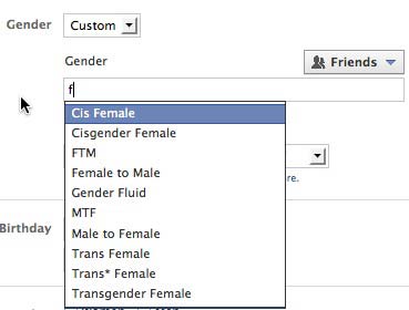
I typed a “f” in the box. Here are the options offered. As you can see, choices included options with “f” in many places, not just as the first letter.
The “f” options
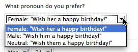
5. Pick a pronoun. If you choose a custom gender definition, you have a chance to choose your pronoun.
Choose a pronoun
The pronoun choices are limited and don’t offer some common choices that people who don’t fit the binary prefer. Maybe Facebook will add to the pronoun options later. They need to do that.