The Unicorn Institute

Leslie Jensen-Inman and Jared Spool

Have you noticed what Leslie Jensen-Inman and Jared Spool are doing at The Unicorn Institute? Anyone with an interest in web education should take a look at what they are doing and join them in their effort.

Here’s the goal.

We can create the next generation of UX professionals, also known as Unicorns, by connecting industry, education, and community.

Here’s a bit more about what they are doing.

We know UX design career pathways and education need a transformation. So we’ve set out on a research adventure to determine what skills UX designers need and what type of learning environment is best suited to practice and to apply those skills. Our goal: Find out everything we can to create the next generation of UX design unicorns.

You can sign up with them to stay informed and participate at the web site. They are looking for students, teachers, hiring managers, and “fellow adventurers” to join them.

Go look at what they are doing and consider helping out.

Review: Designing for Behavior Change

Designing for Behavior Change: Applying Psychology and Behavioral Economics by Stephen Wendel is from O’Reilly (2013). The book is aimed at app developers who want to make a product that will be used regularly and will cause people to change their daily habits and routines.

It’s full of ideas, examples, studies, and information to help you plan, design, test, and deploy an app that will help people make a change. The change might be to exercise more often, save money, or something else. Many examples in the book are from HelloWallet, where author Stephen Wendel works, but there are plenty of examples from other places as well.

The book takes you through the complete process of figuring out the goal for your app, clearly stating the behavior you want to achieve, and the process of creating, designing and testing to make sure you accomplish the goal. There is science to back up the author’s suggestions. There are examples to help you understand what kind of behavior change you can expect people to make using an app, and how to get them to use it long enough to make the desired changes by keeping the interface simple. It talks about designing, coding, about measuring impact, and about refining a product as you go along.

Footnotes and appendices are many if you want to get into the various studies and examples cited in the book, but there’s plenty of information here to get you going with just this source.

Each chapter is almost a text in itself, because the author repeats many of the core princples of what you need to keep in mind in every chapter. It’s repetitious, but it also reinforces the key points at every step along the way.

Summary: An excellent guide to designing apps to create behavior changes.

A review by Virginia DeBolt of Designing for Behavior Change: Applying Psychology and Behavioral Economics (rating: 5 stars)

Disclosure: I received a free copy of this book from the publisher for this review. Opinions are my own. Links to Amazon are affiliate links. Here is my review policy. You can buy the book from O’Reilly, as well as Amazon. The link to O’Reilly is not an affiliate link.

The State of Things and What it Means for Web Education

Connection

Several interesting things have come up in the last week or so that I think need to be connected.

Who’s Not Online?

Pew Internet did a study on Who’s Not Online and Why. They found that 15% of American adults do not use the internet at all, and another 9% of adults use the internet but not at home.

As to who those non-Internet users are, Pew found this:

Internet use remains strongly correlated with age, educational attainment, and household income. One of the strongest patterns in the data on internet use is by age group: 44% of Americans ages 65 and older do not use the internet, and these older Americans make up almost half (49%) of non-internet users overall.

That hardly seems like earth shaking news, but Pew reports it as if it is. As for why they are not using the Internet, there were many reasons given. 34% of non-users said they just weren’t interested and didn’t consider it relevant to their daily lives. 32% cited usability issues, learning issues, and worries about privacy or spam. 19% cited price, and 7% said it wasn’t available where they lived.

A similar report that was written about in The NY Times prompted this letter and post from disability lawyer Lainey Feingold about the digital divide and disability.

The Mobile-Born

Kobe drawing
After reading about the non-Internet using elderly and poor, I saw this TechCrunch post on The Rise of the Mobile Born. This post by Paul Holland talks about The Mobile Born, which he describes as,

A generation of kids that have been raised while literally gnawing on the equivalent of a supercomputer — otherwise known as mom’s smartphone.

Holland says that companies are embracing mobility and transforming their business practices and work arrangements through mobility. He predicts changes in office processes, organizational structures, consumer engagement and young people who have never known any kind of interaction other than that which we create on mobile devices.

What Does That Mean for Teaching Web Design

As a web educator, I look at trends like those reported above from Pew Internet and TechCrunch, and think about what all that means to me in the classroom.

At Smashing Magazine, Jen Kramer wrote about Teaching Web Design to New Students in Higher Education. I think it’s worth taking a look at her suggestions and how they will help us meet the changing world that surrounds us.
It's rough out there for a web designer.

Kramer first talks about the classes where students are taught to build a “comp.” An image from Photoshop or Fireworks that somehow will get translated into a web page. Her ideas on making this type of class more useful are excellent. She suggests:

  • Build a design in 12 evenly-sized columns.
    This is a great time to explain about grids and how they work. Have students build designs based on this grid to demonstrate their understanding.
  • Show versions of the design.
    If the design looks one way at 960 pixels, how does it look at 1200 pixels? 320? 767? Have students use the same content in their designs, rearranged for these different screen environments. Be sure to ask about transitions — what happens as the design moves from 767 to 320 pixels?
  • Ask questions about photos.
    What does that big photo banner stretching so beautifully across the top of the page at 960 pixels look like at 767 pixels? What happens between 960 and 767 pixels?
  • Encourage students to think about touch.
    This is particularly important at smaller screen dimensions, but desktops and laptops are trending towards touch as well. Encourage students to build navigation suitable for fat fingers, for example.
  • Deemphasize slicing.
    Rather than thinking about the comp as the source of imagery for a website, consider it its own prototype. Slicing may not be required at all, because images may need to be generated in several sizes for different screen dimensions. Even background graphics can be generated in their own independent documents. By deemphasizing slicing, you also deemphasize the centrality of this comp for the website’s design. With responsive design, the comp sets a goal or a direction, but tweaking is required to accomodate the space between 320, 767 and 960 pixels and beyond.

Kramer also has some great ideas about teaching HTML and CSS.

  • Standardize in one browser.
    I’d recommend working with Firefox or Chrome as the standard browser in class, because they’re available on Mac and PC and are the most standards-compliant. Tell students that this is the only browser that matters for the purpose of this class. Cross-browser issues should be dealt with later, once students understand how HTML and CSS work completely in this browser. When cross-browser problems are introduced too soon, students get confused, unclear whether a particular problem is due to the browser or just badly formed code.
  • Teach HTML5.
    Students should learn how to mark up documents with sections, asides, navigation, headers and footers from the start.
  • Teach CSS3 and all types of selectors.
    Make sure students understand media queries as soon as they are able to. Introduce adjacent sibling selectors, child selectors, universal selectors, various pseudo-classes and so forth. Again, worry less about browser support, because these students have years before graduation.
  • Incorporate grid-based thinking early on.
    Even if students can’t code their own grid yet, they could certainly build layouts while thinking about 12 columns, using em and/or percentage widths and sizes. Have students code standard shapes of pages, such as two- and three-column layouts, with or without headers, footers and horizontal navigation, rather than leaving students open to code any type of layout. Understanding the trade-offs between design and code is important, so always address those.
  • As soon as students grasp floats and positioning, teach how to code a grid.
    Because students have been thinking about Web design with grid-based principles, this transition should be fairly quick for them.
  • Responsive design is now a short lecture, not a long one.
    Students are now able to pull together grid-based layouts and media queries. They’ve likely encountered image-resizing issues along the way, but if not, this is the time to discuss them.
  • Now is the time to discuss browser compatibility.
    Now that students have mastered valid, standards-compliant, responsive code, it’s time to think about browser compatibility. One way to introduce this is to work with poorly supported HTML5 tags or CSS3 elements such as rounded corners.
  • CSS preprocessing is a hot topic.
    Centralizing CSS variables is a great idea and is bound to be a core CSS skill, required by employers, in the next year or two. (Some say it’s already here.) Some LESS and Sass concepts, such as centralized variables and logic, also offer a smooth transition to a course on JavaScript and jQuery, in which similar concepts would be important.
  • Covering responsive design frameworks is not a bad idea.
    If there’s time left in class, this is a great topic to explore. I’d recommend covering Bootstrap if you’ve taught LESS, or Foundation if you’ve taught Sass. Students will learn how to read someone else’s code (an important skill!) and how to read documentation; they will also learn new technology, as well as explore the positives and negatives of using a documented, open-source framework. Finally, they will learn to customize this code for their own purpose.

We all know that things are going to continue to condense, grow smaller and more mobile. Remember Moore’s Law? Just as we once relied on floated divs to create columns, and now we rely on grid systems with media queries to create responsive designs, there will be a future web design and development trend for even smaller and more mobile displays. Surely Google Glass is not as small as it’s going to get. Teaching students how to design for this future is challenging indeed.

I applaud Jen Kramer for her excellent teaching ideas. But I encourage you to keep thinking smaller and smaller, more mobile and wearable, and completely wireless as the direction web education must take.

10 New Photoshop Freebies

One of the greatest things about the field of graphic design is that so many talented professionals are willing to share their work with one another. This is especially true for Photoshop, arguably the most popular graphic design software on the planet. Photoshop freebies make it easy to improve your efficiency and productivity as a designer, thereby helping you make more money in less time. Here are 10 new Photoshop freebies you should add to your stable today.

1. Flaticon.com Photoshop Plugin

I think you’ll come to regard this as one of the best Photoshop plugins you ever install. The Flaticon.com Photoshop plugin gives you access to more than 14,000 free icons, searchable from right within Photoshop!

Flaticon

2. Retinize It

Retinize It is a Photoshop plugin that slices your designs to make them Retina-ready. Take advantage of the most advanced screen display technology by ensuring your websites and iOS apps are Retina-ready with this free plugin.

retinize

3. Camouflage Patterns for Photoshop

Go full camo with this set of 10 free camouflage patterns for Photoshop, created by user Tijo and posted on Brusheezy.

camo

4. Vanilla Cream UI Kit PSD

One of the most aesthetically pleasing UI kits on the web is available as a free PSD download! This UI kit includes elements for blogs, forms, filters, buttons and more.

vanilla

5. Color Swap and Monochrome Photoshop Actions

Michelle Kane continues to offer outstanding, premium-quality Photoshop freebies on her website. The color swap action lets you instantly and effortlessly change background colors, while the monochrome action gives your grayscales a professional finish.  Other Photoshop freebies are also available

michelle kane

6. Instagram Vintage Pro Photoshop Action

Give your images the vintage look Instagram users love with this action by DeviantArt user Friabrisa.

vintage pro

7. HDR Photoshop Action

This Photoshop freebie is a sample from the commercial Faux HDR Actions suite, and will give your photos a premium HDR photography appeal out-of-the-box.

free HDR

8. Fall Foliage Photoshop Brushes

From the Creature Comforts blog comes this set of 23 high-quality fall foliage Photoshop brushes that look absolutely beautiful when finished with a watercolor effect.

fall brushes

9. Photoshop Skin Smoothing Action

Fundy presents this free Photoshop skin smoothing action, available for instant download from their website. Soften your portrait subjects for beautiful glamor shots and more.

skin smoother

10. High-resolution Photoshop Watercolor Brushes

Digitally paint watercolor masterpieces with this set of 38 free watercolor brushes by Brusheezy contributor Sandy.

watercolor brushes

Guest Author Brian Morris writes for the PsPrint Design & Printing Blog. PsPrint is an online commercial printing company. Follow PsPrint on Twitter @PsPrint.

HTML5 Video in Dreamweaver CC

I saw a nice post at Overdigital called HTML5 Video Guide – All You Need to Know for 2014. It contains information about current codecs, streaming, mobiles and more.

As I was reading it, I realized I hadn’t looked at Dreamweaver CC to see how it handled the video element. Dreamweaver 5.5, which is what I had before CC, had no help at all with HTML5 video element insertion. You could do it in Code View, of course, but no WYSIWYG help.

But many things in Dreamweaver have changed in CC. I took a look.

There’s now an HTML5 Video command in the Insert menu. Once you have a placeholder for the video element on the document page, the Properties Panel gives you all the options you need to manage your video in Document View.

Dreamweaver property panel for video element

The Properties panel includes places to add alt sources in different codecs, specify the poster image, the Flash fallback file, fallback text and more.

I’m happy to see that Adobe has given Dreamweaver users such an easy tool for using HTML5 video. This can only help with the adoption of the video element across many sites.

Review: Lightbeam for Firefox

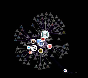
Lightbeam in graph view
LIghtbeam in graph view after 1 day

An email from Mozilla about Lightbeam for Firefox said,

We built Lightbeam to shine a spotlight on online data tracking to help people understand the Web. After you download and install the Lightbeam add-on to Firefox, it creates a real-time visualization of the websites you visit and all the third parties active on those sites. As you browse from site to site you can watch the visualization grow. You can also share your Lightbeam data with Mozilla and better inform a global dialog on the prevalence of tracking.

I’m not particularly interested in sharing my data with Mozilla – they probably know everything there is to know about me already without giving them more – but I was interested in seeing how this worked and what kind of privacy insights it offered.

The graph at the top of the post shows Lightbeam after being installed in Firefox for only one day. The circles are sites I visited, the triangles are “third party site” connected to the sites I visited. In one day after installing Lightbeam, I visited 11 sites and was connected to 117 third party sites.

On the graph view, if you hover over any one of the circles or triangles, you can see what it is. You can manipulate the display. For example, here is the graph with third party sites dimmed out.

Lightbeam with visited sites highlighted and third party sites dimmed
Lightbeam graph with visited sites highlighted and third party sites dimmed

Dragging (like on a Google map) will zoom in or out of the graph so you can look at the data in various closer or more meta ways. The controls under the display help you choose what you want to examine more closely.

LIghtbeam controls and filter options

The Cookies filter identifies when a site has stored some data in your browser. You can set site preferences and the graph will identify sites that are blocked or watched.

The data can be viewed as a clock (not shown) and as a list, which you can see here.

Lightbeam data displayed as a list

Next I visited this blog. Clicking on anything in the graph gives you more information. Here’s the graph with the little WT icon for Web Teacher selected. A sidebar opens with all kinds of data about the site.

Lightbeam information about Web Teacher

Some of the sites this blog is connected to are obvious from the content, ads and various sharing icons: youtube, gravatar, twitter, blogherads, addthis. Further down the list of 33 sites linking from Web Teacher, I found names I never heard of and didn’t know how they got there. I suspect they come from something related to the ads, but I really don’t know for sure. And this is my blog!

LIghtbeam is an eye-opener. It gives me the ability to block sites, but beyond that I don’t see many opportunities for actions to improve my privacy I can take using this addon. Am I missing something important Lightbeam offers me as an individual user? Is it just part of big data collection about me?