Have you thought about the gender choices on web forms?

I’ve never had a problem selecting the Female option on a form asking me whether I’m male or female. Never a pause for thought, never an unsure moment. Nothing in my long life ever prompted me to hesitate over the choice between male or female.

An easy choice is probably the case for most people.

But it’s not the case for everyone.

A year or so ago, I watched a presentation by maymay that opened my eyes to the fact that not every person on the planet is quite so confident when faced with a binary gender choice. (I wish I could find that presentation now, but I don’t see a link to it on maymay’s site or blog.) In that year, the problem caused for some by  limiting the gender choices to two options has been percolating in my brain.

A good bit of my thinking dealt with whether or not something about this should be taught to students of web design, in the same way that accessible form design is taught. I didn’t have any brilliant ideas about how to deal with the issue in terms of educating students about what might be a better practice, so I just let the thoughts rattle about in my head.

The fabulous Sarah Dopp does have some brilliant ideas about this. On  Dopp Juice she recently posted Designing a Better Drop Down Menu for Gender with four very good suggestions to replace the binary option of either male or female. The simplest is just stop making the gender option a required form field. Another simple suggestion from Sarah is to don’t even ask the question. She also suggests having a third option—something like “it’s complicated” or “decline to state.” Her fourth idea was a sliding scale.

A lot of people support the idea of having more than two options. A Facebook group petitioning Facebook to include more gender options has almost 19,000 members.

On Dopp Juice, there’s an earlier post that will help you understand the dilemma the gender form field presents to some people called Genders and Drop Down Menus. Another helpful post to clarify the problem for you is Beyond the Binary: Forms at this ain’t livin’.

I invite you to think about the issue of how we deal with gender identification in forms. Also, think about whether there a need to address this at an education level from the angle of best practices, accessibility, or human rights.
Useful Links: Accessibility, Valentine’s advice, Google Buzz

Tools for Conducting and Accessibility Review is an excellent summary by Angela Colter of the tools you should gather and use when doing an accessibility check. Read the comments, too, as some additional tools are mentioned by Jared Smith from WebAIM.

The couple who hold the record for the longest marriage are answering questions about romance on Twitter for Valentine’s Day. Married in 1924, Herbert and Zelmyra Fisher are willing to share their tips for keeping the romance alive from their Twitter account at @longestmarried. Send in a question, they’ll pick 14 questions to answer. Don’t ever assume anything about older people and what they can do with technology, you’ll probably be wrong. And by the way, it’s an insult to say something is so easy your mom or your grandmother could do it.

Okay. So what are you thinking about Google Buzz? Is it great or terrible? Will it make life easier or more exposed? Is combining all your information streams into one a good idea? Talk to me.

[polldaddy poll=”2685110″]

Blogger changes its FTP rules

The announcement on the Blogger Buzz blog had the mild mannered title “An Important Note to FTP Users.”

To the bloggers who use Blogger FTP for their blogs, the news was more of a bombshell.

I switched from Blogger by FTP to WordPress several years ago. I wanted tags and categories and stand alone pages, none of which were available from Blogger at that time. BlogCoach just announced that You Can Now Add Pages to Your Blogger Blog! That’s certainly good news and may cheer up some of the people who are having a problem deciding what to do since they can no longer run their Blogger blog by FTP.

Blogger suggests moving your blog to what they call a “custom domain.” They explain what this is in FTP vs. Custom Domains. A custom domain gives you a domain name of your own rather than a blogspot.com URL, even though the blog is run by Blogger and hosted on Google’s servers. To use a custom domain, you first register your domain name. Then, in your Blogger dashboard, go to Settings > Publishing and switch to Custom Domain publishing. Tell them your domain name and you’re set to publish there.

Blogger’s initial announcement of the change promised help in making the transition in the form of a migration tool that will walk you through the migration from a current URL to a Blogger managed URL. A Blogger managed URL can be either a custom domain or a blogspot.com blog. Blogger also set up a blog dedicated to just Blogger FTP Info to help with the transition.

Blogger Widgets wrote a tutorial about Blogger FTP to Custom Domain Migration that is helpful.

Cross posted in a different version at BlogHer.

Useful links: accessibility mistakes, WAVE in Dreamweaver, countdown to mobile, Gartner predictions, ePub for Web Designers

Common Accessibility Mistakes at Visual Twenty-Eight is a good checklist of things to make sure you aren’t doing.

WAVE Dreamweaver Extension is just out from WebAIM. It’s in beta, and there are some limitations at the moment. Now you can get a WAVE report on your page right in Dreamweaver. Super!

Gartner forecast

The road to 2013: A timeline for newspapers at RJI Mobile Blog talks about Gartner’s forecast that “By 2013, mobile phones will overtake PCs as the most common Web access device worldwide.” Donald Reynolds, the RJI Mobile blogger, says:

This is a killer deadline — within 35 months the whole newspaper industry needs to move its emphasis from the static Web to the mobile Web.  From 17-inch displays to 3-inch displays.  From full keyboard and mouse to one-handed navigation.  And you can’t really wait until the deal is done if you want to be a major player in technology.  If Gartner’s prediction is accurate, newspapers really have just 18-24 months to position themselves as the leading news content provider for mobile platforms.

I look at a statement like that and my educator background kicks in with questions like

  • Are we teaching web design students enough about making mobile-ready content?
  • Are there enough trained developers in the industry who can create an effective mobile site?
  • What should educators be doing with curriculum when faced with trends like this?

The entire set of predictions by Gartner are relevant to educators.  Here are just a few:

  • By 2012, India-centric IT services companies will represent 20 percent of the leading cloud aggregators in the market (through cloud service offerings).
  • By 2014, most IT business cases will include carbon remediation costs.
  • Internet marketing will be regulated by 2015, controlling more than $250 billion in Internet marketing spending worldwide.
  • By 2014, over 3 billion of the world’s adult population will be able to transact electronically via mobile or Internet technology.

The full report from Gartner Predicts 2010 is available from Gartner.

ePub

What Web Designers need to know about ePub from Nimbupani Designs explains what ePub is:

EPUB is a collection of 3 specifications:

  • Open Publication Structure (OPS) 2.0, defines what formats are allowed to be used for the content (e.g. XHTML 1.1 and CSS 2).
  • Open Packaging Format (OPF) 2.0, describes metadata, and structure of the .epub file in XML
  • OEBPS Container Format (OCF) 1., specifies the directory structure of the EPUB ZIP archive.

This looks like an opportunity for a web designer who knows how to create effective document structure and formatting, or as Nimbupani says,

Most e-books today are created by automated tools which are, at best, tag soup generators with no concern for design. My guess is publishers who consistently output great e-book designs would do much better in the marketplace.

What’s hot on eHow

Here are my hottest sellers  on eHow in the past month.

How to Videos & Articles: eHow.com

You can explore all my articles at eHow by starting at my profile page.

Most of what I’ve posted at eHow is in the Internet category, there are a few odd bits that don’t fit into that category.

The CSS background property

Several CSS properties are involved in understanding how to use background images.  As you probably know, a background image can be added to any element on a page of HTML using a CSS rule for background-image which points to a URL for the image you are using. The CSS syntax looks like this:

selector {
background-color: #fff;
background-image: url(bgimage.jpg);
}

That’s the easy part.

The part that gets a little more complex involves background-repeat and background-position.

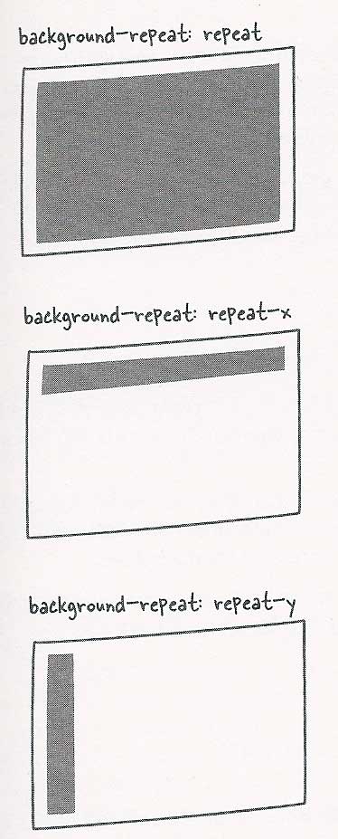
Possible choices for background-repeat include repeat, no-repeat, repeat-x and repeat-y. The CSS syntax looks like this:

selector {
background-color: #fff;
background-image: url(bgimage.jpg);
background-repeat: repeat-x;
}

The graphic shows how a small graphic applied to a body element would render as a repeated background image, a background image repeated on the x axis and a background image repeated on the y axis. Remember, you can apply a background image to any element, not just the body element. The principle involved in using a background-image repeat behind a list item in a navigation bar would be the same, but the effect would be constrained to the list item.

graphic examples of background repeat, repeat-x and repeat-y
Diagram from "Mastering Integrated HTML and CSS"

The third CSS property that comes into the mix with background images is background-position. Values for the background-position property include top, center, bottom, left, right, <percentage>, <length>.

The keywords can be replicated with percentage or pixel values, but percentages and pixel lengths allow for more precise placement than simply choosing top or center or left or right.

When positioning, you use two values, one for the x axis and one for the y axis. Here’s an example of the syntax. And, you don’t want the image to repeat.

selector {
background-color: #fff;
background-image: url(bgimage.jpg);

background-repeat: no-repeat;
background-position: 0% 100%;
}

In the example just given, the percentage of 0% would be the same position as the keyword left. A percentage of 100% would be the same position as the keyword bottom or this: background-position: left bottom;.  There’s no keyword for a position on either the x or y axis like 33% or 47px.

Some graphic examples of background-position.

graphic examples of background-position
Diagram from "Mastering Integrated HTML and CSS"

Let me repeat the reminder that the illustrations show a small graphic used as a background image on a body element. The principle would be the same on some smaller part of a page such as a blockquote or a table. With a large graphic instead of a small one, the effect would be different even though the principle would be the same.

A less often used property is background-attachment. The possible values for this property are fixed and scroll. This is used less often because it’s a bit buggier than other background properties in various browsers. With a fixed background image, the image stays in a the same relative position as the user scrolls down a page. Scroll is the default.

Useful Links: iPad accessibility, Gmail, browser share, textbooks

ATMac tells about Accessing the iPad: Mouthsticks and Styluses with some tips for how a user with limited mobility can work the device. It’s useful to also read ATMac’s post Accessibility and the iPad: First Impressions.

In the category of “stuff I didn’t know you could do but it sounds really great and I want to try it” comes this news from Demo Girl: How-to: Google Search in Gmail.

Where did Internet Explorer’s Browser Share Go? in an interesting look at trends in browser usage. I tried to have an effect on this trending information by installing Chrome on my Mac, but it won’t open after it’s installed. Instead I just get error messages.

Yes, there will be textbooks on the iPad. At least according to this article in the NYTimes.