Designing with Structural Thinking

In the old days, many of us learned to make web pages by first thinking about the “look” and what images, fonts, color schemes, and graphic design elements we would use to achieve it. We launched Photoshop or Fireworks and played with the look until we knew precisely (down to the pixel) what the page would look like. Once we had that plan, we began trying to make HTML create a pixel perfect rendering of the design.

If you want your HTML page to be web standards compliant and accessible you need to back off from thinking about “the look” first and begin your process by thinking about the semantic meaning and structure of the content your page will hold.

The look doesn’t matter

Before you faint and fall out of your chair over that statement, let me explain. A well-structured HTML page can look like absolutely anything. The CSS Zen Garden revolutionized web design by proving that a page of HTML can be made to look like absolutely anything. The CSS Zen Garden helped us finally get it: there is power in CSS that can be used to create any presentation whatsoever out of a simple page of HTML.

HTML is not just for the computer monitor anymore. That wonderful look you created in Photoshop or Fireworks might not work at all on a cell phone, or an aural screen reader. But a well-structured HTML page can go anywhere, work on any internet capable device, and be styled in a manner appropriate to the device with a CSS stylesheet.

Start Your Thinking

The starting point is structural. Some writers call it semantic. What those terms mean is that you need to think of your content as blocks of related meaning, or more simply, as content blocks. Think about the purpose your various content blocks will serve. Then design a semantic HTML structure that supports the meaning and purpose of your content.

If you sat down and planned out the structural bits and pieces you wanted on a web page, you might come up with a list like this.

  1. heading with logo and site name
  2. main page content
  3. global site navigation
  4. subsection navigation
  5. search form
  6. utility area with shopping cart and check out
  7. footer with legal stuff

The generic element used to provide structural context to a page of HTML is the div element. (That’s assuming you aren’t experimenting with HTML5, which has elements fitting many of these structures built in.) Using the div element with assigned ids for the structural parts of the page, your major structural content blocks could be:

<div id="header"></div>
<div id="content"></div>
<div id="globalnav"></div>
<div id="subnav"></div>
<div id="search"></div>
<div id="shop"></div>
<div id="footer"></div>

It isn’t a layout; it’s a structure. It’s the organization of information into content blocks. Once you understand what your structure needs to be, adding the appropriate content in the appropriate divisions of the page becomes automatic.

A div can contain anything, even another div. Your major content blocks will contain the HTML elements you need to create your page–headings, paragraphs, images, forms, lists, and so on.

By thinking first in terms of content, you now have structural HTML elements that can be positioned and styled in any place on the page and in any way you want. Each of those content blocks in your HTML can be individually placed on the page, and assigned colors, fonts, margins, backgrounds, padding, or alignment rules.

This information was rewritten from an earlier much longer article published at the Wise-Women.org site called The Early Bird Catches the CSS: Planning Structural HTML.

Site Testing Checklist

It’s wise to test your site as you’re building it. Check your pages for accessibility, for validity, for appearance and function as you go along. Don’t wait until you’re finished to think about things like valid code and accessibility.

Even when you do those things as a normal part of your process, you still need to perform a number of tests after the files are uploaded to a live server. Here’s a brief checklist of things you need to test when your site goes live.

  • Validate HTML and CSS
  • Run accessibility checks
  • Check every function and script
  • Check spelling and grammar
  • Check page appearance in a variety of browsers
  • Evaluate the site with CSS disabled
  • Evaluate search engine friendliness

    Useful Links: Backchannel, adoption rates, Scrunchup

    Chris Pirillo of Lockergnome has some thoughts about Twitter in the backchannel at LeWeb 09 in Paris. His ideas are a little different from some of those I’ve mentioned previously in posts about the backchannel. Give a listen. There’s talking on the phone while driving, there’s texting while driving, and now there’s video while driving, Pirillo style.

    Matrix: Social Technology Adoption Curve Benefits—and Downsides from Jeremiah Owyang compares technology adoption rates with success in the social media world. Very interesting categories and opinions. He offers three suggestions that I think sum it up for those who want to make the most of social media for a company. Especially significant are “Be a Category Ahead of Your Company” in terms of adoption and “Track the Category Ahead of You.” Or, to quote myself, Keep up with what’s changing and learn how to use those changes to achieve your goals.

    Issue #4 of Scrunchup is available. I’ve mentioned this new magazine already, but if you still aren’t turned on to it, this is your final clue. Become a reader of Scrunchup now.

    Useful Links: Soma FontFriend, accessibility, high tech movies

    In case you haven’t already picked this bookmarklet up from Zeldman’s blog, here’s Soma FontFriend. “This is a bookmarklet made for web designers who want to rapidly check how different fonts and font styles look on their screen without editing code and refreshing pages.”

    Keeping an aging population online looks at accessible forms.

    It seems problem for society is that an aging population means the cost of ensuring the well-being of the elderly population goes up, but if those aging individuals are able to maintain their independence for longer, say, by leveraging the Internet, those costs could be alleviated.

    When you think about it like that, the importance of web accessibility for the elderly begins to sound quite urgent.

    Are you rushing to see Avatar? The theater in my town was crammed with people this weekend. Michael Arrington said, “Movies will never be the same after Avatar. Like the iPhone in the mobile world, this movie disrupts an entire industry.” What do you think?

    Useful Links: Social media your presentations, Design with intent, future ed, accessibility in business

    We’re all presenters–in the classroom, at conferences, among your colleagues. Here are 9 Tips for Enriching Your Presentations with Social Media. One of the tips in the article is about the backchannel, a topic I’m interested in and have talked about here and here and from SXSWi and again here as well as at BlogHer. Plus, I just reviewed an excellent book called The Backchannel: How Audiences are Using Twitter and Social Media and Changing Presentations Forever.

    Design with Intent talks about how designers can influence behavior—and why they should. It’s one of the most interesting articles I’ve read in a long time.

    Persuasion design embeds various forms of influence and “choice architectures” in products and services to maximize the likelihood of positive behavior change. It has been popularized by economists like Richard Thaler through books like Nudge and services like Mint and stickK.com, which provide countless examples of subtle cues that lead to major shifts in behavior.

    The reason this notion of persuasion design tugs at me is that I can see it applied in so many ways to create positive changes in behavior around all sorts of topics. The article is by Robert Fabricant of frog design.

    21 Things That Will Become Obsolete in Education by 2020 at TeachPaperless takes a look at where tech in education is taking us and makes bold predictions. Standardized test makers may not like what TeachPaperless has to say, but I think this idealized version of the future makes a lot of sense.

    Resources for Developing a Web Accessibility Business Case for Your Organization from the W3C is a good resource for anyone trying to convince a client about the need for accessibility and for anyone teaching a class in accessibility on the web.

    Useful Links: Accessiblity not an afterthought, Outed by underpants

    Web accessibility is no longer an afterthought at CNET is a good summary of some of the accessibility issues in web design and would make a good reading assignment for a web dev class. The article interviews Yahoo! trainer Alan Brightman, who is quoted as saying,

    There are about 60 million people in the U.S. who can’t use a computer to get on the Internet in the normal fashion.

    As Matt May pointed out immediately on seeing the article, talking about being accessible and being accessible are two different points on the spectrum entirely. About 60 million of us could be better served by CNET.

    Call Me Virgil

    Why James Chartrand Wears Women’s Underpants. Because James Chartrand got outed, we get this compelling story that tells you exactly where we are on the gender equality spectrum today. After you read that post, check out Freelance Writing Job’s post Do Male Bloggers Receive More Respect? This story is so much like the ever recurring “where are the women in tech” that I’m thinking women in tech would be better served by a little faux gender manipulation. Have I mentioned that this blog is actually written by Virgil DeBolt?

    Style Fieldsets like a Pro

    Just a few CSS rules can make your fieldset look like it was styled by a pro. A fieldset is used to organize forms into sections that can be identified with labels called legends. We’re going to start this discussion looking at a fieldset with no legend. We’ll get to legends in a bit.

    Here’s a fieldset with no styling as displayed in the Firefox browser.

    unstyled fieldset in Firefox

    The default Firefox fieldset is a gray border around the enclosed form fields. I’ll start with the border. This rule will change the make it solid, 2 pixels in width, and a dark blue.

    fieldset {
    border: 2px solid #00F;
    }

    This changes the appearance:fieldset with a blue 2px border

    Any border width, style or color could be used. Next, I’ll round the corners. Use the border-radius property for that.

    fieldset {
    border: 2px solid #00F;
    border-radius: 8px;
    }

    In Firefox, you now see this.

    the fieldset with rounded corners

    I want to change the alignment in the form. That has nothing to do with the fieldset, but it will look better if the fields align. This is the rule added.

    label {
    padding: 3px;
    display: block;
    }

    The new appearance.

    the form with some style added to the labels

    Many rules can be applied to the label element. Color, font, and other aspects of the label appearance can be styled.

    There are still many things that can be styled about the fieldset. Width, background-color, background-image and others. Here’s the fieldset with a gradient background image added to the fieldset rule.

    fieldset {
    border: 2px solid #00F;
    border-radius: 8px;
    background: url(fieldsetbg.jpg) no-repeat left top;
    }

    The effect is this.

    the fieldset with a background image

    What about legends?

    Web Teacher reviewed Fancy Form Design a few days ago. One of the things I learned in that fine little book is that screen readers such as JAWS announce the fieldset legend anew for each new field in the fieldset. The example in Fancy Form Design uses a fieldset with the legend “Change Password” and fields labeled “Current Password” and “New Password.” The authors pointed out that hearing the screen reader say “Change Password” before each of the form labels can be quite a lot of listening to the word “password.” As the authors also pointed out, not every screen reader even announces the legend at all.

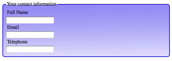
    Before I explain the solution from Fancy Form Design, here’s how the fieldset would look with an unstyled legend added.

    the fieldset with a legend

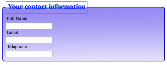
    So you’ll see what some of the possibilities are with styling a legend, I’ll show you a legend with the following rule applied.

    legend {
    font-weight: bold;
    font-size: 1.5em;
    color: #03F;
    border: 1px solid #03F;
    padding: 5px;
    }

    Here’s how it looks.

    the fieldset legend with CSS styles added

    Much more can be done to the legend with CSS. For example, the corners could be rounded, the background could be styled, the font could be changed, and so on.

    For this example form, I don’t think it would be too much for a screen reader to announce, “Your contact information, full name” followed by “Your contact information, email,” and “Your contact information, telephone.” I might decide to use the legend here.

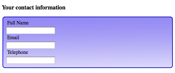
    In Fancy Form Design, the authors suggest using a heading before the fieldset, rather than using a legend in the fieldset. With a heading rather than a legend, the screen reader would read the heading just once. Visually, it still makes sense. Here it is with an unstyled h3 element.

    the fieldset with a heading

    My advice is to decide whether or not a legend makes sense on a case-by-case basis.

    Conclusion

    You can style a fieldset like a pro when you realize that everything you know about CSS can be applied to the elements, classes and ids that exist as hooks for CSS rules within the HTML used to construct the form. Everything you know about styling fonts, colors, backgrounds, borders, padding, margin, width, display, and other CSS properties can be applied to styling fieldsets.

    See also: