
If you read Web Teacher posts via an RSS feed, you may forget that there is a page on the blog where I track a list of most of the posts I categorize as Web Teacher Tips. Here are 5 of the best ones brought back to your attention.
Tips, web design book reviews, resources and observations for teaching and learning web development.
If you read Web Teacher posts via an RSS feed, you may forget that there is a page on the blog where I track a list of most of the posts I categorize as Web Teacher Tips. Here are 5 of the best ones brought back to your attention.
User Testing for Web Accessbility from six revisions is an excellent summary of user testing and web accessibility.
Must reading: Misogyny and the Marketing Chick.
The Periodic Table of SEO Success Factors is from Search Engine Land. Well organized and effective tool for checking your site’s SEO practices.
Carolyn Wood asked this question on Twitter yesterday.
I used plain old HTML and CSS yrs ago. Now so much to catch up with. If I only read 1 or 2 books to COMPLETELY catch up, what shd they be?
— Carolyn Wood (@carywood) June 9, 2013
I responded with two suggestions that are current favorites of mine. I’ve reviewed them both here. If you’d like to know more about what I recommend as the two best books for catching up, here are my reviews:
I often see people in my classes who learned HTML and basic CSS back in the day and who need to bring themselves up to date. These two books will be a big help if all you want to deal with is two books.
7 Academic Search Engines Not Named Google comes from Teach Thought.
Pinterest announced you can now search your own pins.
Mobile Form Usability: Never Use Inline Labels explains why what they call “inline labels” are are such an accessibility problem in mobile design.
Retention and Intention in Massive Open Online Courses: In Depth is a study from EDUCAUSE. It examines the retention rate in MOOCs and what that means to educators.
Lately I’ve been seeing many articles talking about flat design. It was not totally clear from the articles what flat design was. It wasn’t clear why we needed to talk about it as the latest hot thing. So I did a little research. Here’s what I learned.
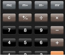
Most articles talk about flat design as opposed to skeuomorphic design. Skeuomorphism is an attempt to give web page elements qualities they might have in real life. For example, a button might have a drop shadow so it looks like a real-life button. Think Apple design elements with drop shadows, gradients, rounded corners. You can see an example in this calculator keyboard from Apple.
On the other hand, flat design gets rid of those beveled edges, gradients, shadows, and reflections. The look of Windows 8 is a good example of flat design.

I don’t want to paint this design discussion as a Mac vs. Windows thing. Web sites are using what they are identifying as flat design. Google+ uses it. There’s even one of those showcase design sites where you can look at the latest in flat designs. It’s called – what else – Flat Design.
On the Usabilla blog, they wrote Flat Design: Trend or Revolution? They argue there that flat designs are honest, quick, usable, and scalable. I don’t see any evidence that flat design is more honest, quick, usable and scalable than any other kind of design, but that’s their checklist. In the end, however, Usabilla does not come out and boldly say that flat design is better or more usable.
Reading and researching this topic has been interesting in terms of trying to parse out the facts from the slant and bias. For example, Gizmodo describes skeuomorphism as overwrought trickery while describing flat design as modern and simple.
The article that got me started reading on the topic of flat design is The Interview about flat design that wasn’t cool enough for the media by Michael Flarup. It’s an interview he did for Wired that never made it into the magazine so he published it himself. He, very sensibly in my opinion, says that the debate about flat vs. skeu is a false one.
I think I speak for a sizable amount of the design community when I say that we’re all a bit tired of this debate. One isn’t better than the other, no more than a hammer is better than a screwdriver. A flat minimalistic design, and a rich ‘themed’ design are both tools in a designers toolbox. They are different approaches and they each come with their own pros and cons. Both can work fantastically in the right context.
To me, describing the two styles as 3-D and 2-D makes more sense than using terms like skeuomorphism and flat. But such basic terminology might not generate as much discussion.
What did I learn from this little research project? I learned about the 2 dimensional flat design trend (I’ll label it a trend, even though Usabilla wouldn’t). I understand what the term means now.
Did I learn anything about what makes good design, or the best type of design? No. Flat design is just another type of design. Use it if it makes sense for you. But don’t think you have to because there are 631,000,000 mentions about it on Google.
WYSIWTF at A List Apart is by Karen McGrane. I’ve shown her videos and linked to her speeches here several times lately. It’s because I’m convinced she is the most important thinker working on the web right now. She’s not talking about responsive design, which is important, she’s talking about content. How to make content that works. How to create CMS tools that let authors create content that works. How to get away from WYSIWYG and its formatting tools, and move into the underlying structure of content. How to make content useful. She’s an evangelist who’s out to change the web.
In case you may have blown off the previous mentions of Karen McGrane on this blog, I remind you of her keynote at Drupal Con, and the video of her talk called Adapting Ourselves to Adaptive Content.
You know drones are soon going to be everywhere when they start using them to deliver pizza. Technology replaces the pizza guy. Not much is left that isn’t changed forever by technology – especially privacy.
The Best Apps for Educators at Media Shift has 8 useful ideas.
Estelle Weyl explains Clown Car Technique: Solving Adaptive Images In Responsive Web Design in this article at Smashing Magazine. This is the full story from the originator of the idea and is worth attention.
Tech Crunch says As TV Falls Apart, Tumblr And Twitter Aim To Pick Up The Pieces. The thing this article does not mention is that we choose which screen to pay attention to based on the quality of what we’re getting from the screen in question. The quality on TV is failing, not the medium of TV itself.
McAfee Digital Deception Study 2013: Exploring the Online Disconnect between Parents & Pre-teens, Teens and Young Adults shows that parents don’t really know what their kids are doing. Teachers and parents should take a look at this study.