Suggestions from a Web Educator for the Dreamweaver Folks at Adobe

I’ve been teaching Dreamweaver again. Yeah, I do it all the time, I know. I have some ideas about what Dreamweaver needs to do to make life easier for newbies who haven’t been using the product forever like I have.

The New Document Options
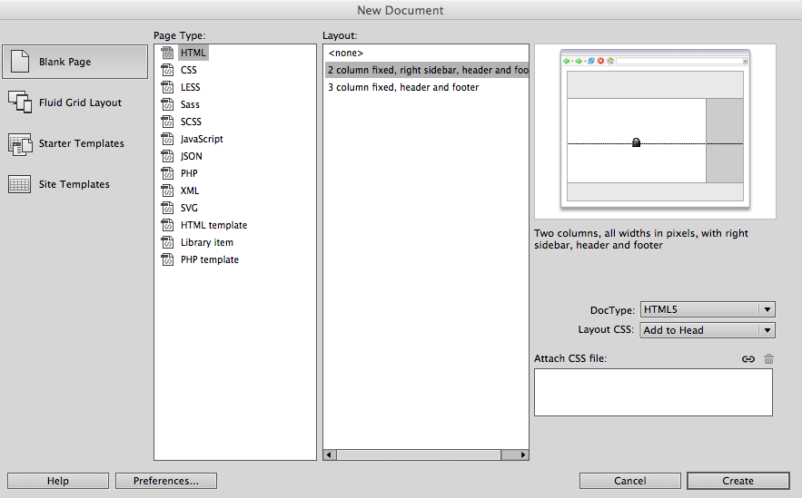
The Dreamweaver New File dialog box

These suggestions deal with the options for people who are opening a new file and starting to work on a new site.

  1. Get rid of the fixed width layouts.
  2. Provide a 1, 2 and 3 column responsive layout
  3. The Fluid Grid layouts are very complex. Find a way to make them more user friendly. In fact, if there were enough useful responsive layouts provided in the layouts category, fluid grids could go away, period.

The CSS Designer

Regarding the CSS Designer interface, when media queries are present, even if all the CSS rules are in a single stylesheet, the CSS Designer lists them as separate stylesheets. It would be clearer if the terminology was different. Perhaps something like “save the styles in” or “locate the style in” to indicate where to place them in the single stylesheet.

In the panel where the selectors are listed, it would be very helpful if some sort of divider or identifier could be included to indicate which selectors went with which part of a stylesheet. When there are media queries, there are several selectors by the same name. Yes, I know that the selectors at the end of the stylesheet would be the ones used in the @media rules, but that isn’t obvious to someone rather new at CSS.

Why Adobe Should Care About This

I see people who are new to Dreamweaver in my classes. If Adobe wants them to convert to subscribers and users, they need to pay attention to the learning curve on the product. I can’t tell you statistics on how many of the people who come to learn Dreamweaver go away thinking maybe they’ll use WordPress instead, but it’s a good percent. Putting aside my female tendency to be modest –  I’m a good teacher. I’m doing everything humanly possible to make successful Dreamweaver users out of my students. Some attention from the Adobe Dreamweaver team should go into the same consideration.
Adobe Creative Cloud: The Good News and the Bad News

good vs. bad

The good news about subscribing to Adobe Creative Cloud is that you always have shiny fresh, updated software. You’re up to date all the time.

The bad news about subscribing to Adobe Creative Cloud is that you always have shiny fresh, updated software. Every time you update it’s different and you have to figure things out all over again.

Review: Badass: Making Users Awesome


Badass: Making Users Awesome by Kathy Sierra is from O’Reilly (2015). This book is about motivation and skills and progress and brain science. It shows you how to use motivation and skill levels and learning progress by being badass, by modeling badass, and by giving you the badass version of learning how to be badass.

If you know who Kathy Sierra is and what she’s already done as a writer and programmer, you’ll recognize what she’s talking about in this book. It’s been her topic before and she’s come back to it with a powerful teaching device – this book. Kathy’s premise is you don’t just want a great product, you want great users. You want users who find it easy to learn to be experts with your product. Even when your product is complicated and hard to learn to use at an expert level, if you approach helping users the right way, they will reach the badass level as users.

The book if full of lively graphics, funny illustrations, and simple but powerful charts.

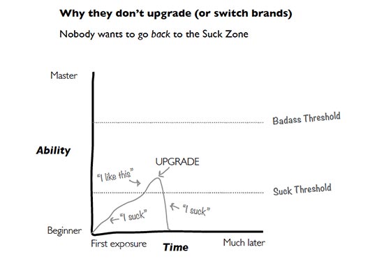
A chart showing how an upgrade to software can move users from competent back to feeling like they suck

This chart shows exactly how I feel about every new upgrade of Dreamweaver CC. Each time I open it, I go back into the suck zone on something. Getting the labels on form fields – oh, no, I suck. Creating a new selector in the style sheet – oh, no, I suck. Using the fucking fluid layout grid – oh, no, I suck. Kathy explains how to help users avoid that oh, no, I suck sensation with upgrades and with new skills mastery in general. The people at Adobe are definitely not using all of Kathy’s suggestions to help users move to badass with updates to their products.

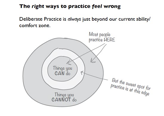
A chart showing the good practice is in the zone between what your good at and what you are bad at

Even something as basic as practicing a skill to get better at it has brain science examples to help you design experiences for users that let them practice the right way. There are also chapters on how to help users filter out brain spam so they can concentrate on things that matter. Here’s the table of contents:

The table of contents for Badass: Making Users Awesome

Just looking at the table of contents tells you a lot about how this book works, and how Kathy Sierra uses her deep understanding of brain science and user experience to craft an experience for you that will leave you feeling badass.

If you want to learn how to create and market a product that your users will love using and will recommend to others, read this book. After you’ve read it, go back and look at how it was written. What were you asked to do as you read? How were you helped to understand the points made? How were you helped and supported as a reader to become an expert in making users awesome? What patterns and perceptions sneaked into your brain without you knowing how it happened?

Kathy Sierra has always been about creating awesome users, and this book can help you be about that, too.

Welcome back to the conversation, Kathy. You were missed.

A review by Virginia DeBolt of Badass: Making Users Awesome (rating: 5 stars)

Summary: Kathy Sierra shows you how to make your users keep coming back by helping them be badass at using your product.

Disclosure: I received a free copy of this book from the publisher for this review. Opinions are my own. Links to Amazon are affiliate links. Here is my review policy. .

Interactive Video: Think of the Possibilities for Education

Scene from Jack Black's "That Black Bat Licorice" video
Scene from Jack Black’s “That Black Bat Licorice” video

I’ve seen a couple of interactive videos recently. One was an version of Bob Dylan’s “Like a Rolling Stone.”

In the Bob Dylan video, you use up and down arrow keys to move between various visuals, all perfected coordinated with the song. I’m unable to embed the video here, but I urge you to check it out and play with the interactive elements.

The second, which is below, is by Jack Black for his song “That Black Bat Licorice.” In Jack Black’s video use the “3” or the “B” key for 3 different versions of the video. Again, play with the controls as you watch it.

What got me all worked up as I watched these two videos is the educational possibilities. HTML, CSS, JavaScript, apps like Dreamweaver and Photoshop – imagine how something like this could be used to teach those topics.

Tools and Resources for Interactive Video

The folks at PBS’s POV Filmmakers have a great resource list of tools and costs. For each tool in their list, they give examples of work and describe what the tool does. Finding the best tool is also a topic of discussion on Quora. You can do some interactive work with videos on YouTube.

I would certainly be interested in seeing someone experiment with interactive video as a teaching tool. If you’ve seen anything like that on the web, please mention it in the comments.

Resources for Material Design

Material Design is a set of design principles created by Google for developers creating apps for Android. They call it a design language. The concepts don’t apply only to Android, of course. Some of the resources I’ll mention below can be helpful to anyone.

You may be familiar with the way things designed this way look and work, because Google has deployed it on most of its sites since last June.

color blocks for picking a color scheme
The opening page of materialpalette.com

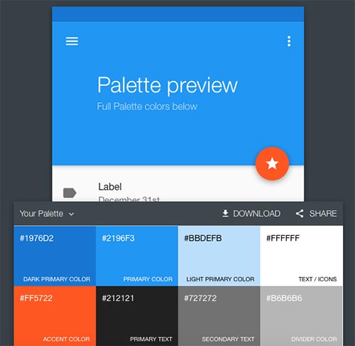
Material Palette is a bold color picking tool. Simply pick two colors and you are offered a color palette.

a group of colors with color codes
The color palette for blue and deep orange

Material Palette is quick, simple, and useful to any app developer.

To back up a bit, a definition and description of what Material Design is all about can be found at developer.android.com. It deals with more than color choices. The design concepts also involve animations, shadows, and drawables.

Google also provides a set of basics about Material Design. The Google site discusses the goals and principles of Material Design and goes on to explain style, animation and many more aspects of development using the concepts.

MaterialUp.com offers inspiration in the form of daily examples of how the concepts have been used in websites and apps. This site and Material Palette are interconnected.

The Relevance of Dreamweaver

Stefan Mischook from Studioweb.com posted an article a day or two ago called Is Dreamweaver still Relevant in Web Design? His conclusion was no, it is not.

Granted there are many more ways to make an effective and functional website than there used to be. I often steer people away from Dreamweaver toward some other tool when I don’t think they need to know everything you must know to use Dreamweaver properly.

However, that does not mean that the software is past its useful prime. What that article failed to take into consideration is all the site-wide tools and integrated tools that come with Dreamweaver. Dreamweaver does more than just write HTML and CSS. There are tools save a great deal of time for a developer who knows how to use them. There are tools that track links, update links, manage snippets, write JavaScripts, insert jQuery, write PHP. Dreamweaver works with Photoshop and other Adobe tools in ways that save both time and effort. In many ways, Dreamweaver forces developers to use accessible techniques – something other software doesn’t necessarily do.

I’ve certainly aired some complaints about Dreamweaver since Creative Cloud came along. But that doesn’t mean I think it’s irrelevant.

Anyone who doesn’t know enough to built a good website is going to build a bad website whether they are using Dreamweaver or some other tool. If I use Microsoft Word to write a terrible book, is that the fault of Word? Developers have to know what they are doing. When they do, their choice of software is just a choice. That software will do what they tell it to do.


Intro to the Web Developer Toolbar

I always tell students to use the Web Developer Toolbar developed by Chris Pederick. It’s free, it works in Firefox, Opera, or Chrome and it’s very helpful.

This short video explains a bit about it. Although it’s talking about Joomla specifically and is an ad for Lynda.com, it’s still a good video. You hear Jen Kramer doing the description. It’s almost the same speech that I give students when I introduce them to this tool, so I thought it was worth sharing with you.