Review: Web Design for Developers


get this book at amazon.com

A review by Web Teacher of Web Design for Developers: A Programmer’s Guide to Design Tools and Techniques (Pragmatic Programmers)

(rating: 3 stars)

Web Design for Developers: A Programmers Guide to Design Tools and Techniques by Brian P. Hogan, is, as the title suggests, aimed at developers rather than at designers. In just over 300 pages, Hogan tries to cover everything about creating a web site starting from initial pencil sketches to the finished product. Included are chapters about color, typography, structure, content, HTML, CSS, print and mobile CSS, cross-browser isssues, accessibility, search engine optimization, testing and a set of resources.

The list of topics sounds really good. It’s a lot to ask of one book, and it’s a decent book, but it isn’t a great book. The 300 pages are a restriction. Some things that could take a whole chapter to explain were mentioned with one or two sentences. There are good tips and techniques in the book, but there are also a number of things about the book that I found problematic. For example, in the section on building the home page search form with HTML, the notion of using the <label> with form fields is ignored. Later in the book, the developer is told to go back to the form and add <label> elements for the sake of accessibility. I’m glad he got around to mentioning it, points for that, but doesn’t it make better sense to tell a developer how to design an accessible form right the first time it’s mentioned? Otherwise, it feels like something you might do after you’re finished if you feel like getting around to it.

Some of the information seems out of date. The accessibility chapter talks about using access keys, an idea that’s no longer considered best practice. The use of unobtrusive JavaScript is mentioned in passing after several JavaScript ideas that are not unobtrusive have been trotted out. A tag cloud example is given with links reading <a href="#">. The use of the pound sign in the element is explained by saying that it will be replaced programmatically later, but that programming is never mentioned.

The sections on color and typography were good. The sections on images and image optimization were good.The coding examples in both HTML 4 and HTML 5 for the layout were well done. I had to keep reminding myself that the audience for this book is developers who are adept at things like Java or Ruby or PHP but don’t necessarily know how to make a web site look appealing. Limited and flawed as the book seems to a web standards advocate like myself, to a developer this might be the quick and simple guidance that is needed for a project.

When I read the title of the book I initially thought it might be something along the lines of the classic The Non-Designer’s Web Book by Robin Williams, with its explanation of design techniques. The title gives that impression. However, this book is nothing like that.

Summary: A general and wide-ranging look at web design techniques.

Technorati Tags: ,

Designing with Structural Thinking

In the old days, many of us learned to make web pages by first thinking about the “look” and what images, fonts, color schemes, and graphic design elements we would use to achieve it. We launched Photoshop or Fireworks and played with the look until we knew precisely (down to the pixel) what the page would look like. Once we had that plan, we began trying to make HTML create a pixel perfect rendering of the design.

If you want your HTML page to be web standards compliant and accessible you need to back off from thinking about “the look” first and begin your process by thinking about the semantic meaning and structure of the content your page will hold.

The look doesn’t matter

Before you faint and fall out of your chair over that statement, let me explain. A well-structured HTML page can look like absolutely anything. The CSS Zen Garden revolutionized web design by proving that a page of HTML can be made to look like absolutely anything. The CSS Zen Garden helped us finally get it: there is power in CSS that can be used to create any presentation whatsoever out of a simple page of HTML.

HTML is not just for the computer monitor anymore. That wonderful look you created in Photoshop or Fireworks might not work at all on a cell phone, or an aural screen reader. But a well-structured HTML page can go anywhere, work on any internet capable device, and be styled in a manner appropriate to the device with a CSS stylesheet.

Start Your Thinking

The starting point is structural. Some writers call it semantic. What those terms mean is that you need to think of your content as blocks of related meaning, or more simply, as content blocks. Think about the purpose your various content blocks will serve. Then design a semantic HTML structure that supports the meaning and purpose of your content.

If you sat down and planned out the structural bits and pieces you wanted on a web page, you might come up with a list like this.

  1. heading with logo and site name
  2. main page content
  3. global site navigation
  4. subsection navigation
  5. search form
  6. utility area with shopping cart and check out
  7. footer with legal stuff

The generic element used to provide structural context to a page of HTML is the div element. (That’s assuming you aren’t experimenting with HTML5, which has elements fitting many of these structures built in.) Using the div element with assigned ids for the structural parts of the page, your major structural content blocks could be:

<div id="header"></div>
<div id="content"></div>
<div id="globalnav"></div>
<div id="subnav"></div>
<div id="search"></div>
<div id="shop"></div>
<div id="footer"></div>

It isn’t a layout; it’s a structure. It’s the organization of information into content blocks. Once you understand what your structure needs to be, adding the appropriate content in the appropriate divisions of the page becomes automatic.

A div can contain anything, even another div. Your major content blocks will contain the HTML elements you need to create your page–headings, paragraphs, images, forms, lists, and so on.

By thinking first in terms of content, you now have structural HTML elements that can be positioned and styled in any place on the page and in any way you want. Each of those content blocks in your HTML can be individually placed on the page, and assigned colors, fonts, margins, backgrounds, padding, or alignment rules.

This information was rewritten from an earlier much longer article published at the Wise-Women.org site called The Early Bird Catches the CSS: Planning Structural HTML.

Semantic HTML, or why Chris Mills is my guru

Chris David Mills The WaSP Interact Curriculum group of volunteer workers are working on a book, to be published by New Riders. Among the many folks working on this book are Chris Mills, from Opera, and myself. Chris has put a few chapters up on the publishers FTP site where we all turn in our chapters. I’ve been peeking at Chris’ work.

This sounds like I’m being naughty, but actually, I need to see everyone else’s chapters. That’s because my chapter is to be a final project chapter to culminate the book, and I need to know what’s come before in order to suggest a final project.

In one of his chapters, Chris talks about semantic HTML. The phrase he used for it was “self-describing.” I think this is the most brilliant turn of phrase I’ve ever heard. Chris is my wordsmithing guru. From his penchant for British spelling to his drumsticks, he’s every bit my hero.

If you are marking up content with semantic HTML, the HTML itself describes for you what the content is. It’s a paragraph, it’s a list, it’s a blockquote, it’s a heading, it’s a citation, it’s emphasized. You can trust this to be what you are reading, because it’s marked up with the HTML to describe it as exactly what it is.

Self describing. So simple yet so complete.

The best ideas always are.

Style Fieldsets like a Pro

Just a few CSS rules can make your fieldset look like it was styled by a pro. A fieldset is used to organize forms into sections that can be identified with labels called legends. We’re going to start this discussion looking at a fieldset with no legend. We’ll get to legends in a bit.

Here’s a fieldset with no styling as displayed in the Firefox browser.

unstyled fieldset in Firefox

The default Firefox fieldset is a gray border around the enclosed form fields. I’ll start with the border. This rule will change the make it solid, 2 pixels in width, and a dark blue.

fieldset {
border: 2px solid #00F;
}

This changes the appearance:fieldset with a blue 2px border

Any border width, style or color could be used. Next, I’ll round the corners. Use the border-radius property for that.

fieldset {
border: 2px solid #00F;
border-radius: 8px;
}

In Firefox, you now see this.

the fieldset with rounded corners

I want to change the alignment in the form. That has nothing to do with the fieldset, but it will look better if the fields align. This is the rule added.

label {
padding: 3px;
display: block;
}

The new appearance.

the form with some style added to the labels

Many rules can be applied to the label element. Color, font, and other aspects of the label appearance can be styled.

There are still many things that can be styled about the fieldset. Width, background-color, background-image and others. Here’s the fieldset with a gradient background image added to the fieldset rule.

fieldset {
border: 2px solid #00F;
border-radius: 8px;
background: url(fieldsetbg.jpg) no-repeat left top;
}

The effect is this.

the fieldset with a background image

What about legends?

Web Teacher reviewed Fancy Form Design a few days ago. One of the things I learned in that fine little book is that screen readers such as JAWS announce the fieldset legend anew for each new field in the fieldset. The example in Fancy Form Design uses a fieldset with the legend “Change Password” and fields labeled “Current Password” and “New Password.” The authors pointed out that hearing the screen reader say “Change Password” before each of the form labels can be quite a lot of listening to the word “password.” As the authors also pointed out, not every screen reader even announces the legend at all.

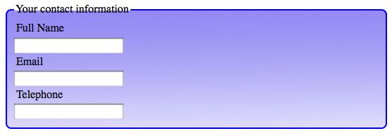
Before I explain the solution from Fancy Form Design, here’s how the fieldset would look with an unstyled legend added.

the fieldset with a legend

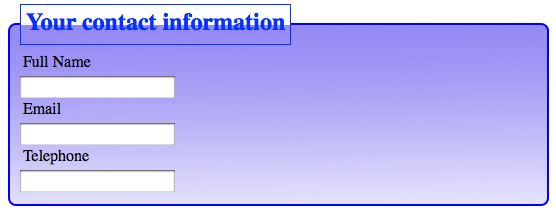
So you’ll see what some of the possibilities are with styling a legend, I’ll show you a legend with the following rule applied.

legend {
font-weight: bold;
font-size: 1.5em;
color: #03F;
border: 1px solid #03F;
padding: 5px;
}

Here’s how it looks.

the fieldset legend with CSS styles added

Much more can be done to the legend with CSS. For example, the corners could be rounded, the background could be styled, the font could be changed, and so on.

For this example form, I don’t think it would be too much for a screen reader to announce, “Your contact information, full name” followed by “Your contact information, email,” and “Your contact information, telephone.” I might decide to use the legend here.

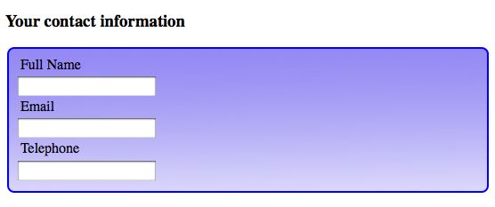
In Fancy Form Design, the authors suggest using a heading before the fieldset, rather than using a legend in the fieldset. With a heading rather than a legend, the screen reader would read the heading just once. Visually, it still makes sense. Here it is with an unstyled h3 element.

the fieldset with a heading

My advice is to decide whether or not a legend makes sense on a case-by-case basis.

Conclusion

You can style a fieldset like a pro when you realize that everything you know about CSS can be applied to the elements, classes and ids that exist as hooks for CSS rules within the HTML used to construct the form. Everything you know about styling fonts, colors, backgrounds, borders, padding, margin, width, display, and other CSS properties can be applied to styling fieldsets.

See also:

Review: Handcrafted CSS


get this book at amazon.com

A review by Web Teacher of
Handcrafted CSS: More Bulletproof Web Design, Video Edition (includes Handcrafted CSS book and Handcrafted CSS: Bulletproof Essentials DVD)

(rating: 5 stars)

Handcrafted CSS: More Bulletproof Web Design by Dan Cederholm with Ethan Marcotte is from New Riders (2010). It’s a beautiful book designed by Cederholm himself. Most of it was written by Cederholm. Marcotte contriubuted one chapter called “The Fluid Grid”.

Cederholm’s trademark style is to examine every angle of a problem—such as the way to display a menu with an item and a price or the way to create rounded corners. After looking at the various options, he selects the one he considers the most bulletproof and recommends it for use.  To be bulletproof, a design solution must be flexible enough to work in many browsers (or at least not differ beyond use in some browsers), be functional with various levels of zoom, be accessible, and be workable in terms of future upkeep.

Many of the techniques in the book use CSS3. There’s also some jQuery in the mix. No HTML5, though he does suggest it’s the next big thing.

He concentrates on a few “crafty” CSS techniques in the slender volume. This book is not a complete guide to CSS. It deals with selected design problems. The specific topics getting the Cederholm treatment in this book:

  • his flexible approach to problem solving with CSS
  • rounded corners and background clipping
  • text-shadow
  • RGBA and opacity, with several lovely design tricks well explained
  • his progressive enhancement philosophy aimed at better browsers and letting go of pixel perfect sameness in lesser browser
  • modular float management, a very cool idea for dealing with float problems
  • fluid designs with percentages and ems, even fluid media sizing (this is Ethan’s chapter)
  • typography and @font-face
  • select jQuery enhancements

Well written and clear to implement ideas are what you’ll find in this book. You need to know HTML and CSS before you dig in.

Summary: A select set of CSS improvements for designers.

Technorati Tags: ,

Review: Fancy Form Design

A review by Web Teacher of

(rating: 5 stars)

Fancy Form Design by Jina Bolton, Tim Connell and Derek Featherstone is from Sitepoint Book (2009). This is really an excellent little book. It gives you tips on planning and designing a form that is both attractive and usable. It provides information on structuring the form using standards-based HTML. Both usability and accessibility features are built into the form structure as a matter of practice in this book. You’d hardly expect less with authors of the caliber of the three who worked on the book.

Since this book is just about one thing, forms, you learn some things you might not learn in a book that treated forms as a small part of a larger whole. For example, there is an interesting discussion about when to use legends with fieldsets, and when you’d be better off not using legends. You learn about the types of error messages that are most useful in form design. The fine points of labels are discussed.

In the chapter on styling the form with CSS, there are some excellent tips for form design. Everything from ideas for styling with icons, sprites, and styling widgets is included in the CSS chapter.

The final chapter takes you through some JavaScript enhancements that will improve your form without making it inaccessible.

The book reads fast, the code examples are right there and are clearly explained.

Summary: A must-have book for the form designer.

Technorati Tags: ,

Should your blog have an hCard?

What’s an hCard, you ask? It’s a digital version of a business card. You put it on your blog or website and it provides your name, your contact information and other information you want people to know. Because it’s digital, it can be exported from your web page to an address book and synched to a mobile phone. Google and Yahoo! both index information in hCards, so it gives you some search engine clout as well as providing portable contact information to your blog’s users.

You can provide only your name in an hCard, or you can give a physical address and phone number. If you are running a brick and mortar business, letting your customers have your phone number and address on their mobile phones might be a smart move. If you aren’t selling something at a physical location, you might just want to include your name, perhaps your URLs or an email contact.

Before you learn how to make an hCard, look at some in action. hCards are a particular type of HTML code called a microformat. A Blog Not Limited is the home of the queen of microformats, Emily Lewis. Scroll to the bottom of her page and look at that material where is says, “The Coolest Person I Know.” That information, which includes Emily’s name, email, and location is wrapped up in HTML behind the scenes that makes it an hCard. The hCard can be exported from her web page and saved as a contact. Emily wrote a book about microformats—Microformats Made Simple—and numerous blog posts on the topic. Here’s her post describing everything you’d ever need to know about hCard.

Here’s another blog with an hCard: New England Living. This blog uses the hCard in the footer of each post, and identifies only the post author’s full name as Alyson (New England Living). This isn’t the only blog I’ve seen with an hCard microformat in the post footers. It makes sense in each post footer if the blog has more than one author. If your blog has a single author, I think it would be much better placed on the page’s footer for each page of the blog. I have an hCard in the footer of my blog that simply provides my real name and a link to my sadly neglected site at vdebolt.com

Look at New Parent’s About Us page. Here is all the business information you would put in a full-blown hCard, but it isn’t in one. This is a place where an hCard would be very valuable. Or here, at the Austin Real Estate News and Advice Blog. The realtor’s name and phone number is given right there in the blog’s header, but there’s no downloadable hCard with the info that can be synched with a mobile phone. A realtor’s blog is a perfect spot for an hCard.

Ready to make one? The easiest way is to go to Microformats.org hCard Creator and fill in the form. As you add your information to the form fields, the HTML is generated beside it. Only fill in the fields for the information you want to share. Copy and paste the HTML into your blog in an appropriate place. An appropriate place might be the page footer or an About page. (Feel free to leave out that last line about the hCard Creator when you use the code.)

When you examine the code, you see that most of the magic is done by using various classes to define your data. You don’t really need to know why the microformat class is called “vcard” instead of “hcard,” but if you are interested in the reason, the article I mentioned by Emily Lewis tells you all about it. If you are geeky enough to make your own hCard by hand instead of using the hCard Creator, Emily’s article is the place to learn all the details.

How do you find and download hCards that are on web pages? The easiest way is to use the Operator Add-on in Firefox. When an hCard (or several other types of microformats) are on a web page, the Operator toolbar lets you know and has a menu option to view or export the information.

If you visit this page at A Blog Not Limited with the Operator Toolbar working in Firefox, you see three contacts.

export contacts menu

One or all of the contacts can be exported to your address book and synched to your mobile phone.

The Operator toolbar also shows other microformats on the page. The image above shows: Events(2). hEvents can be exported, too, and added to your calendar. Microformats have many handy uses besides contact information via hCards.

If you are running a business with your blog, I think you need an hCard. If you are using your blog for other reasons, you need to decide for yourself how important having your contact information in an hCard format is to you.

Cross posted at BlogHer.