Why have a wrapper div?

Students may have a problem grasping is the need for a wrapper div. I frequently find myself explaining it numerous times until the message finally sinks in.

The metaphor I’ll use today will be to compare a wrapper div to a fence.

A wrapper div, or a container div, has no semantic meaning. It’s a generic container. Therefore, <div> is the proper tag. A <section> element should not be used as a container. [See: Sections and Articles are Not Generic Containers]

What does a fence do?

  • It demarks the edges of your property.
  • It contains animals or children within a prescribed area. It keeps them from getting out.
  • It creates a border between one area and another.
  • It can be plain or decorative.

A wrapper div in an HTML document does the same things but to a layout instead of to actual property.

  • The wrapper holds a design within certain boundaries.
  • The various areas of a design cannot escape from the boundaries set by the wrapper.
  • A max-width or min-width or varying width based on an @media query can be set for the wrapper that makes it size a design responsively.
  • The id identifying a wrapper provides a CSS hook which enables more than size constraints. Borders and other decorations can be added.

With a wrapper div in place, a layout can be centered on the page. The width of the design can be controlled for easier reading and line-length.

It’s necessary to create the wrapper with a div and an id:

<div id="wrapper">everything on the page goes in here</div>

One of the principles of HTML5 is to pave the existing cow paths. Hence we have all sorts of new semantic elements like header, main, and footer that were once created using the same div with an id technique.

If wrappers are so great, why isn’t there a new HTML5 element called wrapper? I don’t know the answer for sure, but I’m guessing it’s because a wrapper is not a semantic element. It’s merely a container, a boundary into which you place all your semantic content.

By the same token, there is no ARIA landmark role for wrapper or container divs. The container carries no semantic meaning, it just puts a fence around the content. There’s no need to indicate it as a landmark on the page.

Form New Habits for Working with CSS in Dreamweaver CC

The way the CSS Designer in Dreamweaver CC creates selectors is different from the way you may be in the habit of working with previous version of Dreamweaver.

Good, Bad Habits

You now need to know more about creating an appropriate selector. Instead of relying on Dreamweaver to generate a good selector for you based on your selection in the Document window, you need to be ready to decide for yourself what the best selector should be. This is especially true if you are using the CSS that comes from using the Dreamweaver grid layouts. The suggested selectors with a grid layout are quite cumbersome.

If you know what selector you want, Dreamweaver will help you choose it, but you have to know the trick.

A Specific Example

This example comes from a grid system layout. Other layouts might not have such ungainly selectors as default suggestions. If you click the familiar plus sign (+) to create a new selector while something is selected in the Document window, the selector suggested by Dreamweaver gives the full page structure.

The Dreamweaver suggested selector based on something selected in the Document window.

There is no longer a “Less Specific” option to remove the unneeded parts of this very long suggested selector. The easiest way to deal with it is to remove the entire thing. Do that by typing the beginning letters of what you know you want the new selector to be.

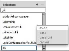
For example, if the element to style is an <a> element nested in an <aside> element, begin by typing as in the editable selector field. Code hint appear giving choices that contain “as.”

Begin typing a selector and Dreamweaver will show you options as code hints

Using the arrow keys, or the mouse, select aside. To add a descendent selector after aside appears in the editable selector field, type a space and another selector after aside. For this example, type a: and Dreamweaver shows code hints.

The field remains editable so that descendant selectors can be built

From the code hints for :. pick one of them using the mouse or arrow keys. Press Return/Enter when you’ve finally go the selector you want. The selector will turn blue and the Properties Pane for that selector will be populated with all the Property options.

Knowing how to use the code hints provided in the editable selector field will help you get quickly to the selector you need for a particular style.

Tips on Using the Dreamweaver CC Layout Grid

I’ve learned a few things about how the Dreamweaver CC layout grid system works after making about 30 different layouts with it and struggling to figure out its bugs.

One helpful thing is to take a look at the stylesheet that Dreamweaver generates after you’ve told it how many columns you want in the various sizes. This is before you’ve entered any content of your own or added any CSS rules of your own.

Read through it and notice the order of the rules and media queries.


@charset "UTF-8";
/* Simple fluid media
   Note: Fluid media requires that you remove the media's height
  and width attributes from the HTML
   http://www.alistapart.com/articles/fluid-images/ 
*/
img, object, embed, video {
	max-width: 100%;
}

/* IE 6 does not support max-width so default to width 100% */
.ie6 img {
	width:100%;
}

/*
	Dreamweaver Fluid Grid Properties
	----------------------------------
	dw-num-cols-mobile:		4;
	dw-num-cols-tablet:		8;
	dw-num-cols-desktop:	12;
	dw-gutter-percentage:	15;

	Inspiration from "Responsive Web Design" by Ethan Marcotte 
	http://www.alistapart.com/articles/responsive-web-design
	and Golden Grid System by Joni Korpi
	
Home
*/ .fluid { clear: both; margin-left: 0; width: 100%; float: left; display: block; } .fluidList { list-style:none; list-style-image:none; margin:0; padding:0; } /* Mobile Layout: 480px and below. */ .gridContainer { margin-left: auto; margin-right: auto; width: 96.7391%; padding-left: 1.6304%; padding-right: 1.6304%; clear: none; float: none; } #div1 { } .zeroMargin_mobile { margin-left: 0; } .hide_mobile { display: none; } /* Tablet Layout: 481px to 768px. Inherits styles from: Mobile Layout. */ @media only screen and (min-width: 481px) { .gridContainer { width: 91.4836%; padding-left: 0.7581%; padding-right: 0.7581%; clear: none; float: none; margin-left: auto; } #div1 { } .zeroMargin_tablet { margin-left: 0; } .hide_tablet { display: none; } } /* Desktop Layout: 769px to a max of 1232px. Inherits styles from: Mobile Layout and Tablet Layout. */ @media only screen and (min-width: 769px) { .gridContainer { width: 89.0217%; max-width: 1232px; padding-left: 0.4891%; padding-right: 0.4891%; margin: auto; clear: none; float: none; margin-left: auto; } #div1 { } .zeroMargin_desktop { margin-left: 0; } .hide_desktop { display: none; } }

The styles all flow from the 480 px and below layout rules. Dreamweaver expects you to begin adapting the style rules and adding your content in the mobile layout. Nothing explains that to you, but when the grid you set up in the File > New dialog opens in the Design View, it opens on the mobile view. Notice the size selector at the bottom of the document window, and the 4 column grid in the background.

This subtle clue means start with the mobile layout. Too subtle?
These subtle clues means start with the mobile layout. Too subtle?

Is opening up in the mobile view too subtle a clue? Shouldn’t there be some text somewhere, about starting with the mobile layout?

Once you have the mobile layout done, you are expected to move to the tablet size layout and adjust the fluid grid accordingly.

Finally, you can make any adjustments to the fluid grid for a desktop layout.

Additionally, when the initial grid layout opens in Design View, it contains a div (with the id div1) which you are expect to delete. There’s nothing to alert you to the fact that you should delete this placeholder div and replace it with a header element or whatever you want to add first to your page.

Since Adobe has so few tutorials that illustrate the proper use of the grid layout system, much of what you need to know to figure out the new layout system comes by way of trial and error. I hope my trial and error stumbling and learning experiences can help you get off to a smoother start.

Review: SASS for Web Designers

SASS for Web Designers by Dan Cederholm is from A Book Apart (2013). Like all the A Book Apart books, it’s brief and very good. And like all books from A Book Apart, it isn’t available new from anyone but them.

SASS is a CSS preprocessor. The book’s first chapter is Why SASS? Cederholm does the explaining with this elevator pitch:

Ever needed to change, say, a color in your stylesheet, and found that you had to find and replace the value multiple times? What if you could change that value in one place and the entire stylesheet reflected that change? You can with SASS! Or how about repeated blocks of styles that are used in various locations throughout the stylesheet? That’s also SASS!

From the first page, you see code examples for how something would be written in SASS. Following that, the CSS output from SASS is shown, to explain exactly what the SASS example does. You quickly begin to see the connection between what you’re asking the preprocessor to do and the CSS output.

Chapter 1 also explains SASS syntax and using the .scss file extension.

Chapter 2 is Workflow. It explains how to install SASS on a Mac and/or Windows. It gives you a few (very few) command line entries but also mentions some apps you can use if the command line freaks you out. Finally it explains how to choose an output style for the CSS that SASS is going to spit out.

Chapter 3 is Using SASS. You learn about nesting rules and namespace properties, about referencing parent selectors with &, about commenting in SASS, about variables and mixins, about mixin arguments. Cederholm also explains mixin libraries and the use of @import rule. He discusses the pros and cons of the Compass framework and the Bourbon library.

He explains extends, multiple extends, and extend vs. mixin. Every one of the topics in chapter 3 comes with very clear code examples that help you see how to do something with SASS and what the results would be in CSS.

Chapter 4 is Media Queries. You find out about nesting media queries, using variables for breakpoints, using the content directive, and putting mixins inside mixins.

The book wraps up with a list of resources for learning more.

A review by Virginia DeBolt of SASS for Web Designers (rating: 5 stars)

Summary: You could start using SASS today with this book as a guide.

Syntax Blindness

Keyboard

An interesting post from Khan Academy about Newbie Syntax Blindness got me thinking about teaching syntax.

First let me point out that Khan Academy is dealing with a different situation than face-to-face teaching. Their problem is about finding ways to alert students who are working online with useful messages about what their syntax errors might be.

In a classroom, face to face with students, I do it very differently. I introduce either HTML or CSS syntax in minute detail. I discuss every bracket, space, comma, semi colon, forward slash, and quotation mark they will be using. I show lots of examples. Then when they begin the actual typing, I walk around and help them spot their errors.

I also teach them that when a page falls apart, look in the HTML for a syntax error right before where the problem appears. It will most likely be a missing quotation mark or bracket someone just ahead of where the problem shows us. I find that students invariably pull their hair out over the part of the page they think is broken, but never think about simple syntax errors or typos that may have occurred just prior to that. That usually where the problem is.

Another problem students have with syntax when they first begin hand coding is taking what they see on a whiteboard or a projection screen or a demonstration monitor and translating into finger strokes on their own computer. The details are minute and exacting. The more time they can spend developing some muscle memory around these strange new keys they are using on their keyboards, the better they will do. People who have been keyboarding for years can be thrown into beginner’s mode hunting for curly braces and brackets and slashes and equals signs.

If you are teaching, either face to face or in online classes, how do you teach syntax?

Useful Links: Content Ideas, Beauty Pageant, Date Input

I saw this tweeted by Kristina Halvorson, so I took a look. It’s a tool to help you generate ideas for new content for your blog, called Content Strategy Generator. It works through Google Drive.

To Increase Women’s Participation, They Added a Beauty Pageant. Good grief!

Date input in HTML5: Restricting dates, and a thought for working around limitations is from Tiffany B. Brown.

Useful links: Fast Forms, Slanted Tabs, Zombie Scroll

5 Killer Ways to Use Fast Forms has some interesting suggestions in form design.

Slanted Tabs with CSS 3D Transforms is a very nice tutorial from Lea Verou.

Creating game-style parallax scrolling: Zombie Edition at Dev.Opera has the world’s best blog post title and enough HTML, CSS, and JavaScript to fill your geeky heart.