HTML5 Doctor just published a great post on semantics – go read it. It included this terrific flowchart to help you figure out which sectioning element is appropriate for a particular situation.
Click image to view at full size.

Tips, web design book reviews, resources and observations for teaching and learning web development.
HTML5 Doctor just published a great post on semantics – go read it. It included this terrific flowchart to help you figure out which sectioning element is appropriate for a particular situation.
Click image to view at full size.
Steve Faulkner reports of some of the quirks in the way JAWS announces ARIA landmark roles.
If you are a woman working in technology fields at innovative companies in the San Francisco Bay Area you can mentor a woman from the Middle East through the TechWomen program.
Jakob Nielsen wrote about mobile and got some reaction. Here are a few links:
Google+ made some changes and upgrades last week and I thought it was time to take a second at this site, both to see what’s new and to discuss helpful features. Google announced the changes on the Google blog in Toward a Simpler, More Beautiful Google.

If you are familiar with Google+, you can see from the image the look has changed to something sleek and minamalist. Google describes it as “more functional and flexible.” Google touts the new navigation, saying,
- You can drag apps up or down to create the order you want
- You can hover over certain apps to reveal a set of quick actions
- You can show or hide apps by moving them in and out of “More”
A few of the other changes (you can get the full list in this video) are easier ways to join conversations, ways to track activity around conversations you’re following, and a page just for Hangouts. Some of the menu items pop out for more precise options, such as the Photo menu.

The Profile page changed to include something that bears a whole lot of similarities to the Facebook Timeline, with a large image. Take a look at how She Geeks describes the Profile changes in Google Receives a Fresh Redesign that You Might Like.
The redesign raised the hackles of developers whose apps broke, and engendered a mocking meme about whitespace. You can explore those issues in Google Introduces a Familiar Redesign and Google Angers Developer with Google+ Redesign.
After several months using Google+ it remains way down on the list of social networks I check regularly. Perhaps I’m not following enough people to get the value I was hoping for from it, but I don’t find it especially important – yet. I think the Hangouts feature is terrific, but people I’d like to share a Hangout with (for example, my book discussion group) are not all on Google+.
Even so, I’ve learned some tricks that help me get the most from Google+. They seem almost secret, because they are a bit hidden. If you take a second look at the site now to check out the new look, perhaps these tips will help you get more out of Google+.
The first almost-secret is circle volume control. It’s a bit tricky to find.

Start in your stream with the Home button. Then pull down the More menu and select a circle. I picked my circle called BlogHers. That will bring posts from BlogHers to the top of my stream. And, it brings up a volume control slider to the right of the page.

Use the slider to determine the amount of volume as a percentage of your total stream you want to see from the chosen Circle. I find this really helpful. I recently added a circle called Women Who Work in STEM, and, wow, those women are talkative! I can turn the volume down on those posts, while getting more volume from my BlogHer circle.
The second almost-secret is Sparks. A Spark is basically a saved search. I searched on the keywords “web design.” You see the results immediately, of course, but when the results appear, a button to “Save This Search” also appears. Click it and your search is saved.
I saved another search, too. This one was for “social media.” Now, when I’m on the Home page looking at my stream, I can find both those searches in the More menu and check for new search results anytime.

As with any change, reactions to new design are mixed. It’s interesting to use Google+ to search for “Google+ redesign” and see the mixed reactions. My personal reaction is, “Oh, Google+ changed.” What’s your response?
Honestly, I’m more excited about using features that were there all the time like the Volume Control and Saved Search. The new design is just “Okay. Thanks for letting me know.”
Editor’s Note: All screen captures from Google+ by Virginia DeBolt. Cross-posted at BlogHer.
I saw this tweet from Pamela Fox about a source for online teaching materials. You might want to check it out.
Added yesterday’s HTML & CSS curriculum to teaching-materials.org, with ideas on ways they can be improved: teaching-materials.org/htmlcss-1day/
— pamelafox (@pamelafox) April 16, 2012
If you’re interested in joining in with a week of action against CISPA, Mashable has the info.
Nice explanation of the rule of thirds, which applies to web design as well as to photography. Here’s a source of the same info, related specifically to web design:
The Divine Proportion and Web Design mln.im/HPR6NF
— Mike Lane (@mlane) April 17, 2012

HTML5 contains several new elements that are considered semantic in that they more accurately describe the content they contain than a generic element such as a div.
These new elements improve accessibility as standalone structure, because of the semantic underpinnings they carry with them. The elements in question are: header, footer, main, section, article, aside, and nav. Simply using them without any additional coding such as the WAI-ARIA landmark roles I’m going to describe today is an improvement.
The roles I’ll describe are banner, complementary, contentinfo, form, main, navigation, search. The names make the role pretty obvious, but some roles have fine points.
In HTML5, the header element can be used repeatedly on a page. It can be the main header for the entire page, or a header for a subsection of the page such as a section or an article or an aside.
If the header element is used at the main header for the entire page, the role banner can be assigned to it. Only one header on a page can have the role banner.
<header role="banner"> . . .</header>
Within the page there may be header elements used as article or section or aside headings. The ARIA role that can by used in that case is heading.
<article><header role="heading">Article heading</header>Article body</article>
The heading role can also be used in tables.
In HTML5, the footer element can be used repeatedly on a page. It can be the main footer for the entire page, or a footer for a subsection of the page such as a section or an article or an aside.
The main page footer can use the role contentinfo. But footer elements for subsections of a page may not use this role. It can only be used once on a page.
<footer role="contentinfo"> footer for entire page</footer>
Depending on what kind of information is included in the footer for articles or other smaller page sections, the footer might be appropriately labeled with the complementary role.
<footer role="complementary"> informative footer for an article</footer>
The aside element is meant for complementary material, not crucial to the page content, but supplementary. Therefore the complementary role is perfect for it.
<aside role="complementary"> supplemental content</aside>
You’ve seen how simple it is to assign a role to an element, so I’ll stop giving code examples. There are just a few points about the roles main, navigation, form and search. It seems self-evident when to apply navigation, form, and search to page elements. But main is another role that can only be used once on a page to indicate the main content, which might be contained in a main, div or section element. Using the main role properly eliminates the need for those “jump to main content” links that were so prevalent for a while on the web.
The last point to keep in mind is that ARIA roles work in all flavors of HTML. They do not depend on the use of HTML5 to make your web page accessible. Even if you are not ready to switch to HTML5, you should begin using ARIA roles.
See Also: ARIA Roles 101 and How to Make HTML5 Semantic Elements more Accessible.
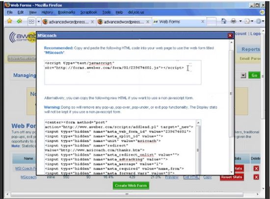
If you want to make using WordPress an easier process, or just want to make the most out of what WordPress has to offer, check out these ten tools.
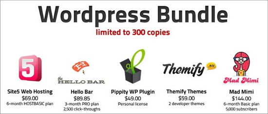
The great thing about this content package is that it is more than just beneficial for WordPress bloggers. It is also a charity package, which gives 100% of their proceeds to emergency programs through UNICEF. It comes with access to nine different services: Site5 Web Hosting, The Hello Bar, Themify, Pippity WP Plugin, Mad Mimi, CodeGuard, Sendible, OrganicThemes ‘Bold Theme’ and Themes Kingdom (5 different themes). Some of these, such as the themes, are one time purchases that give you full use rights. As for the services, they are between three and six month plans. In all, this is a $630 value package for $59, and all to help UNICEF. Definitely worth getting.
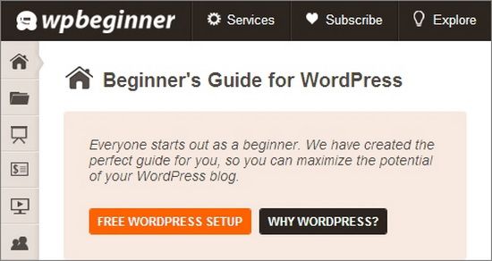
When you first go onto this site you might be a little confused. The format is a fantastic clone of the WP dashboard, complete with matching side icons. In itself, it is the perfect guide for the WP beginner. It goes through every element of the website, giving you a total tutorial to use. They also have a list of useful WordPress books you can read if you want to learn even more.

As a blog owner, you are responsible for the content that is posted on your site. The biggest issue with this comes with guest bloggers. While you can easily control the genre or topics they write on, it is harder to handle format. Most writers will try to follow by the general layout used on other posts, or follow your instructions, they can often forget something. Which leads to more work for you in edit. That is why having a checklist for guest post formatting is a great idea. You can make your own, or use this one by the great Ann Smarty. Download and customize it.
Copyblogger is a very informative site, and they aim to provide simple posts with plenty of advice for the average blog owner. In this edition, they give you seven tips on how to make WP work for you. It includes tricks for your sidebar, navigation advice and more.

WordPress has a large selection of templates for you to use. Most of them are free, and some of them cost between $15 and $200. All of them are customizable and easily adapted for your needs. However, you might want something entirely your own. In that case, you will have to create one. Luckily, this isn’t as difficult as creating other coding, such as traditional graphic design. This video will show you how to make a template for WP, step by step.
If you want more information on design for WordPress, this series is a good place to start. They have a few videos explaining the finer points of the topic, starting from the Starkers theme rather than a default. In all, the video series runs about two hours and fifteen minutes.
Sometimes you love a theme, but you hate the header that it generates. Which is fine, because it is very simple to create your own header. On this video it will break it down for you, showing exactly how to make a header that will fit your blog. You will be ready in a manner of minutes.
The most confusing part of customizing a blog for more WorPress users is modifying an existing theme. It doesn’t take that much to learn what you are doing. Each part is in a different area of the coding box. This video breaks it down for you and shows you how to make changes.

ScribeFire is a great plugin tool for Firefox, Chrome, Safari or Opera. It allows users to turn their browser into a full blog updater. Create new posts, edit old ones, work on SEO and more through the plugin itself. But best of all is that it allows you to work on all of your blogs in one place.
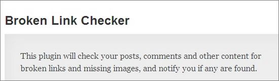
An official tool from WP, this allows you to check for any broken links in your posts. This makes it really easy to keep track of them, and to be alerted to any problems in the future.
If you want to make WordPress really work for you, then these ten tools can help. From getting advice on how to create a better blog to learning how to properly code your theme, they have everything you need to get things started.
Guest Author Jessy is the tech blogger for VIP Reality blog. Vip Reality is a Dallas real estate company preaching a high-quality approach to online marketing. All images courtesy Jessy.
