Useful Links: Responsive Recruiting, Yahoo logo, meta fizzy

Why Responsive Web Design Can Transform Higher Ed Recruiting. One of many interesting tidbits in this article: “According to research from Higher Education Consultants Noel-Levitz, 68 percent of college applicants have viewed college websites on mobile devices. And if a college’s website isn’t optimized for mobile, these potential students drop off: 24 percent of students would leave a website after a poor internet experience.”

Here’s a view of the changes that Yahoo! went through in building its new logo. It’s simple, and the exclamation mark is animated. What do you think of it?

I’m feeling just a bit cross-eyed after seeing the meta-fizzy effects created in MetaFizzy Effect with SASS at CSS Tricks. Let’s not all go out and do this, okay?

2 Excellent (and Free) Text Editors

Since any basic text editor can write HTML, CSS, and various scripting languages, I like to let my students know which I recommend and why.

I have two favorites. Both are free. Both use color coding and indentation to make reading and troubleshooting easier. Both provide line numbering. One is for Mac and one is for Windows.

For the Mac, I like TextWrangler. TextWrangler is a “lite” version of BBEdit. Many Mac users may already own BBEdit, but if you aren’t in that position, you should get TextWranger.

For Windows, I like Notepad++.

Both these editors allow you to have multiple tabbed windows open at once a number of helpful functions for dealing with code and for general editing. I’m not sure about Notepad++, but I know that TextWrangler has FTP built in.

I consider a good text editor an essential, even if you use a tool like Dreamweaver to do most of your work. I find, for the way I work, that I often open up pages in a text editor for various chores instead of using Dreamweaver – or in addition to using Dreamweaver.

Creating Transitions in Dreamweaver CC

The CSS interface for Dreamweaver CC is very different from the classic look seasoned users interacted with for years. In Dreamweaver 6, CSS 3 transitions were added to Dreamweaver’s design tools. The interface works approximately the same in Creative Cloud (Dreamweaver CC).

I added a transition to a couple of images on my home page. Here’s how I did it, step-by-step.

1. Find or create a selector

I decided to apply the transition to a couple of book images. I added class="grow" to the images, so I could target them easily for the transition.

Also note, while you’re looking at the code for the image, that it is set at a width of 30%. My goal is to change that width with my transition rule.

class selectro

2. Add a new Transition and Target a Rule

In the CSS Transitions panel, I clicked the familiar plus sign to add a new transition. A dialog window opened. I’ll go through it in steps.

target rule

First, pick the target rule. Every rule you have in your style sheet is shown in alphabetical order. Like any other field in Dreamweaver, you can type directly in the field if you want instead of looking through your list of styles. I selected the .grow rule to target.

3. Transition On

The next choice is to decide when you want the transition to happen. You can see the options in the image. I picked on hover.

hover

4. Pick the timing

You can use the same transition for all properties, as I have here. You can also set different transitions for different properties if you want to have more than one transition happening in the same event.

You set the duration and delay in either seconds or milliseconds. The timing function offers ease-in, ease-out and others as well as the one I picked, linear.

duration and timing

5. Pick a property to transition

Click the plus in the Property area. As I mentioned, my goal is to change the width of the image during the transition, so I picked the property width. I set the end value to 40%.

Finally, I picked the stylesheet where I wanted it saved, and clicked Save Transition.

width

And You’re Done

That’s the transition. It’s now shown in my CSS Transitions pane. I can edit it at any time by double clicking the transition.

transitions list

This was added to my stylesheet. The necessary vendor prefixes are included.

css rule

In a browser, you see the normal display to the left, and what happens on hover to the right in this composite image.

results

You’re now ready to make transitions happen in Dreamweaver Creative Cloud.

See Also: Dreamweaver and CSS in Creative Cloud

Dreamweaver and CSS in Creative Cloud

The Dreamweaver wizard that Macromedia came up with way back in the dark ages to create CSS rules stayed with us and served us well for a long time. Because of all the CSS 3 properties that have come along since then that weren’t anywhere in the wizard, things were due for a change.

In Dreamweaver CC, we see the change. It looks really different, but you’ll get the hang of it quickly.

Choose Your View: Compact or Expanded

The panels are where the action is now, not in a pop-up dialog box (the well-known wizard). You can view the CSS tools with the panels in either compact or expanded view. Here’s compact.

DW CSS panels

Start from the very top menu bar, you see the pull down menu to choose compact or expanded.

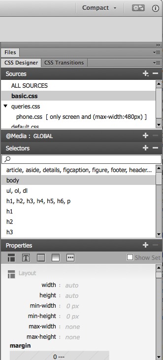
In the panels area, you see I’ve collapsed the Files panel. Immediately under that you see two CSS main panels, CSS Designer and CSS Transitions. With the CSS Designer panel active, under it you see the list of style sheets in my particular example. There’s a panel for adding @media queries (collapsed in this image) to your stylesheets, just in case you didn’t start your project by creating layouts for various media sizes from the outset. There’s a Selectors panel which looks quite familiar, and a Properties panel which is very changed. We’ll look at the fine details about the Properties panel in just a bit.

First lets see the expanded view.

DW expanded view

In the expanded view, you have space to see a smidgen of the Files panel and a whole lot more of the crucial Properties panel. You can see that this particular example has a style sheet called basic.css selected, and within that a rule for body is highlighted.

It only takes a second to switch from Compact to Expanded view, but you’ll find it almost impossible to do anything useful to your CSS in Compact view, so that’s a good thing.

The Properties panel

At the top of the Properties panel, you see icons for the categories of CSS you will want to work with. The first category is layout. I’ve pasted two sections of this together into one long image, so you get an idea of what you would see if you scrolled down a bit in the layout category.

layout

You have a box model thumbnail for setting margins, padding, and positioning. Below that you set float, clear and more. You can set individual properties for margins and padding by typing any amount and unit you want, or you click the linky looking symbol in the center to set them all at once.

If you continue to scroll down, you come to the Text category, or you can click the Text icon at the top.

text

Below what you see here for text, you also have a text-transform, letter spacing, alignment  and other text choices.

border

Border is the next category. Scroll below what you see here and there’s a border-radius area with a nice thumbnail representation of your choices for each corner.

background

Background is the next category. The box-shadow options will show in the next image.

other

The last category is Others, which includes list options.

On the right of the Properties panel title bar, you see a box called “Show Set.” If you select that, you see only the properties that have been assigned a value.

Nothing looks the same, but it only takes a second to grasp what the new symbols represent.

float and clear

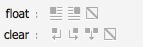
Look at the icons for float and clear, for example. You click the icons to set up float:left, float:right or float:none. With clear, you click the icons for clear:left, clear:right, clear:both, or clear:none. It’s different looking, but what you’re doing is pretty obvious once you figure out how the interface is organized now.

After you’ve worked on your CSS, change the view back to Compact while you’re working in the Document window so you have more space on your screen.

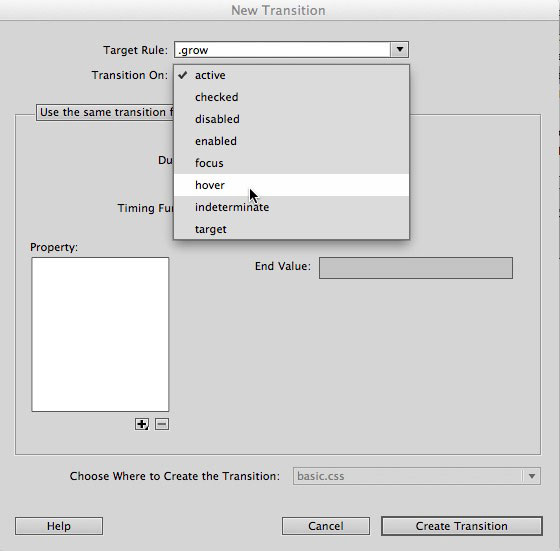
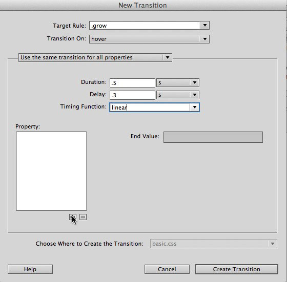
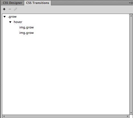
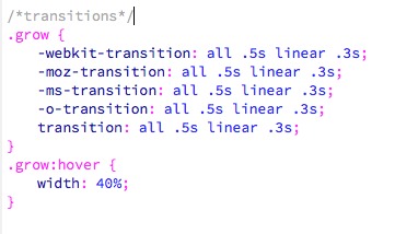
See Also: Creating Transitions in Dreamweaver CC.

Useful links: Shadow DOM, social media & Myers Briggs, CSS examples

What the Heck is Shadow DOM? Indeed.

Here’s a fun infographic relating Myers Briggs results to the way you use social media.

Web Design Inspiration: 45 examples of CSS. I normally don’t link to stories like this, but these examples were selected by Jenn Lukas from Happy Cog and are more interesting than the usual list of this type.

Popular Posts

Škoda Popular 1100 - 4

I love those popular posts widgets, but I don’t have room for one here on Web Teacher. Today I want to share some of the most popular posts on this blog to make up for that omission. If you missed them the first time, please take a look.

Useful links: BlogHer, Flexbox, Promote Yourself

BlogHer.com

BlogHer has an new, clean makeover to brag about. Their aim is to make it easy to find your way to great content by women bloggers on the original bloggers site. An impressive goal.

Does Flexbox Have a Performance Problem? CSS Tricks is trying to figure it out. You can help.

8 Tips for Promoting Your Dev Skills. There are some you may not have thought of.