No more leafing through a card catalog card by card. Search travels at the speed of electrons now. There are some characters and tricks that you can use to refine a search on Google that will get you the information you want more efficiently. Here are a four.
Exclude with a Dash
Putting a dash in front of a word excludes it from your search. A Star is Born -Striesand.
Include Synonyms with a Tilde
Putting a tilde before a word means that synonyms will be included for the word. Halloween ~masks.
Use Two Periods to Search a Range
Putting two periods between terms will give you a range of things like dates, measurements or prices. Gas prices 2001 .. 2005.
Use Related to find Related Items
Use related: to search for things that are related to a specific site. related: oldaintdead.com.
It’s time once again to bring something I curate on a daily basis to your attention: The HTML5 News.
It’s a compilation of HTML5 articles that get brought to my daily attention because of certain sites I monitor and certain keywords I monitor. I try to keep it really focused on actual HTML5, although some of the related technologies creep in because they are so interconnected. There are archives of past issues.
Most recently, there have been stories about a community for developers called HTML5 Hub, news from the W3C about lack of support for certain elements, and vulnerabilities in HTML5.
Take a look. You can subscribe if you want daily notifications of new articles.
I’ve learned a few things about how the Dreamweaver CC layout grid system works after making about 30 different layouts with it and struggling to figure out its bugs.
One helpful thing is to take a look at the stylesheet that Dreamweaver generates after you’ve told it how many columns you want in the various sizes. This is before you’ve entered any content of your own or added any CSS rules of your own.
Read through it and notice the order of the rules and media queries.
@charset "UTF-8";
/* Simple fluid media
Note: Fluid media requires that you remove the media's height
and width attributes from the HTML
http://www.alistapart.com/articles/fluid-images/
*/
img, object, embed, video {
max-width: 100%;
}
/* IE 6 does not support max-width so default to width 100% */
.ie6 img {
width:100%;
}
/*
Dreamweaver Fluid Grid Properties
----------------------------------
dw-num-cols-mobile: 4;
dw-num-cols-tablet: 8;
dw-num-cols-desktop: 12;
dw-gutter-percentage: 15;
Inspiration from "Responsive Web Design" by Ethan Marcotte
http://www.alistapart.com/articles/responsive-web-design
and Golden Grid System by Joni Korpi
The styles all flow from the 480 px and below layout rules. Dreamweaver expects you to begin adapting the style rules and adding your content in the mobile layout. Nothing explains that to you, but when the grid you set up in the File > New dialog opens in the Design View, it opens on the mobile view. Notice the size selector at the bottom of the document window, and the 4 column grid in the background.
These subtle clues means start with the mobile layout. Too subtle?
Is opening up in the mobile view too subtle a clue? Shouldn’t there be some text somewhere, about starting with the mobile layout?
Once you have the mobile layout done, you are expected to move to the tablet size layout and adjust the fluid grid accordingly.
Finally, you can make any adjustments to the fluid grid for a desktop layout.
Additionally, when the initial grid layout opens in Design View, it contains a div (with the id div1) which you are expect to delete. There’s nothing to alert you to the fact that you should delete this placeholder div and replace it with a header element or whatever you want to add first to your page.
Since Adobe has so few tutorials that illustrate the proper use of the grid layout system, much of what you need to know to figure out the new layout system comes by way of trial and error. I hope my trial and error stumbling and learning experiences can help you get off to a smoother start.
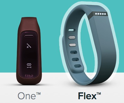
Yesterday I attended a very classy luncheon with a bunch of very classy women. As the meal ended, over pistachio cookies and sorbet, two of the women started talking about their FitBit gadgets.
FitBit One and FitBit Flex. Image from http://www.fitbit.com.
One woman dug her FitBit One out of her bra – yes, she carries it in her bra – and explained all that it did with great enthusiasm. The other woman wore a Flex bracelet. She confessed to being a technology dinosaur, but she was fascinated and obsessed with the data that she got from her FitBit.
They didn’t realize as they talked that they were describing how game theory has affected wearable technology. Nevertheless, that was how FitBit had hooked them both: rewards, feedback, realtime tracking, notifications, nags, acknowledgement. They were both dedicated to making those 10,000 steps per day, to getting quality sleep, to watching their calorie intake. They knew the FitBit was tracking them and they had such easy access to the information, they felt the gadgets had made them healthier people.
If the definition of creating a successful design is making a product that works, then FitBit has taken high tech and game theory and created a great product.
Google recently announced Android Wear, an operating system for smart watches. I wouldn’t be surprised to see FitBit and other technologies like it move into watches soon.