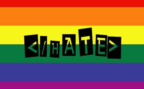
Geek Mom recently published a post by Sarah Pinault called Using HTML in Your Daily Life: The Rise of Fake Code. In this interesting essay, Sarah discussed the use of fake HTML tags in everyday communication. She cites examples like <rant></rant> and <giggle></giggle>.
Sarah provided examples of using fake HTML in clever conversations like this:
Me:<rant>Everyone is using my stuff!!!</rant>
The Husband: The beauty of the rant tag is you don’t need the ‘!!!’ <rant>Everyone is using my stuff.</rant> It adds context.
Me: Wait, are you dissing my use of fake HTML?
The Husband: No, no, no… The point is that the tag takes a totally innocuous statement, i.e., “Everyone is using my stuff” and makes it so you read it with the intended ‘rant-voice’ in your head.
Me: <LOVE>You are an interesting fellow.</LOVE> <worry>Wait. Does that end the love.</worry>
The Husband: <romantic>Our Love will never end.</romantic> <giggle>Tee-Hee</giggle>
Fake HTML is Semantic

End Hate by Marlith via Flickr
It hit me in looking at Sarah’s fake HTML, or in examining the fake HTML in the plea to end hate shown in the image. When people make up fake HTML, it’s semantic. Without even thinking about it, they make up a tag that expresses the semantic meaning of exactly what they are trying to say. Without thinking about semantics at all.
As readers and speakers, we grasp the semantics of words and how the semantic underpinnings of language affect what we mean when we talk and write. And we can apply that with ease to our fake HTML.
What I’d like to have you think about today is the semantics of real HTML. HTML is a semantic markup language. Using it semantically helps your readers make sense of your content.
But here’s the problem. Many people are using tools that encourage them NOT to think about semantics. The tools confuse and befuddle and we end up doing the exact opposite of what we would do naturally and without effort if we understood the tools just a little better. Instead of creating semantic HTML, we create a semantic nightmare. Here are some tips to help you understand (and be the master of) the tools you use to blog.
Do you use WordPress? Then you are familiar with this set of tools:

Most blogs and HTML editors have a similar set of tools. First, I want to talk about the icons that say B, I, and show quotation marks. These tools in your formatting toolbar carry particular semantic meaning.
Bold and Strong
When you use the B icon, you see your words made bold. But the semantic HTML tag that is creating that bold effect is really a <strong> tag. The semantic meaning of <strong> is strong emphasis. While you may want your words to be bold just for presentational reasons, you are giving your words the added semantic meaning of strong emphasis. You need to think about whether you want those words to look bold just because you like they way it looks, or whether you want to give the words strong emphasis.
If you want strong emphasis, use the B icon to create a <strong> tag. If you want bold just for looks, take a side trip into the HTML tab or view of your post and add the bold tag by hand. That’s right, hand coding. The tag for bold is <b>, which you close with </b>.

Bold Isn’t the Same as a Heading
Headings (h1–h6) are bold. Automatically. Headings have a semantic meaning, too. They are headings. I know that sounds silly, but they are meant to be a section heading or title. Using a bolded (or strong) paragraph to create something that looks like a heading doesn’t provide the same semantics. The bold (or strong) words are strongly emphasized but are not headings – and that may cause navigation problems to people who use devices that can navigate by jumping from heading to heading. It’s easy to make something a real heading when you mean for it to be one. In WordPress, use the pulldown menu next to the word ‘paragraph’ in the toolbar to find the proper heading.
Italic and Emphasis (And Don’t Forget Cite)
Next is the I icon. when you use it to format words, they appear as italic. But the tag that is created is an <em> tag, which stands for emphasis. The <em> tag has semantic meaning. It gives words emphasis.
What to do about the I icon? Us it when you want emphasis. The icon says I, but it writes an <em> tag. Us <em> like this: <em>Don’t drink Mercury!</em>
If you want italics for effect or for looks, pop over into the HTML pane and hand enter the <i></i> tag to make your words italic. There are two caveats with italic text. First, in HTML4 and XHTML, the <i> tag had no semantic meaning at all. It was simply decorative text. Starting in HTML5, the <i> tag now means the words can be in a foreign language or can be a title. Bottom line, in HTML5, <i> does have semantic meaning.
Then there’s <cite></cite>, which means a citation. It displays in italics, but it is a citation of a title of a book or movie or web site name. Use it like this: <cite>Geek Mom</cite> recently published a post . . . Yes, you have to jump into the HTML pane and hand code it.
The Blockquote
The toolbar icon with the opening quotation marks creates a blockquote. You may be using this one properly already. The semantic meaning of <blockquote> is that you’re quoting a bit of something from someone elsewhere – perhaps a web site or a book.
Here’s the problem. When you format something as a blockquote, it displays in the browser indented slightly on both sides. So some people use the <blockquote> tag to indent things. In other words, to achieve a visual effect that has nothing to do with the semantics of the tag. This can be confusing to your users if they are browsing using devices that announce something as a blockquote. They expect a quote. If you’re just doing it for looks, you’re semantically confusing. You don’t want to be semantically confusing. No, indeed. Clarity in communication comes from precise semantics.
How should you indent if you can’t do it with a blockquote? The easiest way is to had a few pixels of margin-left in the style sheet to whatever you want to indent on your page. In the style sheet, create a class, perhaps call it indent, add a margin-left rule, and apply the class to anything that you wanted to move over a bit. No semantic miscommunication, and nice appearance.
Paragraphs
One more problem I see frequently in posts involves paragraphs. Apparently, some blogs use two line break tags to create what looks like a paragraph. A line break is created with a <br> tag. (Sometimes it’s written <br />, but <br> and <br /> are the same thing.) If you string two break tags together like this <br><br>, you get a blank line and what looks like the start of a new paragraph.
Paragraphs are semantic blocks of meaning. Each paragraph has one main idea! (Remember THAT English teacher? The one who nagged you about the main idea of a paragraph. I do.) The tag for a paragraph is <p></p>. If you want to start a new paragraph you close the previous one and begin a new one. New paragraph, new main idea. Nice and semantic.
Line breaks just mean the next word starts on a new line. It doesn’t imply anything semantic. You might use line breaks to move down a line in a set of ingredients for a recipe or to move down a line for the next words in a poem. Using breaks to create paragraphs doesn’t make real paragraphs – it just makes something that looks like a paragraph to a reader who is looking at your page (and not all users are looking at your page.)
If you discover that your particular blogging platform is using <br><br> to create paragraphs see if you can find a way to change it. Or use the “paragraph” formatting tool in your toolbar to make it a paragraph.

You never know what kind of browser or device your readers are using to get the content of your web page. The more semantic you can keep your real HTML, the better all your readers will be able to understand the exact meaning of your message.
Editors Note: Cross posted at BlogHer.


