The Joy of HTML

I don’t understand why people treat the Code View option in Dreamweaver like it’s a bad thing. Like everything has to be done in a visual environment. Like the stuff behind the magic mirror of Design View is too awful for even a glance.

If you are using Dreamweaver, or teaching Dreamweaver, or writing a book about Dreamweaver, you and your students or readers deserve the chance to appreciate the joy of a clean, semantic page of HTML. Clean, semantic HTML is a joy to behold. Everyone deserves the opportunity to admire that nicely crafted doctype, the powerful link to the stylesheet, the well-written title. And what a body you get to see! You see properly marked up headings and paragraphs and lists and blockquotes, uncluttered and clean and purposeful. You may see an occasional div enclosing a group of page elements that fit together logically into a stylish and functional part of a page: perhaps a luscious sidebar or a shy footer.

The joy of clean HTML is that it’s all content. There is no clutter, no presentational trash like font tags and align attributes. Just beautiful words, words marked up or identified to indicate their logical purpose as headings or lists or acronyms.

There’s a name for HTML like that: standards-compliant.

Standards-compliant HTML goes anywhere, does everything, never quits being available, and always makes sense no matter how you get to it. That’s a lot of joy from something so basic and simple as clean markup.

If you are using Dreamweaver, or teaching Dreamweaver, or writing a book about Dreamweaver, open things up to Code View now and then, or maybe Split View, so that everyone can see what they are really doing. Then people can see if what they’re creating visually is joyful, clean, and semantic HTML. HTML that is meant for the masses. HTML that can go anywhere, do anything and always make sense.

That’s too hard you say. You have to learn CSS, you say. CSS takes too long, you say.

But. There’s motivation to consider. If you are using Dreamweaver, or teaching Dreamweaver, or writing a book about Dreamweaver, do you think you or the people you are training want to be what Kathy Sierra calls kick-ass users? Do they want to reach the most people on the most devices? Do they want to create work that will go anywhere, do anything and always make sense: professional level kick-ass work?

Let’s look at motivation a bit more. Suppose someone using Dreamweaver wants to move something over to the right on the page a few pixels. Using only Design View, you could have them use the text indent icon on the Property inspector. The stuff would move, right? But what if they were using Split View and realized that they had, in reality, created a blockquote. Having survived 10th grade English, your user realizes in her heart of hearts that whatever she just moved a few spaces really isn’t a blockquote.

Here’s your moment of motivation. In this moment, you show this user how to move things to the right just a bit with a CSS property called margin-left hitched up to a class or id for the element being moved. Not too hard, not too much CSS to take forever to learn. Just enough CSS to help the user kick butt with clean, semantic, standards-compliant HTML. Ah, joy.

Another example. Suppose you or a person you are training creates a class and assigns it to a paragraph. Wow, you feel cool cause you’re using CSS. However, each time you press Enter in Dreamweaver and type another paragraph, the class attribute persists. Soon you have a page full of paragraphs with dozens of class attributes scattered in the markup.

Unless you looked at Code View now and again, or perhaps work in Split View, you’d never know that the page was littered with class attributes. If you did look at Code View, you might wonder if you really need to assign the same class to every single paragraph you write. Isn’t that, like, classitis or something, dude? Here’s that moment of motivation when you explain that one style for the p element could do the same thing with no classes needed anywhere. Suddenly the difference between cluttered markup and clean markup makes sense and CSS isn’t so hard after all.

I’ve been known to call this notion integrated HTML and CSS, but today, I’m calling it joy.

Is writing standards-compliant web pages is a worthy goal? Is work that will go anywhere, do anything and always make sense a worthy goal? I certainly think so. If I’m right, we have admit that Dreamweaver’s Code View is worth using, at least sometimes. We have to admit that using CSS instead of presentational HTML is easier in Dreamweaver if people can experience the joy of HTML.

Technorati Tags: , , , , , ,

Tip: Retrain your HTML 3.2 Brain to Think in CSS

How HTML attributes translate into CSS properties
HTML Attributes CSS Properties Notes
font face

font-family: Arial;

Use quotation marks only when there are spaces in the font-family name, e.g., font-family: Verdana, "Trebuchet MS", Tahoma;
font size font-size: 1em; Sizes can be set in ems, percents, pixels or with keywords such as small, medium and large.
bold <b>

font-weight:bold;
strong

When using bold text for decorative reasons, set it with font-weight: bold.

When using bold text to indicate strong emphasis, use the strong element, not the b element.

italic <i> font-style: italic;
em

When using italic text for decorative purposes, set it with font-style: italic. Oblique is also a font-style.

When using italic text to indicate emphasis, use the em element, not the i element.

Italics for citations such as book titles is created using the cite element.

align="left"
align="right"
float: left;
float: right;

With CSS anything can be floated: images, paragraphs, divs, headings, tables, lists, etc.

Keep in mind that a float may need to be followed by a clear.

marginwidth="0" leftmargin="0" marginheight="0" topmargin="0" margin: 0;

With CSS, margin can be set for any element, not just the body element. More importantly, margins can be set individually for the top, right, bottom and left of any element.

When indenting a block level element, use margin-left, unless the element is actually a
blockquote
.

vlink="#333399" alink="#000000" link="#3333FF"

a:link #3ff;
a:visited: #339;
a:hover: #999;
a:active: #00f;

In HTML, link colors were set as an attribute of the body tag and applied uniformly to every link on the page. Using descendant selectors in CSS, link colors can be set to different values in different parts of a page.
bgcolor="#FFFFFF" background-color: #fff; In CSS, background-color and/or background-image can apply to any element, including body, tables, headings, divs, forms, paragraphs, lists, or spans.
bordercolor="#FFFFFF" border-color: #fff; Any element can have a border, the colors of which can be set individually for top, right, bottom and left if desired.
border="3"
cellspacing="3"
border-width: 3px;

With CSS, any element can have a border. Borders can be set uniformly, or the size, style and color of borders can be set individually for the top, right, bottom and left (or any combination thereof) of any element.

When setting the borders for tables, use the table, td or th selectors.

When setting the spacing for tables, use the table, td, and th selectors.

If you want a single border line between adjacent table cells, use border-collapse: collapse;

Border can replace a decorative hr element when used only as border-top or border-bottom on an element. A rule for border-right and border-bottom can simulate a drop shadow.

<br clear="left">
<br clear="right">
<br clear="all">

clear: left;
clear: right;
clear: both;

Many two and three column layouts use float to position elements on a page. If part of your presentation depends on background colors or images behind floated elements, you may want to use clear.
cellpadding="3"
vspace="3"
hspace="3"
padding: 3px; With CSS, any element can have padding. Padding can be set uniformly or individually for the top, right, bottom and left of any element. Padding is transparent, so background-color or background-image will shine through.
li type="disc"
li type="A"
list-style-type: disc;
list-style-type: upper alpha;
The properties for list-style-type include disc, circle, square, decimal, upper-alpha, lower-alpha, upper-roman, lower-roman and several others, most notably none.
align="center"

text-align: center;

margin-right: auto;
margin-left: auto;

Text-align only applies to text.

Block elements such as paragraphs and divs can be centered using margin-right: auto; and margin-left: auto;

Technorati Tags: ,

Tip: Testing CSS for Handhelds

As I pointed out in a post a few days ago, testing handheld CSS is problematic. Here are a few of the resources that are available.

Opera’s View > Small Screen feature comes close to emulating some handhelds, and will display a page with handheld CSS accordingly. It also does a decent job of displaying a page with no handheld CSS as it would look on a handheld. Even more helpful is the Opera Mini Simulator an online simulator that looks like a phone.

The W3C Mobile Web Best Practices 1.0 comes with an online validator in alpha state that tests 34 of the 60 best practices.

Online simulators are scarce for individual mobile devices. Most manufacturers have some help in their support pages and many offer a downloadable emulator, such as this one from BlackBerry.

Technorati Tags: ,

Tip: IE7’s New Feed Reader

The new Internet Explorer 7 has an RSS feed reader built in. Here’s how you subscribe to a blog using this new feature.

I’m using the blog Time Goes By as my example, because this post was inspired by a woman on a conference call among several of the readers of Time Goes By who said she read the blog but didn’t know how to subscribe to a feed. There were all sorts of suggestions given to her, but since Microsoft is encouraging everyone to download the new IE7, I thought that might be the easiest way to go for her, and perhaps for others too.

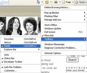
To see the feeds you are subscribed to in IE, open the Feeds toolbar. It is under Tools > Toolbars > Feeds.

Open the feeds toolbar

That opens up a panel on the side of the browser where you can see Favorites and Feeds. It appears at the left in the following image. If you want to add a feed, look for the orange icon that symbolizes the presence of a feed. There’s an arrow pointing to it in the following image.

Adding a feed

If that orange icon is not grayed out, it means the site you are visiting has a feed, and you can subscribe. Click it.

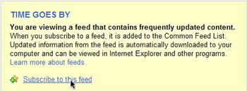
Subscribe to the feed

A new window opens. At the top there’s a box that says this page has a feed and a link that says Subscribe to this feed. Click it.

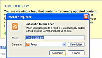
Subscribe again

IE7 asks you again if you really want to subscribe to this feed, and you must click the Subscribe button. After that the feed will be in your panel on the left and you can click it just like clicking on a Favorite. The feed will automatically update each time the blog you’ve subscribe to posts something new.

Tip: Want to write CSS for a handheld?

I’ve been researching CSS for handhelds of late. Chapter 15 for my new book is about CSS for handhelds—Chapter 15, does that mean I’m almost finished—yes! It’s been tough finding information and testing the CSS I’ve written in ways that yield reliable information. Consider this:

  • Some devices, especially phones, use only WAP (Wireless Application Protocol). Phones labeled WAP2 can use regular websites with XHTML and CSS.
  • Some devices, such as the BlackBerry, offer users a choice between WAP and regular browsing.
  • Some devices only support HTML 3.2. Some support HTML 4. Some support XHTML.
  • Some devices support CSS. Some do not. Those that do support CSS understand link better than @import.
  • Some phones apply screen styles as well as handheld styles; others ignore both.
  • Screen widths range from 100 pixels to 320 pixels for phones.
  • Screen widths range from 320 pixels to 640 pixels for PDAs.
  • Some devices have monochromatic screens. Some have color.
  • Some software, such as AvantGo on either a phone or a PDA, offer users a choice as to whether they want images to display or not.
  • Most devices can’t handle tables, floats, frames, JavaScript, popups, or dynamic menus. Some devices, however, will display simply formatted tables and JavaScript when there is a meta element declaring the document HandheldFriendly.

Testing is a nightmare, too, because there aren’t enough easy to find and use emulators and simulators available.

I’ve been able to come up with a few helpful ideas for CSS for handhelds, but I think we still have a long way to go before there’s much predictability in this area. My advice for now is to make lavish and liberal use of display: none for nonessential parts of your pages and make sure your color contrast is going to work on a small screen. Check your pages with CSS switched off to make sure they linearize sensibly (good semantic HTML is the underpinning of everything no matter what kind of device you’re designing for). Provide skip navigation links or other navigation aids to make the pages easier to work through.

Drawing near the close of the writing work on the new book makes me aware of how much I’ve neglected Web Teacher in the last few months. This little excerpt from what’s coming is my way of making peace and promising to be back soon with lots more.

Technorati Tags: , , , , ,

Tip: What is semantic markup and why should you care?

The word semantic gets tossed around a lot in connection with web design. A comment from someone made me realize I had overlooked discussing what that means here on Web Teacher. I use the word logical quite often instead, although I am not in a majority by talking about the logic of HTML tags as relating to sematics.

To me, however, HTML is simple because it’s logical. You can learn the majority of what you need to know about HTML in just a few hours. (It’s CSS that mortifies with its learning curve.) If text is meant to be a heading, there is a semantic (or logical) tag to create a heading element: h1, h2, h3, h4, h5, h6. Creating a bit of text that is big and bold and merely looks like a heading in a computer monitor is not the same thing. Why? Because the heading element carries the semantic meaning “this is a heading” as part of the markup. And that meaning attaches to the text no matter where or how the text is accessed: a computer monitor, a screen reader, a handheld, a cell phone, a printer.

Another way to think about it is to realize that HTML tags are self-describing. The tag itself explains the logic or semantics of what it is meant to markup. p describes a paragraph. li describes a list item. cite describes a citation. strong describes strong empahsis. See how that works?

Using the tags to create semantic meaning makes your content usable in any Internet-capable device with the logical organization carried with it.

In the move to separate content from presentation (or meaning from appearance) the first requirement is solidly structured semantic HTML. CSS can do literally anything with appearance, as long as there is a logical structure to the content that will hold up no matter how the content is styled. Without the proper HTML semantic underpinning for your content, no amount of CSS can make your page work in multiple Internet-capable devices.

In the world of semantic content, a table is used to display tabular data, a list is marked up as a list, indented text is only marked up as a blockquote when it actually is quoted material, text that needs emphasis is marked up as an em element, and so on through the logic of every HTML tag.

There is room for discussion about what element is semantically correct as markup for a certain bit of content. The lively discussions on topics about the best semantic markup for certain types of content at Simple Bits/Simple Quiz lead Simple Bits’ Dan Cederholm to write two excellent books about semantic markup: Web Standards Solutions and Bulletproof Web Design. If you want more detail about the topic, pick up one of those books and get the complete story.

Technorati Tags: , , , ,

Tip: Using Firefox to Wage a Class War

Firefox has a number of Add-Ons. The one especially loved by web developers, the Web Developer Toolbar add-on, gives you the tools to wage a class war.

What is a class war? I’m talking about a war on classitis, a disease characterized by using classes for just about everything on a page of HTML. Read the complete article . . .

Technorati Tags: , , , , , ,