I saw this on Spydergrrl’s website and wanted to share it with you. It takes the work that Annie Leonard did in The Story of Stuff and moves it to the next level with The Story of Change.
How to Put a Sidebar on a WordPress Twenty Eleven Page Like This One – UPDATED
I just changed the theme on this self-hosted WordPress blog. So – no big deal, it’s as easy as pressing a button, right? Not exactly. Not if you want to modify the theme. Not if you are in the BlogHer Ad Network and need an ad in a sidebar on both the main blog page, single blog post pages and site pages.

There’s the required ad in my sidebar.
Here’s how I got that sidebar on every page. I started with the most basic theme you can get at wordpress.org: twentyeleven. There’s a newer one called twentytwelve, too. I chose this theme for several reasons.
- It comes from WordPress, made by WordPress, so I know I can trust it.
- It’s free.
- It has lots of bells and whistles, and it’s a responsive design. (See Should Your Blog Use Responsive Design?)
- It has a very simple and clean look, which I like.
The twentytwelve theme has lots of bells and whistles, too. It is a mobile first design. (See The Mobile First Craze.) I didn’t think I needed to go that far, so I stuck with twentyeleven.
The only drawback to this theme is that the single post pages (called Single in WordPress) and the individual pages (called Pages in WordPress) did not have sidebars. No sidebar, no ad space, which means I couldn’t comply with the BlogHer Ad Network requirements for running their ads.
I had to modify single.php and page.php to add the sidebar. And I had to modify functions.php. I’ll take you step by step through the process. You can do some of this in the WordPress admin area. I also used a text editor and an FTP tool.
Step 1: Install the Theme and Create a Child Theme
Use the blog admin area where you choose a theme to get twentyeleven ready to go. Or you can download twentyeleven from WordPress and add it to your site themes directory using FTP.
Here’s the thing. You have to have twentyeleven on your server, but you are not going to switch to that theme. You are going to use a child theme.
Making a child theme is actually easier than it sounds. You add another folder to your site’s theme’s folder. I did this using FTP, but you can use your site host’s control panels to add folders, too. Just make sure it’s in the themes folder and at the same level as the twentyeleven folder.
Nothing goes into the child folder, which I named twentyeleven-child, except a style.css file and a functions.php file. I started with blank files that I made by saving text documents with those two names.
Here’s the structure you need to see on your server, according to the WordPress Codex.
- site_root (www)
- wp-content
- themes (directory where all themes are)
- twentyeleven (directory of parent theme, Twenty Eleven)
- twentyeleven-child (directory of child theme; can be named anything)
- style.css (required file in a child theme; must be named style.css)
- function.php (not required in a child theme, but needed to modify the pages to add the sidebars)
- themes (directory where all themes are)
- wp-content
Once this child folder is in your themes folder, you will see the child theme as a option in the WordPress Appearance > Themes area where you choose a theme. Let’s do a couple of things to the CSS file before we choose it as the theme, though.
What Goes in the CSS File?
In the style.css file in the child theme, you start out with this:
/*
Theme Name:     Twenty Eleven Child
Description:    Child theme for the Twenty Eleven theme
Author:         your name
Template:       twentyeleven
*/

@import url("../twentyeleven/style.css");
Upload this into the child theme folder.
When you use a child theme, the browser uses any modification you put into the style.css file, but it also looks up to the imported stylesheet for everything you don’t modify. So when you pick this child theme as your theme, the css file tells the browser what the parent theme is and where the parent style sheet is.
Okay. Now you can push the button in the WordPress theme admin area to choose the child theme. Take a minute and go look at your blog with this new theme.
You could do nothing more than this and your child theme would work. It would be exactly like the parent theme, so you probably want to create a few style rules of your own in the child theme that will overrule the rules in the parent theme.
Just as an example, I didn’t like the looks of the h3 tags in the parent theme. They were too small, there was too much white space around them, they weren’t in bold, and they were all caps. So I figured out which rule I wanted to change and added this to the child style sheet:
.entry-content h3,
.comment-content h3 {
	font-size: 16px;
	font-weight:bold;
	line-height: 1.6em;
	text-transform: none;
}
This takes precedence over the rule in the parent theme CSS file, so now I have h3 headings that I like better.
Step Two: Modify single.php and page.php
You need to add the sidebar to pages and single blog posts. You open single.php and page.php in a text editor and upload the changes by FTP. You are going to modify these pages in the parent theme folder, not add anything to the child theme folder.
Open single.php in the text editor. At the very end of the page add
<?php get_sidebar(); ?>
It should be immediately before this line:
<?php get_footer(); ?>
Do the same thing to page.php. Save them both and upload them to the server – back into the parent theme where they came from.
Step Three: Modify functions.php
Now we come to the functions.php file. I found these directions at Twenty Eleven – Sidebar on Single Posts and Pages and they worked perfectly.
Add the following code to the up-till-now blank functions.php file in the child theme folder. Don’t do anything to the functions.php file in the parent theme.
I have no idea what this php is doing, but I can copy and paste like a champ. The author of the code says it will, “Suppress the .singular body_class from the single post or page,” so the sidebar can be added.
add_filter('body_class', 'blacklist_body_class', 20, 2);
function blacklist_body_class($wp_classes, $extra_classes) {
if( is_single() || is_page() ) :
// List of the classes to remove from the WP generated classes
$blacklist = array('singular');
// Filter the body classes
  foreach( $blacklist as $val ) {
    if (!in_array($val, $wp_classes)) : continue;
    else:
      foreach($wp_classes as $key => $value) {
      if ($value == $val) unset($wp_classes[$key]);
      }
    endif;
  }
endif;   // Add the extra classes back untouched
return array_merge($wp_classes, (array) $extra_classes);
}
Now that you have something in your functions.php file, upload it into the child theme folder again.
Anything you put into your sidebar via widgets should now appear on every page of your blog.
An Alternative
After I had done all this, I discovered Extend WordPress Twenty Eleven Theme to Include Sidebars and More Flexible Options that uses an extension to do all this and more. Sound easier? You might give it a try first. One drawback – it won’t work using a child theme. WordPress recommends that modifications to a theme be done with a child theme. But, if easier is better in your world, you might choose to ignore the recommendation to use a child theme and go with the extension. It gives you choices in the WordPress Admin area that let you select options to add sidebars.
[Editor’s Note: Cross posted on BlogHer in slightly different form.]
UPDATE: 1/25/2013.
Since writing this post I discovered a much simpler way of insuring that the sidebar appears on each single page you might want. The theme itself provides a sidebar template, which you can find in the page attributes section of the dashboard while you are editing the page.
Select the sidebar template for the page and you are good to go.
Useful Links: ySlow, WordPress headers, mobile form validation
Getting Started with YSlow is at Speed Awareness Month.
Creating a responsive header in WordPress 3.4 at Web Designer Depot uses a bit of jQuery to insert a responsive image into a WordPress header.
Steven Hoober makes a case for form validation on blur for mobile devices in Mobile Inline Form Validation.
Ever wonder where the idea of social media got started?
I truly doubt there are many people out there that have not at least attempted to use some form of social media. Even some of the most isolated areas in the world are getting internet connections, and sites like Facebook, Twitter and YouTube are often the first destinations. Social media is just a regular part of modern life, these days.
But how did the entire concept of social media sharing come to be? What sparked the phenomenon?
The Origins

This is extremely hard to answer. Because really, social media sharing is just a slightly adapted idea that has been used online for a long time. Links have always been shared from one site to another. Livejournal and copycat sites used to have lists of blogs that person read. RSS feeds allow for subscriptions that were an early form of following.
Of course, you also have the other social networking sites that have become dinosaurs today. Sites such as Friendster and Myspace, which technically had this concept through “friending”. Though the modern equivalents like following on Twitter did not catch on.
So, where did the concept of social media sharing come from? It depends on how you look at it. The best answer is probably that it is a concept that developed from many directions and other platforms.
“Following” Found In Nature

The question of examples of following in nature was brought up on Quora back in 2010, and it is an interesting way of looking at it. Ants follow one another by scent, as one user points out. Lemmings follow one another by movement. Swarms follow the same kind of pattern.
But really, any kind of mass habitat culture will have following within its infrastructure. Humans are very much the same, in how we observe those both in our lives, and those outside of it. Just look at the popularity of tabloids and celebrity gossip blogs.
Do you have a theory as to the true origins of social media sharing as a concept? Let us know in the comments!
Guest Author Jessy is the business and social media blogger for Business registration database, the free tool giving your business profiles more online and social media visibility.
Hello, new world. Hell froze over.
If you read the blog rather than an RSS feed, you’ll notice that I FINALLY changed the theme. I’ve used Very Plain Text for 11 years. It served me very well and I send many thanks to Scott for the serviceable and timeless theme.
You probably recognize the new theme as the standard twentyeleven. I haven’t customized it much yet. I went with the idea of a child theme for customization. I spent some time getting things I wanted into the sidebar. (Gotta get that BlogHer Publishing Network stuff in there first thing. You know how that works.)
I hope you find it readable. I’m not sure that I like having an image at the top of the page – I may get rid of that, but in the meantime may I suggest the Albuquerque International Balloon Fiesta as one of the most fun things you’d ever do in your life.
Thanks for looking. Feedback is welcome.
The Mobile First Craze and Bloggers
Is your blog ready for mobile? Do you know how it looks on an iPhone or Kindle Fire? There’s a push to create websites designed for mobile first and the browser second.

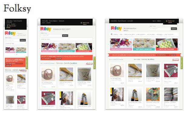
Folksy screenshot via mediaqueri.es
The reverse of the mobile first idea is to start with a desktop design, but make it “responsive” so that it can adapt to any size device. You see that idea at work in the image of the British crafters site Folksy above. I wrote about responsive design last December in Should Your Blog Use Responsive Web Design?
Recently this tweet from Laura Scott got me thinking about how sites look on mobile devices again.
So many links tweeted are to sites that don’t work on
#mobile. Wonder about links I shared. We all must stop assuming desktop privilege!— Laura Scott (@lauras) September 2, 2012
This is a pet peeve of mine too. I don’t always spend time on Twitter when I’m at my computer. Frequently I look at Twitter when I’m away from the house in a waiting room or sitting outside the school waiting for the grandkid. I’ll see something that really looks interesting, but when I follow the link it’s unreadable on my iPhone.
This problem could be solved if sites were designed with mobiles in mind from the very first, or if they were designed respond to mobile devices with different layouts.
Luke Wroblewski wrote a book called Mobile First and is the leader among the proponents of this idea. He explains, in an article at Net Magazine, why he supports the approach.
But things have changed so dramatically over the past few years that starting with the desktop may be an increasingly backwards way of thinking. Designing for mobile first can open up new opportunities for growth and lead to a better overall user experience. Let’s dig into the three key reasons why: mobile is seeing explosive growth; mobile forces you to focus; and mobile extends your capabilities.
Luke’s comment that mobile forces you to focus means that you really have to think about what’s important. You can’t have content that isn’t part of your main message cluttering up the screen when you only have 480×320 pixels of screen space. Narrowing your focus can also extend capability by reducing download speed and making your site easier to use and navigate.
What about Blogs?
Most bloggers are not creating their own templates or themes. But fortunately, the folks who do create templates and themes for blogs are well aware of the need for blogs to work on mobiles and well as desktops. The default WordPress themes 2011 and 2012 are both responsive designs. Switching to one of them guarantees you a good result on a mobile device.
Blogger also allows you to switch to a mobile theme.
If you are unafraid of the idea of designing your own WordPress theme from scratch, here’s a helpful article by Ellen Bauer at Smashing Magazine that explains how to Create A Responsive, Mobile-First WordPress Theme.
Check Yourself. And Everyone Else
What if you don’t own every possible size of mobile device to take a look at your blog and check yourself?
There’s a handy bookmarklet available from Benjamin Keen. You download the bookmarklet and put it in your bookmarks toolbar. Then you can see how your site, or anyone else’s site looks in various sized devices.
You may be losing readers if you don’t find out.
[Note: Cross-posted on BlogHer in slightly different form.]
Wolfram | Alpha Data Mining Your Facebook
Wolfram | Alpha announced a new tool that lets anyone do personal analytics on their Facebook data. Stephen Wolfram described the new capabilities:
Wolfram|Alpha knows about all kinds of knowledge domains; now it can know about you, and apply its powers of analysis to give you all sorts of personal analytics. And this is just the beginning; over the months to come, particularly as we see about how people use this, we’ll be adding more and more capabilities.
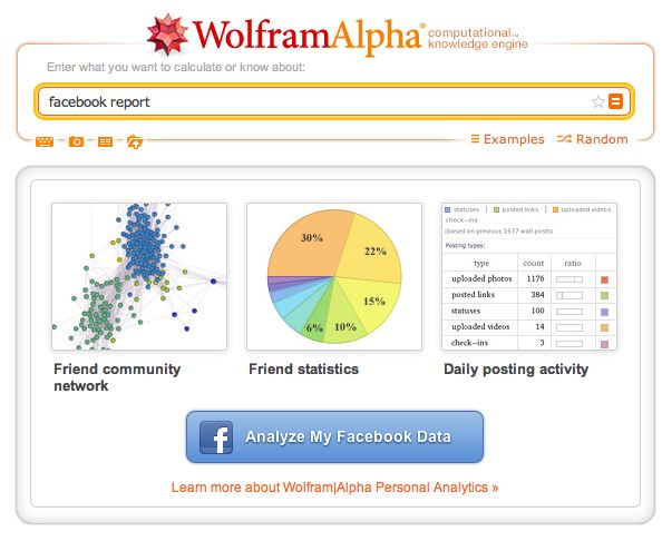
It’s pretty straightforward to get your personal analytics report: all you have to do is type “facebook report” into the standard Wolfram|Alpha website.
Stephen Wolfram also stated:
The personal analytics system we’re releasing today is just the beginning. We’re looking forward to everyone’s feedback . . . and we’re planning to keep adding more and more features and capabilities.
You have to authenticate the app to run in Facebook. Then you get a report showing dozens of charts and graphs that use your Facebook account to form a report with over 60 sets of data.
Here are a few of the results you get from the app:
- a map of your friends’ hometowns
- age distribution of your friends
- today’s weather and other information about your location
- time until your next birthday
- the various types of posts you add to Facebook categorized and a weekly distribution of your updates
- average post length, average number of comments, likes
- word clouds from your posts
- gender and age distribution of your friends
- relationship status of your friends
- most common names among your friends
- who you share friends in common with
- a chart of friend distribution in a network showing connectors and hubs
Individual charts from the report can be “clipped and shared” on a web page or in Facebook.
I’m sure people will be fascinated with seeing all their Facebook facts displayed this way. We are a nation of navel watchers. Some people who use Facebook Pages for business promotion may find the data helpful in deciding what works in promoting their brand. The important thing is, at least for now, you can only gather this information on your own account.

